2

I would like to plot a ggplot2 image using ggplotly What I am trying to do is to initially plot rectangles of grey fill without any aesthetic mapping, and then in a second step to plot tiles and change colors based on aesthetics. My code is working when I use ggplot but crashes when I try to use ggplotly to transform my graph into interactive

Here is a sample code

library(ggplot2)
library(data.table)
library(plotly)
library(dplyr)


  x = rep(c("1", "2", "3"), 3)
  y = rep(c("K", "B","A"), each=3)
  z = sample(c(NA,"A","L"), 9,replace = TRUE)

  df <- data.table(x,y,z)

  p<-ggplot(df)+
    geom_tile(aes(x=x,y=y),width=0.9,height=0.9,fill="grey") 


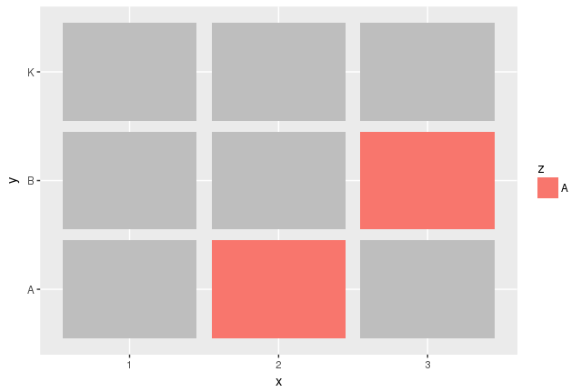
    p<-p+geom_tile(data=filter(df,z=="A"),aes(x=x,y=y,fill=z),width=0.9,height=0.9)
p

enter image description here

But when I type this

 ggplotly(p)

I get the following error

Error in [.data.frame(g, , c("fill_plotlyDomain", "fill")) :
undefined columns selected

The versions I use are

> packageVersion("plotly")

1 ‘4.7.1

packageVersion("ggplot2")

1 ‘2.2.1.9000’

##########Edited example for Arthur
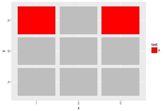
     p<-ggplot(df)+
    geom_tile(aes(x=x,y=y,fill="G"),width=0.9,height=0.9) 
  p<- p+geom_tile(data=filter(df,z=="A"),aes(x=x,y=y,fill=z),width=0.9,height=0.9)

  p<-p+ scale_fill_manual(
    guide = guide_legend(title = "test",
                         override.aes = list(
                           fill =c("red","white")                  )
    ),
    values = c("red","grey"),
    labels=c("A",""))
p

enter image description here

This works but ggplotly(p) adds the grey bar labeled G in the legend
5
  • Hello! Is there any reason with you don't want to color directly through aes(x=x,y=y, fill=z) with a custom +scale_fill_manual()? (ggplot2.tidyverse.org/reference/scale_manual.html)
    – Arthur
    Commented Oct 6, 2017 at 12:00
  • Hi At the end this is what I do. But I want to hide the grey tile from the legend. Which again works with ggplot and correct use of the guide_legend( override.aes)) and legend. But again when I use ggplotly the legend reappears
    – anle
    Commented Oct 6, 2017 at 17:51
  • I added an example to explain better what I mean
    – anle
    Commented Oct 6, 2017 at 18:09
  • So your real question is: "How to hide selected keys in the legend with ggplotly?" Do I understand you correctly?
    – Arthur
    Commented Oct 7, 2017 at 12:41
  • For operational issues and requirements scale_fill_manual may not be always desired solution. Can we not create an issue in GitHub for it. Commented Jul 4, 2019 at 12:12

3 Answers 3

1

The output of the ggplotly function is a list with the plotly class. It gets printed as Plotly graph but you can still work with it as a list. Moreover, the documentation indicates that modifying the list makes it possible to clear all or part of the legend. One only has to understand how the data is structured.

p<-ggplot(df)+
   geom_tile(aes(x=x,y=y,fill=z),width=0.9,height=0.9)+
   scale_fill_manual(values = c(L='grey', A='red'), na.value='grey')
p2 <- ggplotly(p)
str(p2)

The global legend is here in p2$x$layout$showlegend and setting this to false displays no legend at all.

The group-specific legend appears at each of the 9 p2$x$data elements each time in an other showlegend attribute. Only 3 of them are set to TRUE, corresponding to the 3 keys in the legend. The following loop thus clears all the undesired labels:

for(i in seq_along(p2$x$data)){
  if(p2$x$data[[i]]$legendgroup!='A'){
    p2$x$data[[i]]$showlegend <- FALSE
  }
}

Voilà!

1
  • And it worked! Merci!!!! This is really helpful an of course understanding the structure of the plotly object can help me with more manipulations I ll need in the future :)
    – anle
    Commented Oct 7, 2017 at 17:57
0

This works here:

ggplot(df)+
  geom_tile(aes(x=x,y=y,fill=z),width=0.9,height=0.9)+
  scale_fill_manual(values = c(L='grey', A='red'), na.value='grey')

ggplotly(p)

I guess your problem comes from the use of 2 different data sources, df and filter(df,z=="A"), with columns with the same name.

0

[Note this is not an Answer Yet] (Putting for reference, as it is beyond the limits for comments.)

The problem is rather complicated.

I just finished debugging the code of plotly. It seems like it's occurring here.

I have opened an issue in GitHub

Here is the minimal code for the reproduction of the problem.

library(ggplot2)

set.seed(1503)

df <- data.frame(x = rep(1:3, 3),
                 y = rep(1:3, 3),
                 z = sample(c("A","B"), 9,replace = TRUE), 
                 stringsAsFactors = F)

p1 <- ggplot(df)+
  geom_tile(aes(x=x,y=y, fill="grey"), color = "black")

p2 <- ggplot(df)+
  geom_tile(aes(x=x,y=y),fill="grey", color = "black")

class(plotly::ggplotly(p1))
#> [1] "plotly"     "htmlwidget"
class(plotly::ggplotly(p2))
#> Error in `[.data.frame`(g, , c("fill_plotlyDomain", "fill")): undefined columns selected

Your Answer

By clicking “Post Your Answer”, you agree to our terms of service and acknowledge you have read our privacy policy.

Not the answer you're looking for? Browse other questions tagged or ask your own question.