- Material UI
Component library that implements Google's Material Design.
- Joy UI
Component library that implements MUI's own in-house design principles.
- Base UI
Unstyled React components and low-level hooks.
- MUI System
CSS utilities for rapidly laying out custom designs.
- MUI X
Advanced components for complex use cases.
- ToolpadBeta
Components and tools for dashboards and internal apps.
Ready to use
Material Design
components
Material UI is an open-source React component library that implements Google's Material Design. It's comprehensive and can be used in production out of the box.


The world's best product teams trust MUI to deliver an unrivaled experience for both developers and users.
Component library
40+ building block components
A meticulous implementation of Material Design; every Material UI component meets the highest standards of form and function.
<Button variant="text" startIcon={<ShoppingCartRounded />}>
  Add item
</Button>
<Button variant="contained" startIcon={<ShoppingCartRounded />}>
  Add item
</Button>
<Button variant="outlined" startIcon={<ShoppingCartRounded />}>
  Add item
</Button>
Theming
Build your design system just as you want it to be
Start quickly with Material Design or use the advanced theming feature to easily tailor the components to your needs.
Custom Theme
Theming allows you to use your brand's design tokens, easily making the components reflect its look and feel.Material Design
Every component comes with Google's tried and tested design system ready for use.
Contemplative Reptile
Sounds of Nature<Card
variant="outlined"
sx={{ p: 2,
width: { xs: '100%', sm: 'auto' },
display: 'flex',
flexDirection: { xs: 'column', sm: 'row' },
alignItems: 'center',
gap: 2,
}}
>
<CardMedia
component="img"
width="100"
height="100"
alt="Contemplative Reptile album cover"
src="/images/contemplative-reptile.jpg"
sx={{ width: { xs: '100%', sm: 100 },
}}
/>
<Stack direction="column" alignItems="center" spacing={1} useFlexGap>
<div>
<Typography color="text.primary" fontWeight="semiBold">
Contemplative Reptile
</Typography>
<Typography
variant="caption"
color="text.secondary"
fontWeight="medium"
textAlign="center"
sx={{ width: '100%' }}
>
Sounds of Nature
</Typography>
</div>
<Stack direction="row" alignItems="center" spacing={1} useFlexGap>
<IconButton aria-label="Shuffle" disabled size="small">
<ShuffleRoundedIcon fontSize="small" />
</IconButton>
<IconButton aria-label="Fast rewind" disabled size="small">
<FastRewindRounded fontSize="small" />
</IconButton>
<IconButton
aria-label={paused ? 'Play music' : 'Pause music'}
onClick={() => setPaused((val) => !val)}
sx={{ mx: 1 }}
>
{paused ? <PlayArrowRounded /> : <PauseRounded />}
</IconButton>
<IconButton aria-label="Fast forward" disabled size="small">
<FastForwardRounded fontSize="small" />
</IconButton>
<IconButton aria-label="Loop music" disabled size="small">
<LoopRoundedIcon fontSize="small" />
</IconButton>
</Stack>
</Stack>
</Card>Styling
Rapidly add and tweak any styles using CSS utilities
CSS utilities allow you to move faster and make for a smooth developer experience when styling any component.
Leverage the tokens from your theme
Easily use the design tokens defined in your theme for any CSS property out there.No context switching
The styling and component usage are both in the same place, right where you need them.Responsive styles right inside system prop
An elegant API for writing CSS media queries that match your theme breakpoints.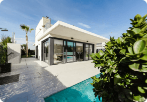
$280k - $310k
<Card
  variant="outlined"
  sx={{ p: 2, display: 'flex', flexWrap: 'wrap', zIndex: 1 }}
>
  <CardMedia
    component="img"
    width="100"
    height="100"
    alt="123 Main St, Phoenix, AZ cover"
    src="/images/real-estate.png"
    sx={{
      borderRadius: '6px',
      width: { xs: '100%', sm: 100 },
    }}
  />
  <Box sx={{ alignSelf: 'center', ml: 2 }}>
    <Typography variant="body2" color="text.secondary" fontWeight="regular">
      123 Main St, Phoenix, AZ, USA
    </Typography>
    <Typography fontWeight="bold" noWrap gutterBottom>
      $280k - $310k
    </Typography>
    <Chip
      size="small"
      variant="outlined"
      icon={<InfoRounded />}
      label="Confidence score: 85%"
      sx={(theme) => ({
        '.MuiChip-icon': { fontSize: 16, ml: '4px', color: 'success.500' },
        bgcolor: 'success.50',
        borderColor: 'success.100',
        color: 'success.900',
        ...theme.applyDarkStyles({
          bgcolor: 'primaryDark.700',
          color: 'success.200',
          borderColor: 'success.900',
        }),
      })}
    />
  </Box>
</Card>
Templates
The right template for your
specific use case
A carefully curated collection of gorgeous, fully functional templates.
Design resources
Enhance your design workflow
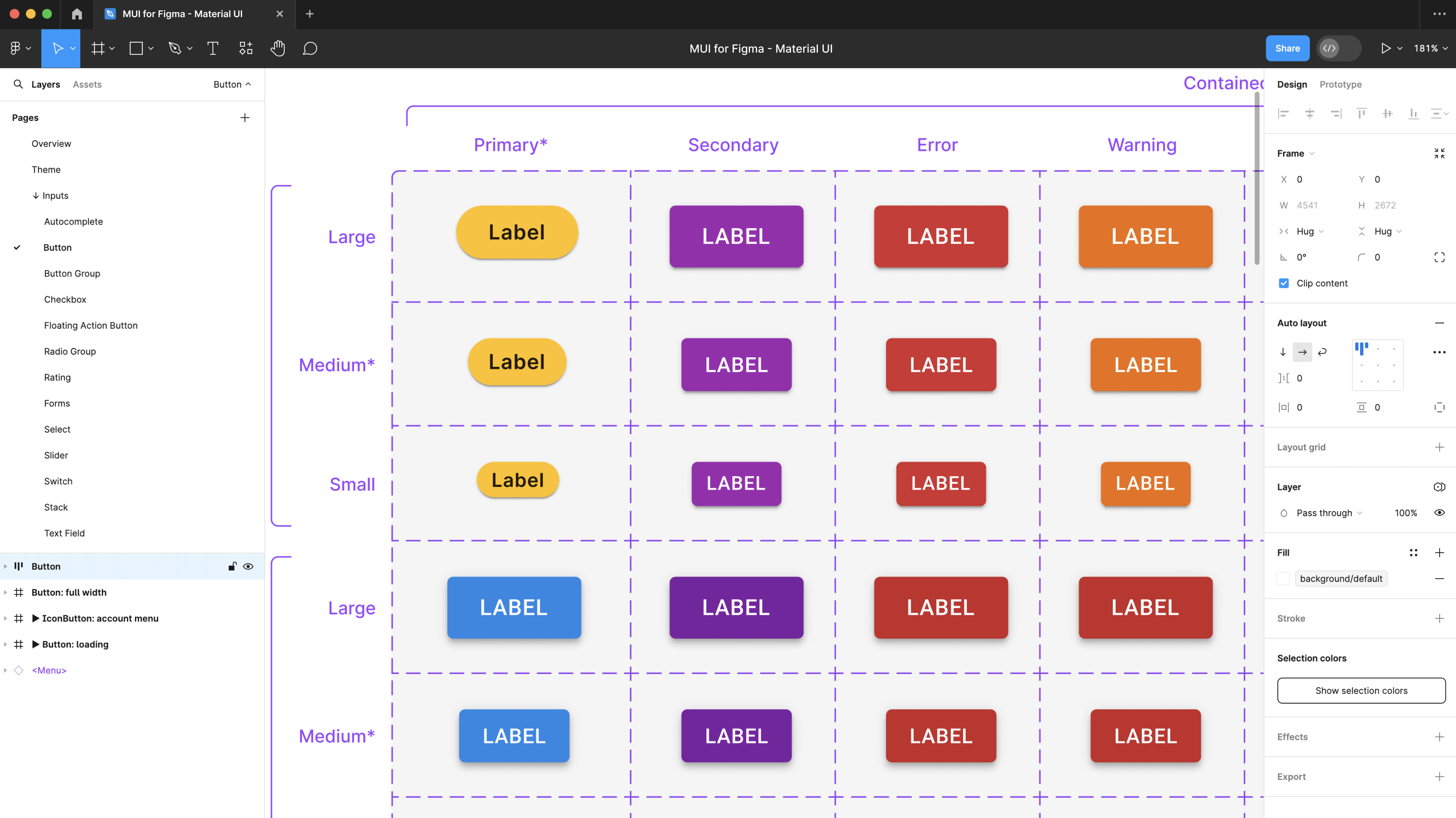
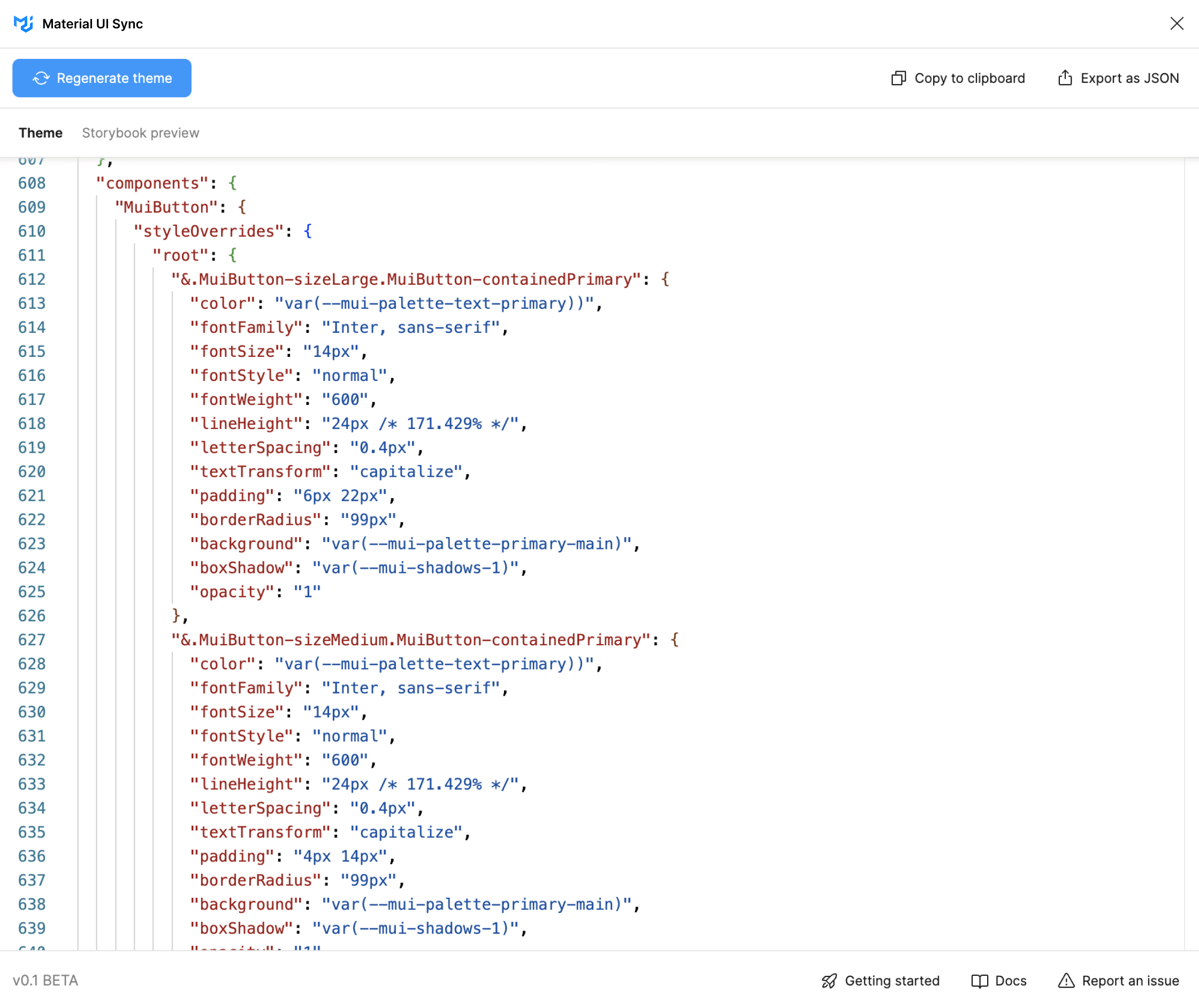
Reach out for the Figma Design Kit and the Sync plugin to bridge the gap between development and design when using Material UI.
Design Kit
Get many Material UI components with states, variations, colors, typography, and icons on your preferred design tool.Sync plugin
Quickly generate a Material UI theme file with token and component customizations done on Figma.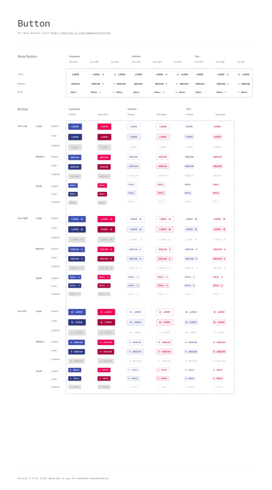

Available in:
We frequently update them to stay up-to-date with the latest release.
Community
Join our global community
Material UI wouldn't be possible without our global community of contributors. Join us today to get help when you need it, and lend a hand when you can.
Material UI vs. Base UI
Material UI implements Google's Material Design whereas Base UI features many of the same components, but without the Material Design implementation.
Does it support Material Design 3?
The adoption of Material Design 3 is tentatively planned for Material UI v7. See the the release schedule and follow this GitHub issue for future updates.

