Title

Extras

1977 United States Environmental
Protection Agency
Graphic Standards System

Designed by Steff Geissbühler,
Chermayeff & Geismar Associates

NYCTA

The history of the EPA program featuring interviews with Ivan Chermayeff, Tom Geismar, and Steff Geissbühler

Stand Clear.

“It all went well until 1980 or so, when Ronald Reagan appointed a new head of the EPA.”

Read the introduction by
Steff Geissbühler


The EPA System History

By Jesse Reed and
Hamish Smyth

Directed by
Harrison Boyce


Introduction
By
Steff Geissbühler

“Born in the wake of elevated concern about environmental pollution, The United States Environmental Protection Agency was established to unify within one government agency a combination of federal research, monitoring, standard-setting and enforcement activities in order to protect human health and to safeguard the air, water, and land upon which life depends. From regulating car emissions to banning the use of DDT; from cleaning up toxic waste to protecting the ozone layer; from increasing recycling to revitalizing inner-city brownfields, EPA’s achievements have resulted in cleaner air, purer water, and better protected land.” That’s how we introduced the project on our project sheet.

I came to the USA from Switzerland in 1967 to teach at the Philadelphia College of Art. It was at first a shock to see trash all over the streets and sidewalks that were littered with chewing gum and cigarette butts, the waste, air and water pollution, pesticide-sprayed fruit and vegetables, and run-down neighborhoods and parks. Richard Nixon, who was later responsible for creating the EPA, was soon elected President. But it was also a time when people all over the world were getting seriously concerned about our planet. The first Earth Day was celebrated in 1970. In addition to teaching, I worked with the architectural firm of Murphy Levy Wurman and became a member of “gee!”: the Group for Environmental Education.

Graphic design for U.S. government agencies and institutions was in its infancy. Nancy Hanks, from the National Endowment for the Arts, and Jerome (Jerry) Perlmutter, graphics coordinator for the National Endowment for the Arts’ Federal Design Improvement Program, were powerful champions of design, urging and helping the EPA to solicit graphic designers to undertake this effort. The firm Chermayeff & Geismar Associates, which I joined in early 1975, was selected. I immediately embraced this new project, so dear to my heart.

As the first step, after the extensive audits described in the Foreword, Tom Geismar and myself wanted to shorten the long and complex name to a colloquial acronym. We looked at alternatives but soon understood that the public knew the agency as the EPA and suggested that this should be adapted as a more direct, short and communicative name.

The flower logo or symbol was a carryover from the ’60s “Flower Power” era. I remember very clearly the iconic image of a young hippie girl putting a flower into the business end of a soldier’s machine gun. The center of the existing seal, symbolizing sun, air, water and land, was and is appropriate, but the complex rendition of the flower seemed weak and perhaps too “feminine” to act as the shield of a law-enforcement agency.

Even though we presented alternatives, in the end we didn’t wanted to stray too far from what was already recognized. The idea was to simplify the flower symbol, to make it stronger, more authoritative and reproducible in small sizes, in black and white, or a single color. The previous logo required three colors and, with the full name encircling the symbol, was difficult to reduce and reverse out of backgrounds.

The agency had a very real problem in unifying all their activities and initiatives. Each department had a different symbol or logo, imagery and type font, sometimes connected to the parent agency and sometimes not at all.

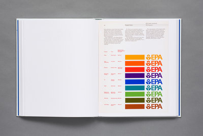
A color scheme was developed to separate the programs and a choice of a main color to designate each individual department — a very specific color each of the departments could own. The nine programs included at the time: Noise, Toxic Substances, Radiation, Technology Transfer, Air, Water, Research & Development, Pesticides, and Solid Waste. We named the colors simply based on visual associations with the subject matter: Air Blue, Solid Waste Brown, Radiation Red, and so forth.

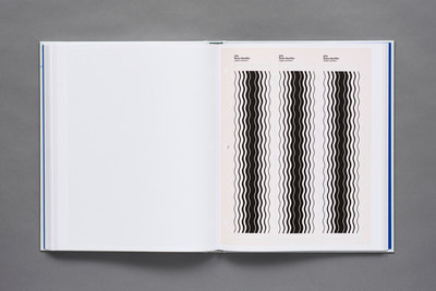
Next came the creation of a system of hand-drawn graphic elements or iconographics. How much easier would it have been to create these with a computer. I called these gradated graphics “Progressions.” I particularly like the word “progress” buried in there. Although quite abstract, these elements were visually related to the topic, as well as sharing a similar visual language. Designed as thin to thick lines or a progression of line to shape, they were meant to symbolize the gradual process and improvement expected of each program. In the end, I drew each of these by hand.

Even though we were provided with and found photography depicting pollution problems, most images were unsatisfactory and mostly black-and-white. Our graphic elements could be used on covers by themselves, or combined with and overlaying photographic images, to make the appearance more “colorful,” attractive, and perhaps less negative and depressing.

Univers, a truly universally available typeface, designed by another Swiss, Adrian Frutiger with lots of weights, slants, and condensed and extended versions, was chosen as the agency’s font. Clean, simple typography assisted by a set of easy to follow layout grids, combined with the color scheme and graphic elements, completed the strong visual system, to be easily implemented by other design studios, agencies, or even EPA staff.

Our presentations went well, as far as I can recall, because the agency had called in some consultants to help them evaluate our work. We realized that we were speaking a “different verbal and visual language,” one the government employees were unfamiliar with. Today, I’m impressed myself and had a lot of fun reading what we wrote at the time, seeing how specific we were with the details and rules. It really is a throwback to the way we used to do things.

It all went well until 1980 or so, when Ronald Reagan appointed a new head of the EPA. The lady didn’t like her stationery we had designed and with a simple “I want my daisy back” undermined the overall graphic system. If the Queen doesn’t like it, we don’t like it became the attitude, and the program began to crumble. The old logo was fully reinstated and the graphic system was abandoned. A decade later, nobody at the EPA could find a copy of the Graphic Standards System, except a bunch of legalese that you will find on its website.

I’m a fan of the EPA and all its efforts and hope that we helped in some small way for this agency to communicate within itself, to other government agencies, and with the American people. I’m very grateful and appreciative that Jesse Reed and Hamish Smyth of Standards Manual, and Julie Anixter of AIGA, brought this document to life again. Have fun revisiting.

Come hell or high water, let’s celebrate our beautiful country and planet.

May 2017

Steff Geissbühler joined Chermayeff & Geismar in January of 1975. He became partner in 1977 and spent 30 years at the firm.


sold out
 

About

The EPA Graphic Standards System is one of the finest examples of a standards manual ever created. The modular and flexible system devised raised the standard for public design in the United States

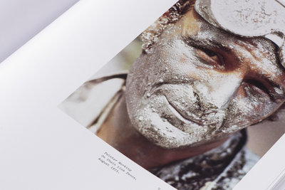
The book features a foreword by Tom Geismar, introduction by Steff Geissbühler, an essay by Christopher Bonanos, scans of the original manual (from Geissbühler’s personal copy), and 48 pages of photographs from the EPA-commissioned Documerica project (1970–1977).

Specifications

228 pages
9.5 × 11.5"
24.1 × 29.2 cm
10 gatefolds
CMYK + 10 Pantone© spot colors
2 paper stocks
Hardcover binding
Silkscreen cover and spine
Recycled board slipcase with blind deboss and blue interior paper
Printed in Italy

International Orders

For orders outside of U.S., Canada, and Mexico, please visit our friends at Counter Print.


Colophon

Copyright

United States Environmental Protection Agency Graphic Standards System © United States Environmental Protection Agency.

EPA logotype © United States Environmental Protection Agency.

While EPA is the source of the Manual, the publication and distribution of the United States Environmental Protection Agency Graphic Standards System is not sponsored or endorsed by EPA and is an independent project undertaken in an effort to preserve and disseminate an archival record of graphic design from the era.

All images of the United States Environmental Protection Agency Graphic Standards System have been scanned from the private collection of Steff Geissbühler and Chermayeff & Geismar & Haviv.

Documerica photographs © The U.S. National Archive.

Credits

Foreword by Tom Geismar
Introduction by Steff Geissbühler
Essay by Christopher Bonanos
Book photography by Brian Kelley
Created by Jesse Reed & Hamish Smyth
Published by Standards Manual, 2017

ISBN

978-0-692-87830-9