Posts in the Woodworking Category

Woodshop SVG: Studs and Shelves

Published 4 years, 9 months past

As I’ve worked on my indoor workspace, I’ve continued to find SVG useful for planning purposes, and putting it to use in my planning has pushed me to learn more about the language.  (That last sentence is actually a play on words, for reasons that I hope will become clear by the end of the post.)

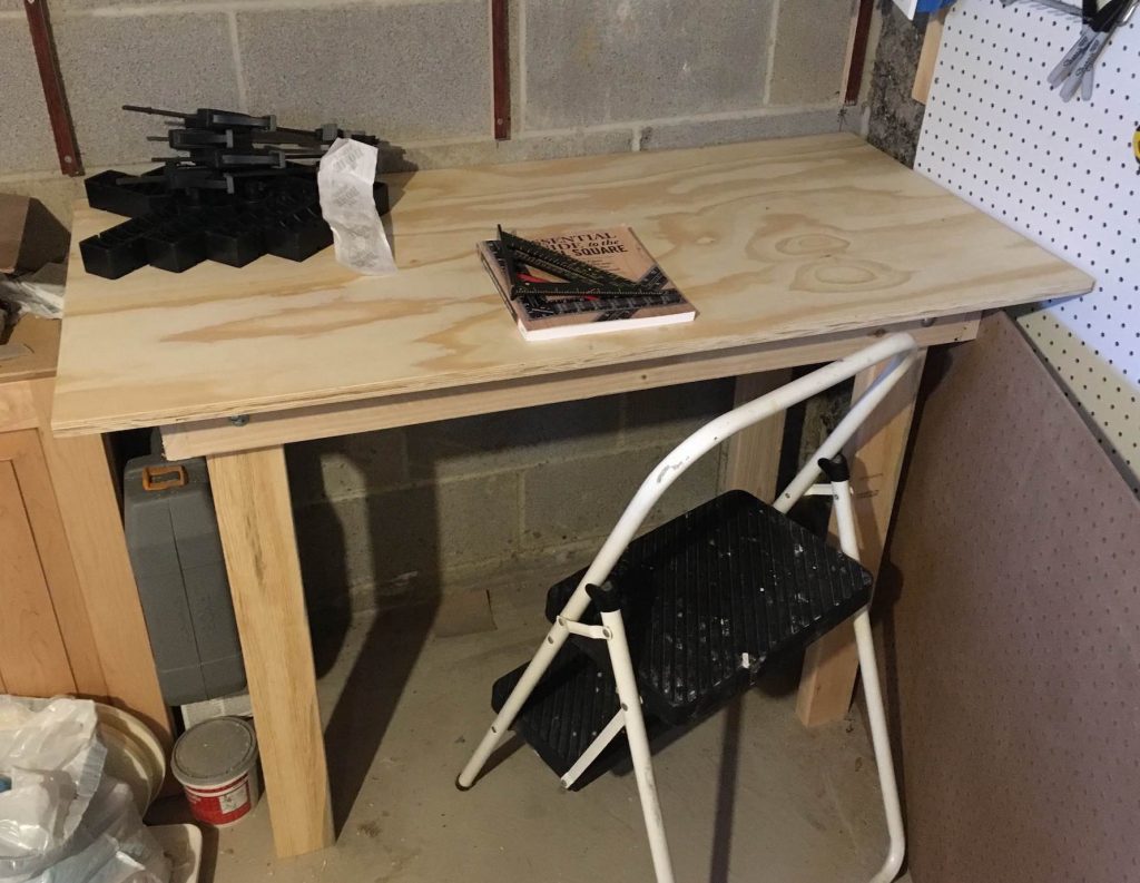
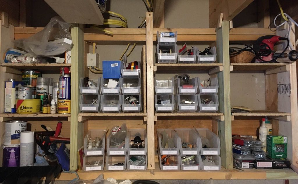
For example, the basement room I’m partially turning into a workspace has a set of exposed framing studs (exposed once I removed a couple of cabinets, anyway) that I wanted to turn into a set of rough shelving, so that I could organize the various bits ‘n’ bobs I accumulate: leftover bolts, extra pullchain, and so on.  These studs are perched on foundation cinderblock, about 48 inches off the floor, and run up to the ceiling from there.

Each stud is 28 inches tall, running from a 2×6 base up to a stacked pair of 2×6 crossbeams.  They also have strips of 2×10 mounted vertically at their bottoms, running between each stud.  (I’m not entirely sure why the 2×10s are there, but I’m not about to start ripping them out now.)

The distances between subsequent studs is also not consistent: they’re mostly close to 16 inches on-center, but not perfectly so, and the last set is only 12 inches apart because the framing ends where a set of stairs begins.  So I created a schematic, including a red box to mark where a 1-gang electrical box. protrudes from the other side of the wall.

The middle stud is taller as a reminder to me that, if not for the crossbeams, it could keep going up past the ceiling joist.  The others are essentially centered on the joists above them (centered within half an inch or so, anyway).

Why does that matter?  Because to make the shelves, I decided to mount 2×6s in front of the framing studs, to allow for shelves 11 inches deep.  So in cases where the studs are centered below ceiling joists, I can run the front-mounted 2×6es up to them.  In that middle case, I’ll actually need a longer 2×6 to run up next to the joist.

This all might sound like a lot of work to deal with odd circumstances, but that was part of the point of this part of the project.  We don’t always get to work in ideal circumstances.  Learning how best to work around the existing limitations is a valuable lesson in itself.

I tried out a lot of different shelf configurations.  At first, I was just using <rect> elements like this.

<rect x="1.5" y="9"    width="14.5" height="0.5" />
<rect x="1.5" y="19.5" width="14.5" height="0.5" />

That’s two shelves, ten inches apart, in the leftmost stud bay.  (The shelves are a half-inch thick.)  That worked okay for a while, but then I decided to show the support rails that would both tie the 2×6s to the studs behind them, and also hold up the shelves.  So that meant more <rect>s, like so.

<rect x="1.5" y="9"    width="14.5" height="0.5" />
<rect x="1.5" y="19.5" width="14.5" height="0.5" />
<rect x="1.5" y="9.5"  width="0.75" height="1.125" />
<rect x="15.25" y="9.5"  width="0.75" height="1.125" />
<rect x="1.5" y="20"  width="0.75" height="1.125" />
<rect x="15.25" y="20"  width="0.75" height="1.125" />

Again, that’s just for the first stud bay: two shelves, and then four supports, two for each shelf.  And I have five bays to do.

Still, it it took deciding to show the storage bins I wanted on the shelves to push to look for a better way.  Basically, what I wanted was a way to define a primitive of a shelf and two support rails, and then just place that.  And then a way to do the same for collections of storage bins, which could be stacked atop each other.

SVG provides for exactly this, through the combination of <defs> and <use>.  I set up a basic shelf set like this:

<defs>
    <g id="shelf">
        <rect x="0" y="0" width="14.5" height="0.5" />
        <rect x="0" y="0.5"  width="0.75" height="1.125" />
        <rect x="13.75" y="0.5"  width="0.75" height="1.125" />
    </g>
</defs>

If you think of that as its own little SVG, it defines a horizontal shelf 14.5 coordinate units wide, and half a unit tall, starting at 0,0.  It then places the two support rails just below, starting half a unit down from the top.

With that in hand, the two shelves I was drawing before collapsed from six lines to two:

<use xlink:href="#shelf" x="1.5" y="9" />
<use xlink:href="#shelf" x="1.5" y="20" />

Suddenly, rather than fiddling with the X,Y coordinates of several pieces just to move a shelf, I could adjust the X,Y of one <use> element.  To say this sped up my workflow would be a monumental understament.  Trying out different shelf spacing and shelf counts went from being a chore to being almost too easy.

This was only magnified when I wrote the definitions for storage-bin primitives.  At first, I drew them the same way I had the shelves, down and right from 0,0, but that was difficult in a number of ways.  Different bin sizes meant I had to do different math to get the bins to sit on the shelves.  And then I remembered that SVG is unbounded on both axes — which meant I could draw the bins up from 0,0, meaning I could give them the same y coordinate as the shelves.

Wait, what?  Let me show you.  Inside <defs>, I wrote:

<g id="bins4">
    <rect x="0" y="-4" width=".15" height="4" />
    <rect x="4" y="-4" width=".15" height="4" />
    <rect x="0" y="-1.5" width="4.15" height="1.5" />
    <rect x="4.2" y="-4" width=".15" height="4" />
    <rect x="8.2" y="-4" width=".15" height="4" />
    <rect x="4.2" y="-1.5" width="4.15" height="1.5" />
    <rect x="8.4"  y="-4" width=".15" height="4" />
    <rect x="12.4" y="-4" width=".15" height="4" />
    <rect x="8.4"  y="-1.5" width="4.15" height="1.5" />
</g>

Everything is drawn starting from above the y=0 line, and reaches down to y=0.  So that first <rect> with height="4" starts at a Y coordinate of -4.  -4 plus 4 equals zero.

That allowed the following:

<use xlink:href="#shelf" x="1.5" y="9" />
<use xlink:href="#bins4" x="2.5" y="9" />
<use xlink:href="#shelf" x="1.5" y="20" />
<use xlink:href="#bins4" x="3.0" y="20" />

See how the y coordinate is the same for both shelf and associated bins?  If I decide to move a shelf up an inch and a half, I just take 1.5 off the y value for the shelf’s <use>, and then use that same value for the y attribute on the bins’ <use>.

Could I have made this even better by combining shelves and bins into a single primitive definition, and only having one <use>?  Yes, if there would only be one set of bins per shelf.  That’s how I dd it in this particular arrangement.  (In this case, the brown vertical studs are actually the 2×6s mounted in front of the wall studs, so they’re taller and based lower.)

However, I also considered stacking bins on each other between shelves, as in this configuration.

That wound up being pretty close to what I did, in the end.

There were a couple of things I wished I could do (or wish I had figured out how to do) in SVG.  The first was a way of varying the width on the <use> elements.  The rightmost stud bay is 12 inches wide, not the 14½ inch bays the others have.  I ended up defining a separate primitive definition for those shelves.

<g id="shelf-sm">
    <rect x="0" y="0" width="12.5" height="0.5" />
    <rect x="0" y="0.5"  width="0.75" height="1.125" />
    <rect x="11.75" y="0.5"  width="0.75" height="1.125" />
</g>

I guess I could have done X-axis scaling transforms on the regular #shelf primitive.  Actually, looking back on it, that probably makes a lot more sense than what I did.  It would have squished the support rails a tiny bit, but not enough to throw off precision cuts or anything.  (There really were no precision cuts in this project — this is carpentry at its roughest.)

The other thing I wanted was the ability to draw “backwards” by giving negative height and width values.  So as an example, I’d have liked to write the rightmost support rail like this:

<rect x="14.5" y="0.5" width="-0.75" height="1.125" />

I know, I know, a negative distance doesn’t really make sense when talking about physical units.  I still wanted to do it.  I mean, it made sense to me in my head.

Just like the idea of hand-authoring SVG to plan out workshop projects made sense to me.  I’m sure I could have done it a little faster and a little more intuitively in a vector editor, but I’d have had to buy one (my copy of Illustrator no longer runs on my Mac, more’s the pity) and if I’d gone that route, I wouldn’t have learned a lot more about SVG and its capabilities.  Either way, the end result is pleasing to me… at least for the time being.

Woodshop SVG

Published 4 years, 9 months past

For the holiday break this year, I decided to finally tackle creating an indoor work space.  I’d had my eye on a corner of our basement storage room for a while, and sketched out various rough plans on graph paper over the past couple of years.  But this time?  This time, I was doing it.

The core goal is to have a workbench where I can do small toy and appliance repair when needed, as well as things like wood assembly after using the garage power tools to produce the parts — somewhere warm in the depths of winter and cool at the height of summer, where glue and finish will always be in its supported temperature range.  But that spawns a whole lot of other things in support of that goal: places to store components like screws, clamps, drills, bits, hammers, saws, wires, and on and on.

Not to mention, many tools are powered, and the corner in question didn’t come with any outlets.  Not even vaguely nearby, unless you count the other side of the room behind a standing freezer.  Which, for the record, I don’t count.  I had to do something about that.

So anyway, a lot of stuff got cleared out of the corner and stored elsewhere, if it wasn’t just tossed outright.  Then I took a couple of cabinets off the wall and remounted one of them elsewhere in the room, which was quite the experience, let me tell you.  When I discovered I’d mis-measured the available space and the cabinet ever so slightly, I had the following conversation with myself:

“This cabinet is an eighth-inch too tall to fit. You’ll never get it in there!”

“Yeah?  Well, me and Mister Block Plane here say different.”

Reader, I got it in there.

Moving the cabinets exposed a short wall of framing studs mounted atop a cinderblock foundation wall.  I’ll get to how I used those in a future piece, but here I want to talk about something I’ve been using to help me visualize parts of this project and get cut lists out of it at the end: hand-written SVG.

You heard me.  I’ve been hand-coding SVG schematics to figure out how thing should go together, and as a by-product, guide me in both material buying and wood cutting.

This might sound hugely bespoke and artisanally overdone, but they’re not that complicated, and as a major benefit, the process has helped me understand SVG a little bit better.  Here’s one example, a top-down diagram of the (supposedly) temporary workbench I recently built out of plywood and kiln-dried framing studs.

That shows a 2’×4′ benchtop with a supporting frame (the overlapping grayish boxes) and the placement of the four legs (the brown rectangles).  Here’s how I wrote the elements to represent the supporting frame.

<g class="structure">
    <path d="M 3.75 3.75  l 40.5 0" /> <!-- back -->
    <path d="M 3.75 12.00 l 40.5 0" class="optional" />
    <path d="M 3.75 20.25 l 40.5 0" /> <!-- front -->

    <path d="M 3.75 3  l 0 18" /> <!-- left -->
    <path d="M 24.00 3.75 l 0 16.5" class="optional" />
    <path d="M 44.25 3 l 0 18" /> <!-- right -->
</g>

And here’s how I styled them.

.structure {
    stroke: #000;
    stroke-width: 0;
    fill: #000;
}
.structure path {
    opacity: 0.1;
    stroke-width: 1.5;
}
.structure .optional {
    opacity: 0.05;
}

I like using paths in this situation because they let me pick a starting coordinate, then draw a line with relative X-Y values.  So that first path starts at X=3.75 and Y=3.75, and then draws a line whose endpoint is 40.5 X-units and 0 Y-units from the starting point.  In other words, it’s 40.5 units long and purely horizontal.  Compare that to the path marked left, which starts nearby (X=3.75, Y=3) and runs 18 units straight down.

This helps with cut planning because I set things up such that each unit equals an inch.  Just by looking at the values in the SVG, I know I need two pieces that are 40.5 inches long, and two that are 18 inches long.  (Three pieces of each length, if I’d decided to use the pieces classed as optional, but I didn’t.)

And how did I get that to work?  I set the viewbox to be only a few coordinate units larger than the overall piece, which I knew would be 24 by 48 units (inches), and then made the image itself large.

<svg xmlns:svg="http://www.w3.org/2000/svg"
    xmlns="http://www.w3.org/2000/svg"
    xmlns:xlink="http://www.w3.org/1999/xlink"
    width="1000"
    height="500"
    viewBox="0 0 54 30"
    >

Basically, I added 6 to each of 24 and 48 to get my viewBox values, allowing me three units of “padding” (not CSS padding) on each side.  I filled the whole thing with a rectangle with a soft gray fill, like so.

<rect height="100%" width="100%" fill="#EEE" />

Which was great, but now I had to figure out how to get the 24×48 workplan into the center of the viewbox without having to add three to every coordinate.  I managed that with a simple translation.

<g transform="translate(3,3)">
    <rect width="48" height="24" fill="hsla(42deg,50%,50%,0.5)" />
    …
</g>

And with that, everything inside that g (which is basically the entire diagram) can use coordinates relative to 0,0 without ending up jammed into the top left corner of the image.  For example, that rect, which has no x or y attributes and so defaults both to 0.  It thus runs from 0,0 to 48,24 (as is proper, X comes before Y), but is actually drawn from 3,3 to 51,27 thanks to the transform of the g container.

The drawback to this approach, in my eyes, is that if text is added, it needs a really small font size.  In this particular case, I decided to add a measurement grid to the diagram which is revealed when the SVG is printed.  You can also see it on a mouse-and-keyboard computer if you click through to the SVG and then hover the tabletop.  To all the paths I used to make the grid (and yes, there’s a better way), I added a set of labels like these:

<text x="12" y="0" dx="0.5" dy="-0.5">12</text>
<text x="24" y="0" dx="0.5" dy="-0.5">24</text>
<text x="36" y="0" dx="0.5" dy="-0.5">36</text>
<text x="48" y="0" dx="0.5" dy="-0.5">48</text>

<text x="0" y="0" dx="-0.33" dy="-0.33">0</text>
<text x="0" y="12" dx="-0.5" dy="0.5">12</text>
<text x="0" y="24" dx="-0.5" dy="0.5">24</text>

At my browser’s default of 16px, the text is HUGE, because it gets made 16 units tall.  That’s almost three-quarters the height of the viewbox!  So I ended up styling it to be teensy by any normal measure, just so it would come out contextually appropriate.

.lines text {
    font-size: 1px;
    font-family: Arvo, sans-serif;
    text-anchor: end;
}

Yes.  1px.  I know.  And yet, they’re the right size for their context.  It still grates on me, but it was the answer that worked for this particular context.  You can see the result if you load up the SVG on its own and mouse-hover the benchtop.

The legs I decided to do as rect elements, for no reason I can adequately explain other than I’d started to get a little sick of the way path forced me to figure out where the center of each line had to be in order to make the edges land where I wanted.  path is great if you want a line exactly centered on a unit, like 12.00, but if you want the edge of a board to be three inches from the left edge of the tabletop, it has to start at x="3.75" if the board is 1.5 inches wide.  If the width ever changes, you have to change the x value as well.

For the support frame, which is going to be made entirely out of boards an inch and a half wide, this wasn’t a super big deal, but the math had started to grate a bit.  So, the legs are rects, because I could use the grid I’d drawn to figure out their top left corners, and the height and width were constants.  (I probably could have set those via the CSS, but eh, sometimes it’s better to have your code self-document.)

<g class="legs">
    <rect x="4.5" y="4.5" height="1.5" width="3.5" />
    <rect x="4.5" y="18" height="1.5" width="3.5" />
    <rect x="40" y="4.5" height="1.5" width="3.5" />
    <rect x="40" y="18" height="1.5" width="3.5" />
</g>

Honestly, I probably didn’t even need to include these, but they served as a useful reminder not to forget them when I went to buy the wood.

As I said, simply by glancing at the SVG source, I can see how long the support frame’s pieces need to be — but more to the point, as I adjusted numbers to move them around, I worked their sizes into my head.  What I mean is, I had to visualize them to draw the right lines, and that means I’ve already done some visualization of the assembly.  I just need to remember that each of the four legs will be 34″ long at the most.  Taken all together, I’ll need three 8-foot 2×4 boards (which actually have a cross-section of 1.5″×3.5″ — don’t ask), chopped up and joined appropriately, to go under my 2’×4′ benchtop.

So that’s how I utterly geeked up my workbench project — and if that seems like a bit much, just wait until you see the next thing I did, and what I learned along the way.


Browse the Archive