-
Notifications
You must be signed in to change notification settings - Fork 1.2k
New issue
Have a question about this project? Sign up for a free GitHub account to open an issue and contact its maintainers and the community.
By clicking “Sign up for GitHub”, you agree to our terms of service and privacy statement. We’ll occasionally send you account related emails.
Already on GitHub? Sign in to your account
Accessible form validation #1044
Conversation
|
This pull request is being automatically deployed with ZEIT Now (learn more). 🔍 Inspect: https://zeit.co/primer/primer-css/1923d2idj |
to make it work with <auto-check>
To match <auto-check>
|
Currently the error message would not go away until the error is addressed. I don't suppose the success message should stay? the check mark currently stays.
Any thoughts around adding this to Primer? This is currently custom CSS in github/github. |
There was a problem hiding this comment.
Choose a reason for hiding this comment
The reason will be displayed to describe this comment to others. Learn more.
👍 thanks for doing this
Yes, right. It would need support in Some alternatives I can think of:
Looks like the styles already are in Primer CSS. But the icons are still on |
This seems fine, though I'm not sure if this needs to be a special case for success message?
Personally I am a fan of not hiding content, though keep in mind that some fields already have help text below them. Currently they're replaced if there's an error message.
The native validation message isn't reliably read to screen reader, and afaik it's not stylable. For example, firefox shows it as a native tooltip, only when you hover over the form field. |
Right. If, we should change all types to use the same.
Yeah, maybe it could be something like mini flash alerts that appear under inputs and don't replace these "help texts". Ok, how about this:
Refactoring |
Are you thinking about adding the
I'll take this since it involves changing or JS behavior and there's quite a lot of tech debt there. Otherwise sounds good. |
Was think the success tooltip should show up as soon as the form is valid. So it matches the announcement to screen readers. I guess adding that in here? And unlike errors, maybe the green tooltip needs to be hidden on blur, once the user moves the focus to another element? So it doesn't keep covering something underneath.
That would be great. 🙇 I can make a new Primer CSS release next week so that the styles will be available on dotcom. |


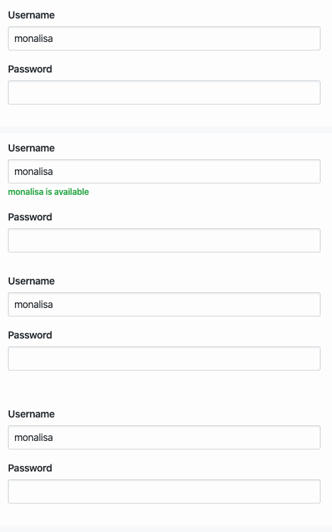
This is on top of #1028. It adds a "success" tooltip when a form input is valid. 👀 Docs preview
The docs example also got split into 3 seperate examples so that the same
ids can be used.Why?
When an input is valid we typically show a checkmark icon. But screen reader users don't get notified. Adding a success message adds confidence that everything is fine. 👌😌
See https://github.com/github/github/issues/132199
Concerns + alternatives
We could consider removing the
.success,.errorand.warningclasses since we already set the state on the.form-groupelement. Maybe once we start refactoring all the form-groups on dotcom? 🤔 And also get rid of the.form-group-headerand.form-group-bodythat are not really needed./cc @primer/ds-core