Readability Guidelines
Imagine a collaboratively developed, universal content style guide, based on usability evidence.
Imagine a collaboratively developed, universal content style guide, based on usability evidence.
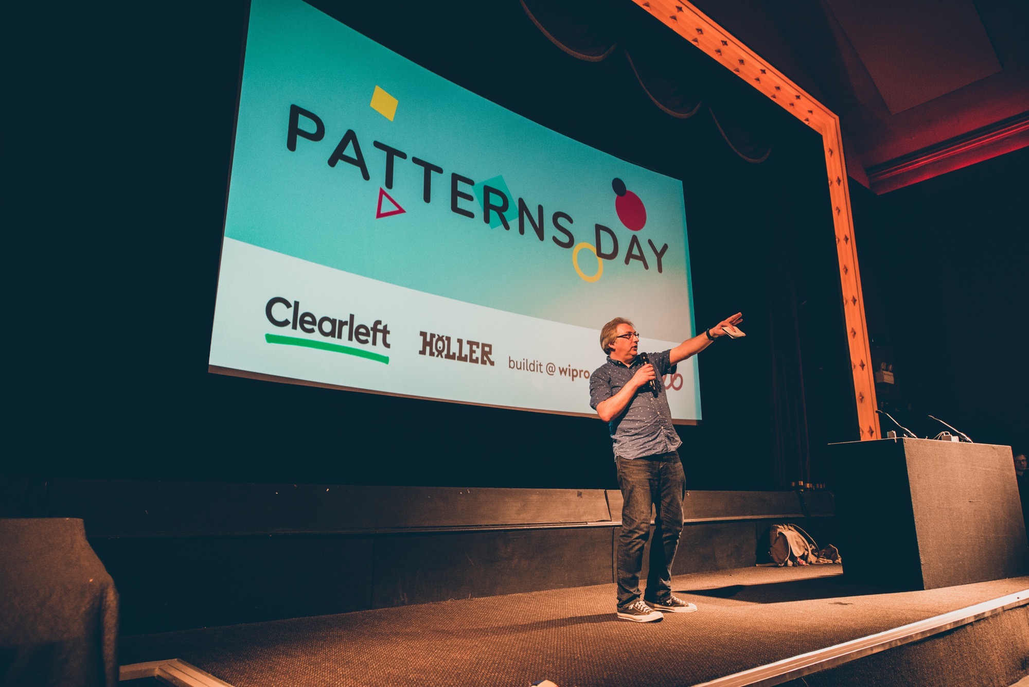
It all started at Patterns Day…
(Note: you’ll probably need to use Reader mode to avoid taxing your eyes reading this—the colour contrast …doesn’t.)
Sara shares how she programmes with custom properties in CSS. It sounds like her sensible approach aligns quite nicely with Andy’s CUBE CSS methodology.
Oh, and she’s using Fractal to organise her components:
I’ve been using Fractal for a couple of years now. I chose it over other pattern library tools because it fit my needs perfectly — I wanted a tool that was unopinionated and flexible enough to allow me to set up and structure my project the way I wanted to. Fractal fit the description perfectly because it is agnostic as to the way I develop or the tools I use.
What a lovely way to walk through the design system underpinning the Guardian website.
Bonus points for using the term “tweak points”!
Amy’s talk at Patterns Day was absolutely brilliant! Here’s an account of the day from her perspective.
The evident care Jeremy put into assembling the lineup meant an incredible mix of talks, covering the big picture stuff right down to the nitty gritty, and plenty in between.
Her observation about pre-talk nerves is spot-on:
I say all of this because it’s important for me and I think anyone who suffers with anxiety about public speaking, or in general, to recognise that having a sense of impending doom doesn’t mean that doom is actually impending.
Here’s a nice little round-up of Friday’s Patterns Day.
Just look at these fantastic pictures that Trys took (very unobstrusively) at Patterns Day—so rock’n’roll!


Stuart took copious notes during every single talk at Patterns Day—what a star!
A starter list of Fractal examples and links. You can expand it.
Mozilla’s work-in-progress style guide and pattern library.
I like the questions that the TELUS team ask about any potential components to be added to their design system:
- Is it on brand?
- Is it accessible?
- Has it been tested?
- Can it be reused?
They also have design principles.
The Gov.uk design system is looking very, very good indeed—nicely organised with plenty of usage guidelines for every component.
Guidance on using components and patterns now follow a simple, consistent format based on task-based research into what users need in order to follow and trust an approach.
I really like the way that this pattern library includes research insights to provide justification for design decisions.
This design system takes an interesting approach, splitting the documentation between designing and coding.
Some lovely branding work for the UK Parliament, presented very nicely.
New Zealand has a pattern library (in Fractal, no less).
A lightweight style guide generator. This one uses SassDoc to parse out the documentation for colours, type, etc.
Great advice from Una on getting buy-in and ensuring the long-term success of a design system.
A library of accessible UI elements that you can use as a starting point, complete with HTML and CSS. Alas, no JavaScript, but there’s always Heydon’s inclusive components for that.
A weirdly over-engineered online book with bizarre scrolljacking (I would advise disabling JavaScript but then all the links stop working so you won’t be able to go past the table of contents) but it’s free and the content—by Marco Suarez, Jina Anne, Katie Sylor-Miller, Diana Mounter, and Roy Stanfield— looks good:
A design system unites product teams around a common visual language. It reduces design debt, accelerates the design process, and builds bridges between teams working in concert to bring products to life. Learn how you can create your design system and help your team improve product quality while reducing design debt.