Design/Archive/Wikimedia Foundation Design/Whitespace
This page is obsolete. It is being retained for archival purposes. It may document extensions or features that are obsolete and/or no longer supported. Do not rely on the information here being up-to-date. This page is from the year 2012. |
This page describes guidelines around whitespace, alignment and visual hierarchy within projects run by the Wikimedia Foundation.
Philosophy
[edit]"Clutter is a failure of design, not an attribute of information" - Edward Tufte.
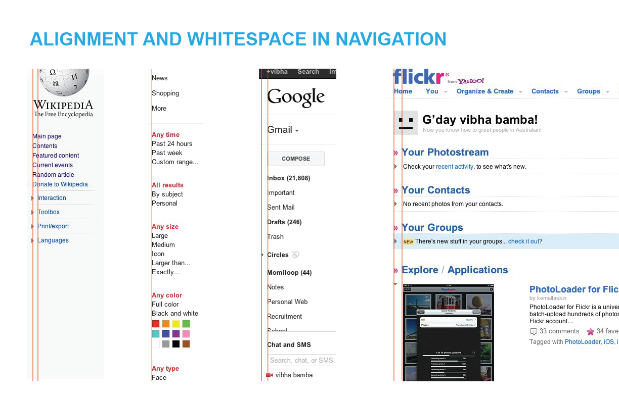
Whitespace and Alignment provide efficiency, information flow and structure to a page. This allows users to efficiently scan the page and find their way around the content.
Alignment
[edit]Alignment is the placement of text and graphics so they line up on the page. Use alignment to:
- Create order
- Organize page elements
- Group items
- Create visual connections
Good alignment is invisible. Most readers won't conciously notice that everything is lined up neatly but they will feel it when things are out of alignment. Lack of alignment creates a sloppy, unorganized look. Mixing too many alignments can have a similiar effect. It is considered OK to break alignment when it serves a specific purpose such as to intentionally create tension or draw attention to a specific element on the page. [1]
Whitespace
[edit]“Whitespace,” or “negative space” is the space between elements in a composition.
Macro whitespace is the space between major elements: between header and body, between columns, between body and footer in a composition.
Micro whitespace is the space between smaller elements: between list items, between a caption and an image, or between words and letters.
White space can make or break the effective communication of image and text. Research suggests that white spaces improves comprehension and satisfaction. When margins are present readers read slowly but comprehend much more. When margins are absent , readers read faster and scan content but have significantly reduced comprehension[2]
Dense content systems such as newspapers, magazines and education sites often deal with content density by setting their body content in a light typeface with plenty of whitespace within and around the characters. [3]
Marking Paragraphs
[edit]Paragraphs do not occur in nature. Paragraphs are a literary convention to divide masses of content into appetizing portions.
Indents have been common since the seventeenth century. Adding space between paragraphs (paragraph spacing) is another standard device.
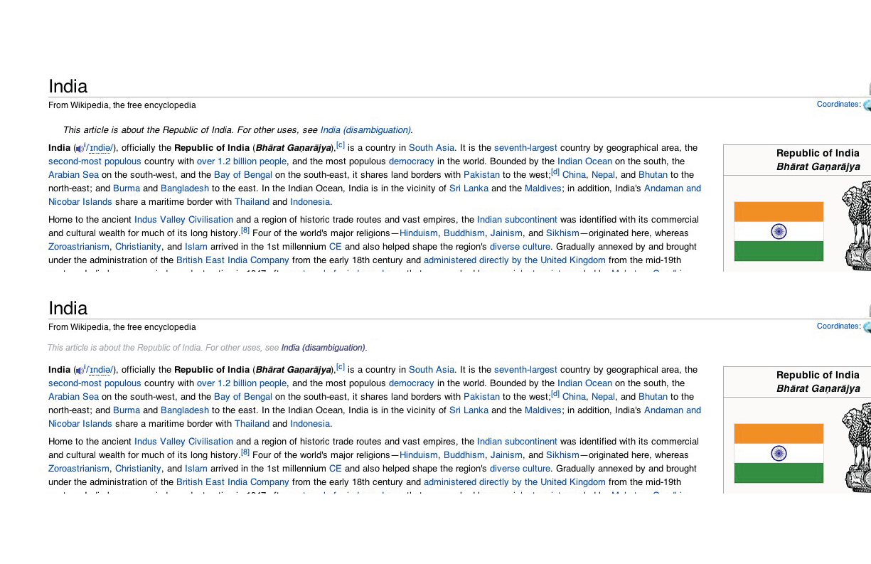
Avoid indenting the very first line of a body of text. An indent signals a break or separation; there is no need to make a break when the text has just begun.
Despite the ubiquity of indents and paragraph spacing, designers have developed numerous alternatives that allow them to shape content in distinctive ways
[4]
In the Elements of Typographic Style, Robert Bringhurst summarizes that
the function of a paragraph indent is to mark a pause, setting the paragraph apart from what precedes it.
If a paragraph is preceded by a title or subhead, the indent is superfluous and can therefore be omitted.
[5]
Hanglines
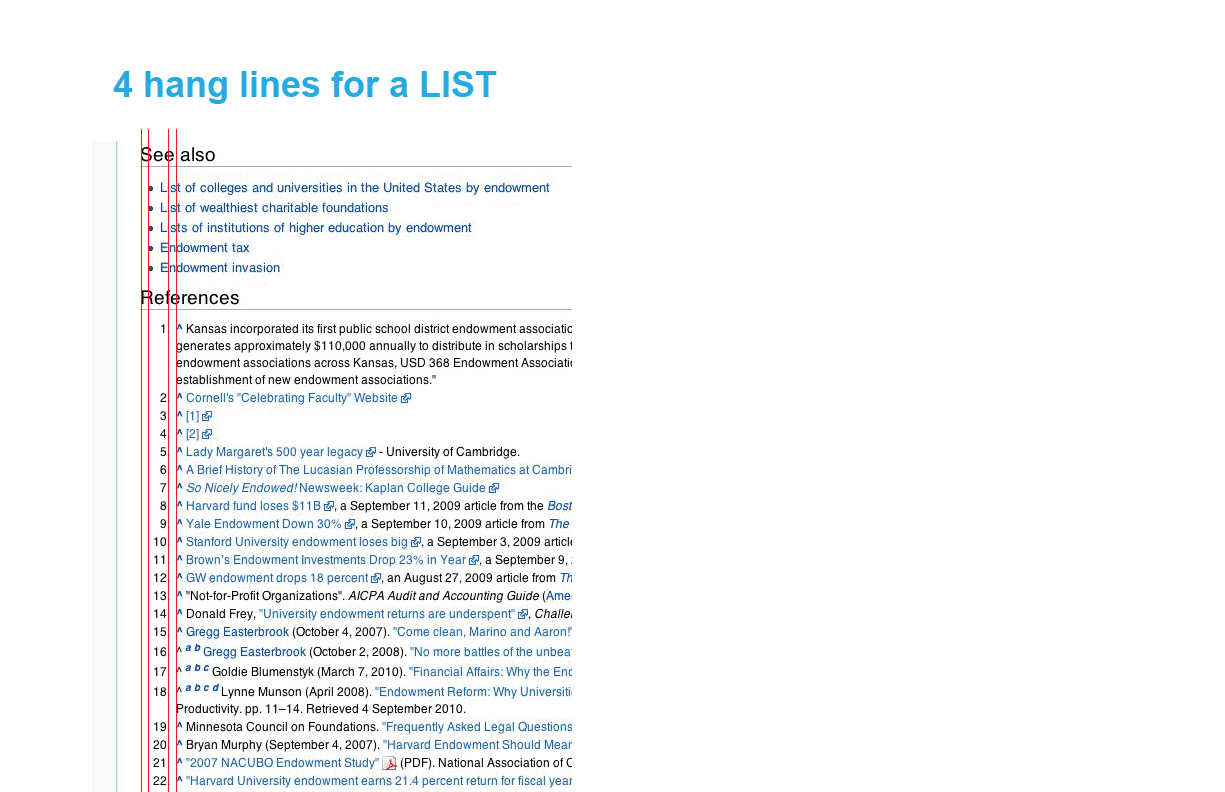
[edit]Grids are set up in ways where body text can “hang” from a common line.
Graphic designers call this a hang line. In architecture, a horizontal reference point like this is known as a datum.
Hanglines act as reference points for the eye or a common edge for every column from where all text begins.
Having too many hanglines in a single column creates chaos.
Current Issues
[edit]References
[edit]- ↑ http://www.thinkingwithtype.com/contents/text/#Alignment
- ↑ http://psychology.wichita.edu/surl/usabilitynews/62/whitespace.htm
- ↑ http://www.alistapart.com/articles/whitespace
- ↑ http://www.thinkingwithtype.com/contents/text/#Marking_Paragraphs
- ↑ http://www.interpretationbydesign.com/?tag=typographic-style


