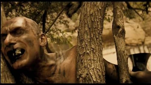
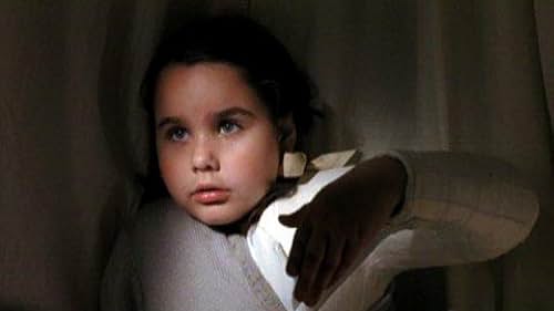
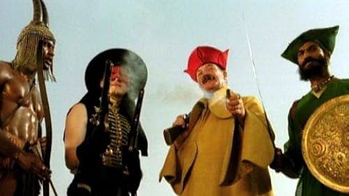
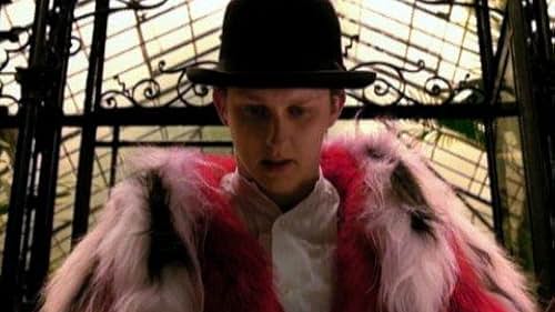
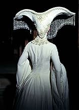
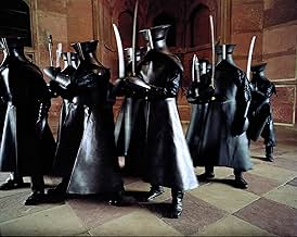
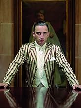
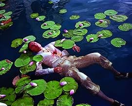
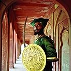
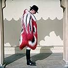
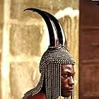
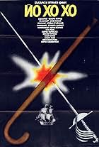
In 1920s Los Angeles, a bedridden patient in a hospital captivates a young girl with a fantastic tale of heroes, myths, and villains on a desert island.In 1920s Los Angeles, a bedridden patient in a hospital captivates a young girl with a fantastic tale of heroes, myths, and villains on a desert island.In 1920s Los Angeles, a bedridden patient in a hospital captivates a young girl with a fantastic tale of heroes, myths, and villains on a desert island.
- Awards
- 4 wins & 11 nominations
Storyline
Did you know
- TriviaThe film was shot in 28 countries for four years. According to the director no stages or sets were ever used, only existing locations.
- GoofsThough the hospital scenes take place in Los Angeles, they actually shot in South Africa, which drives on the left side of the road. All the cars in the shots on location at the hospital have steering wheels on the right side of the car, revealing that they are not actually in LA.
- Quotes
Alexandria: Why are you killing everybody? Why are you making everybody die?
Roy Walker: It's my story.
Alexandria: Mine, too.
- Alternate versionsFor the UK version, some changes were made to remove footage from the archive cinema clips that involved real cruelty to horses, as this contravenes the UK's Cinematograph Films (Animals) Act 1937.
- SoundtracksSymphony No. 7 Op. 92 II. Allegretto
Written by Ludwig van Beethoven
Performed by Bulgarian Symphony Orchestra-Sif 309, conducted by Deian Pavlov
Featured review
This has three things to recommend it. Any two would be remarkable. All three make it a must see.
The most striking aspect of course is how lush the thing is. We may never see another film like this, one that uses real locations and practical effects but which has all of the other benefits of technology. Just the scope in impress of the thing makes it a thrill. Not only do we skip from one profound space to another, but Singhhas selected what seems to be the very best location for the eye. Often these are Tarkovsky-like so that we can see some action in the foreground and with a pan other action in the background. I doubt his DP made these decisions, so the choices are more remarkable.
"The Cell" had some powerful images, but they were incoherent, as if they were designed by competing art departments. No such problem here. Not only do the imaginary sequences have the same color palette (as it changes) even though the locations are a bewildering variety, but all the other artistic values do as well. We could well have different continents mixed in the same few minutes without a situational shift. That alone is a rare and worthy experience.
A second striking aspect is the narrative folding. At first glance it is simple and ordinary: a nested story with blended elements. But overlain n this is a parallel nesting about stories and movies, being a movie about movie-making. And falls, deliberate and staged, with some deep ambiguity about which is which. And which are physical and which emotional. It isn't great art, but its head and shoulders above most.
And finally we have the little girl. Now, I usually revolt when these are used to elicit the standard response. I gagged at "Miss Sunshine," because it was a weak project supported by cuteness. But this is a wholly different thing. This girl is fantastic. There are parts of the script that are embarrassing, and the end is a travesty of a story setup. But she pulls it off and we hardly notice.
This has one of the most impressive title sequences I have ever seen. It alone deserves praise.
I would trade ten "Pan's Labyrinth"s for one of these.
Ted's Evaluation -- 3 of 3: Worth watching.
Details
Box office
- Budget
- $30,000,000 (estimated)
- Gross US & Canada
- $2,578,557
- Opening weekend US & Canada
- $79,611
- May 11, 2008
- Gross worldwide
- $3,981,117
- Runtime1 hour 57 minutes
- Color
- Sound mix
- Aspect ratio
- 1.85 : 1
Contribute to this page
Suggest an edit or add missing content


