We spend a lot of time reviewing high-end photo software, and, while the products from Adobe, DxO, and others can work astounding marvels with your images, many people do just fine with Windows’ free, included Photos app. It not only organizes, adjusts, and edits your photos, but it can also work with video content to an impressive degree. In Windows 11, the default Photos app gets a redesign that keeps what’s good, adds new features, and makes it look even better.
The Photos App Gets an Updated Look
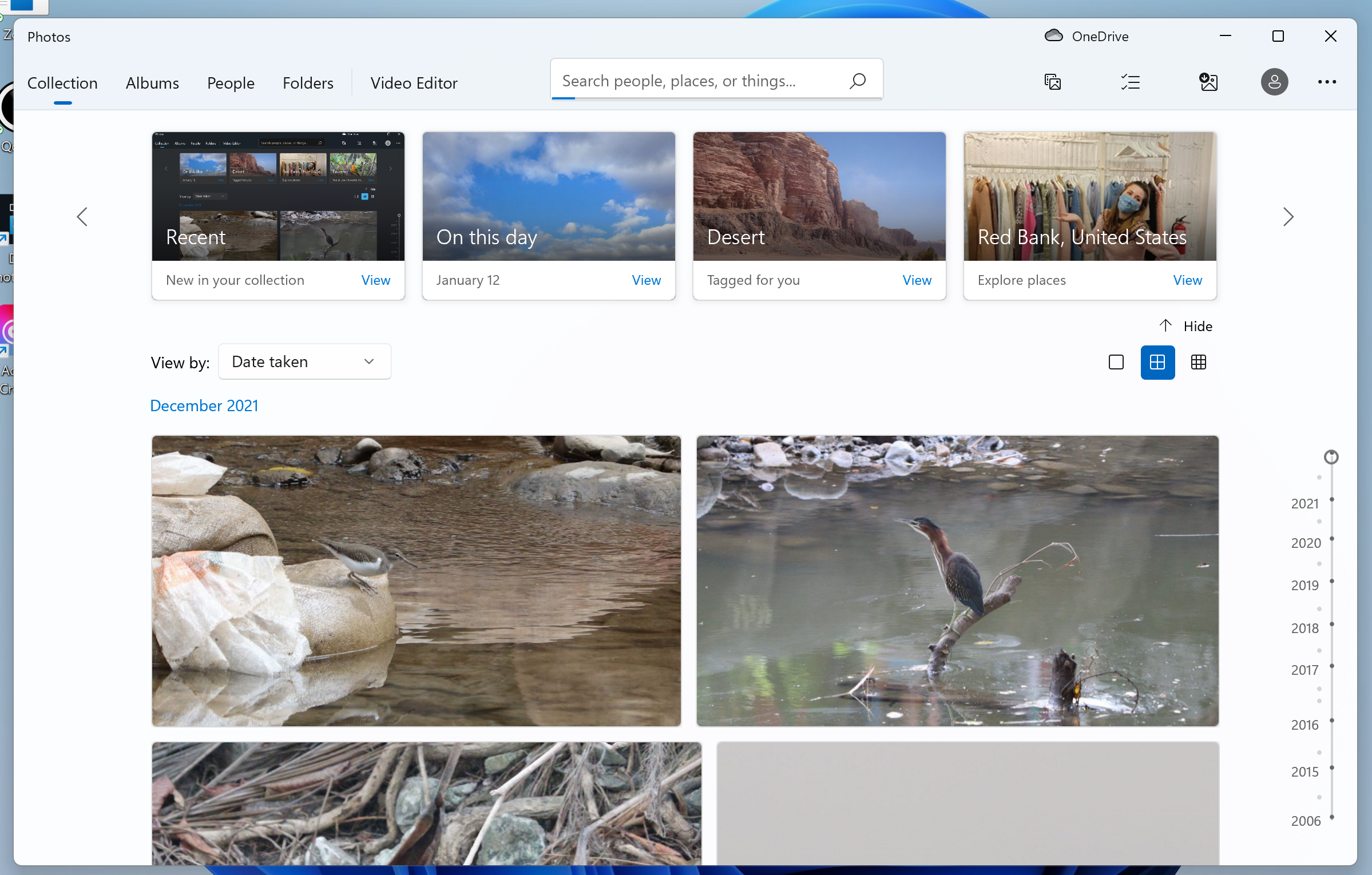
The most noticeable change in the Photos app moving from Window 10 to 11 is the window design. It now uses rounded corners and Mica material, a new semi-transparent texture that’s part of Microsoft’s Fluent Design System. Mica is a subtle effect, which we can just make out if we turn up the brightness on test monitors. It’s more perceptual than obvious. Of course, the new app supports Light mode and Dark mode:

There's a New Button Layout
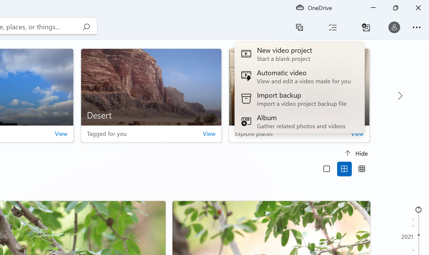
The main menu choices—Collection, Albums, People, Folders, and Video Editor—remain the same, but you may notice that all the buttons in the top right corner have been redesigned. The first button in that group is now simply New, as opposed to Windows 10's New Video button. Tapping the new button drops down choices including New Video Project, Automatic Video, Import Backup, and Album. Those last three choices show up in Windows 10 Photos when you press the New Video button; the Album choice only appears when you switch to the Album tab in the older OS.
Zoom In With the Overhauled Photo View
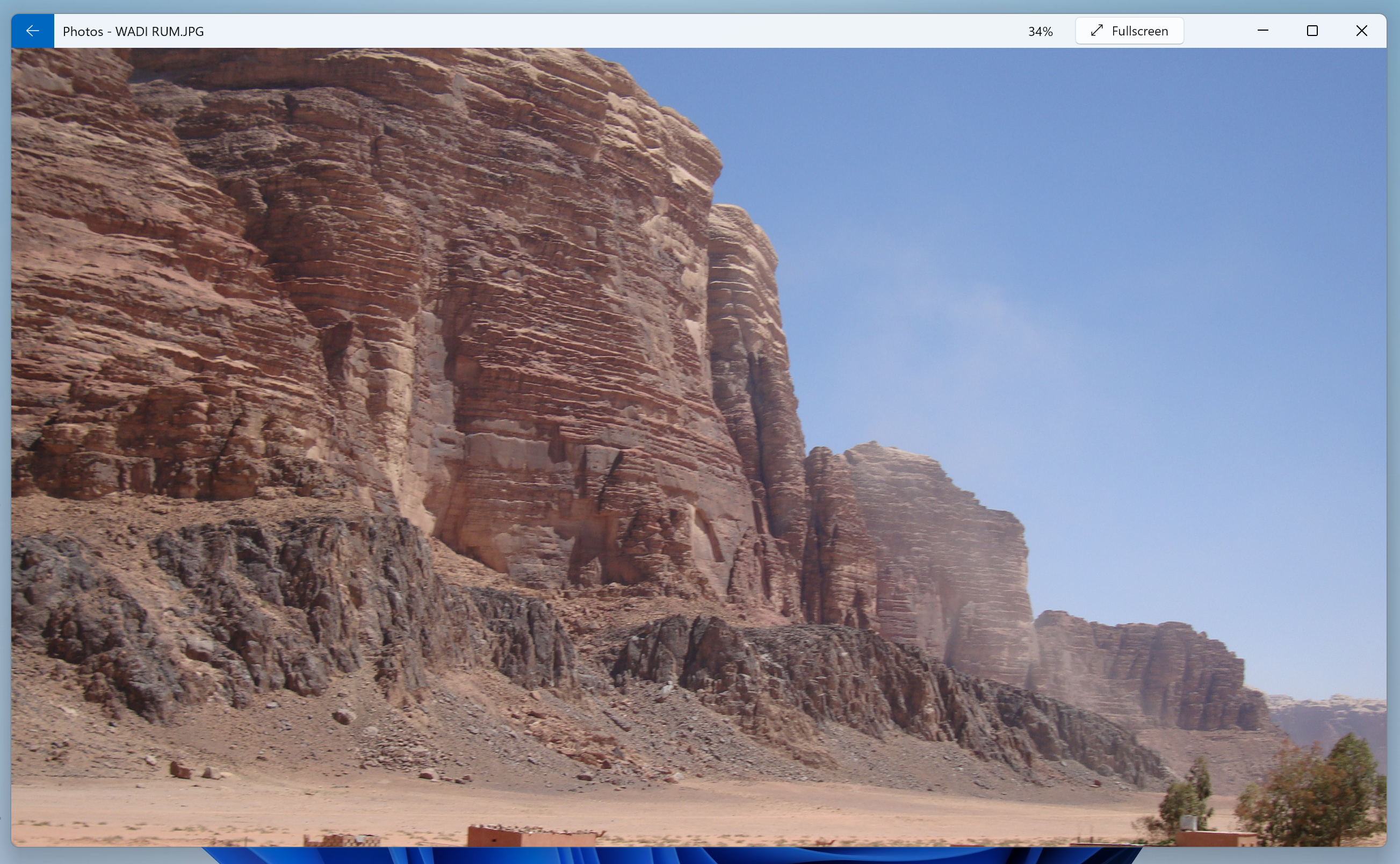
When you click on a photo in your collection, the app now shows your image edge-to-edge in the window. This is important because the app serves as the OS’s default photo viewer as well as a photo editor. You can use the arrow keys to move back and forth between photos.
In Windows 10, by comparison, you see a border (white or black, depending on your theme setting):
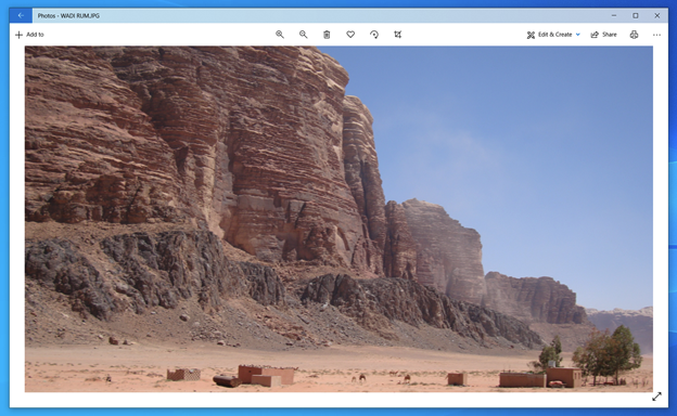
Note, too, that the Windows 11 version starts without the toolbar at the top, for an undistracted look at your image. But what about those photo-editing tools? Just tap the image with the mouse cursor or your finger on a touch screen and the new toolbar (as well as a filmstrip view of other photos you’ve opened) appears (shown below). When you click Fullscreen, the photo literally becomes the full screen, as though it were your wallpaper.
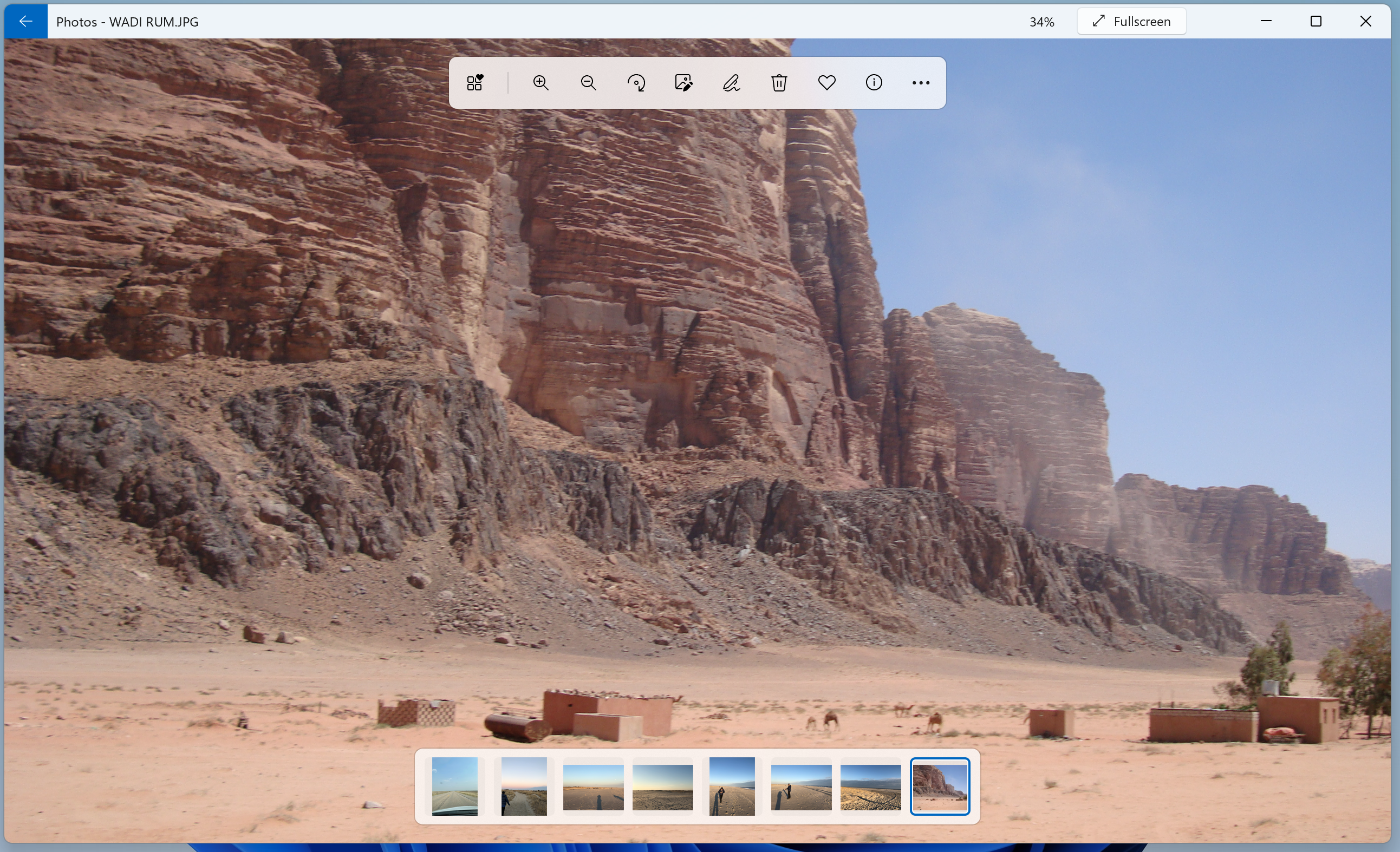
The new toolbar buttons’ functions are quite clear, but when you hover over any of the icons, tooltips tell you what they’re for. I’ll tell you as well: From left to right they’re See All Favorites, Zoom In, Zoom Out, Rotate, Edit Image, Mark Up, Delete, Favorite, and File Information.
The File Information panel gets a clean and clear redesign for Windows 11, too:

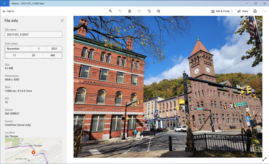
Notice that the File Information panel is now on the right, and you no longer have to scroll down to see the map for photos with location data (which is common in smartphone shots), new icons make entries skimmable, and the sections in the panel are more clearly delineated. For comparison, here’s the Windows 10 Photos information sidebar:
Compare Pictures With the New Multi-View Option
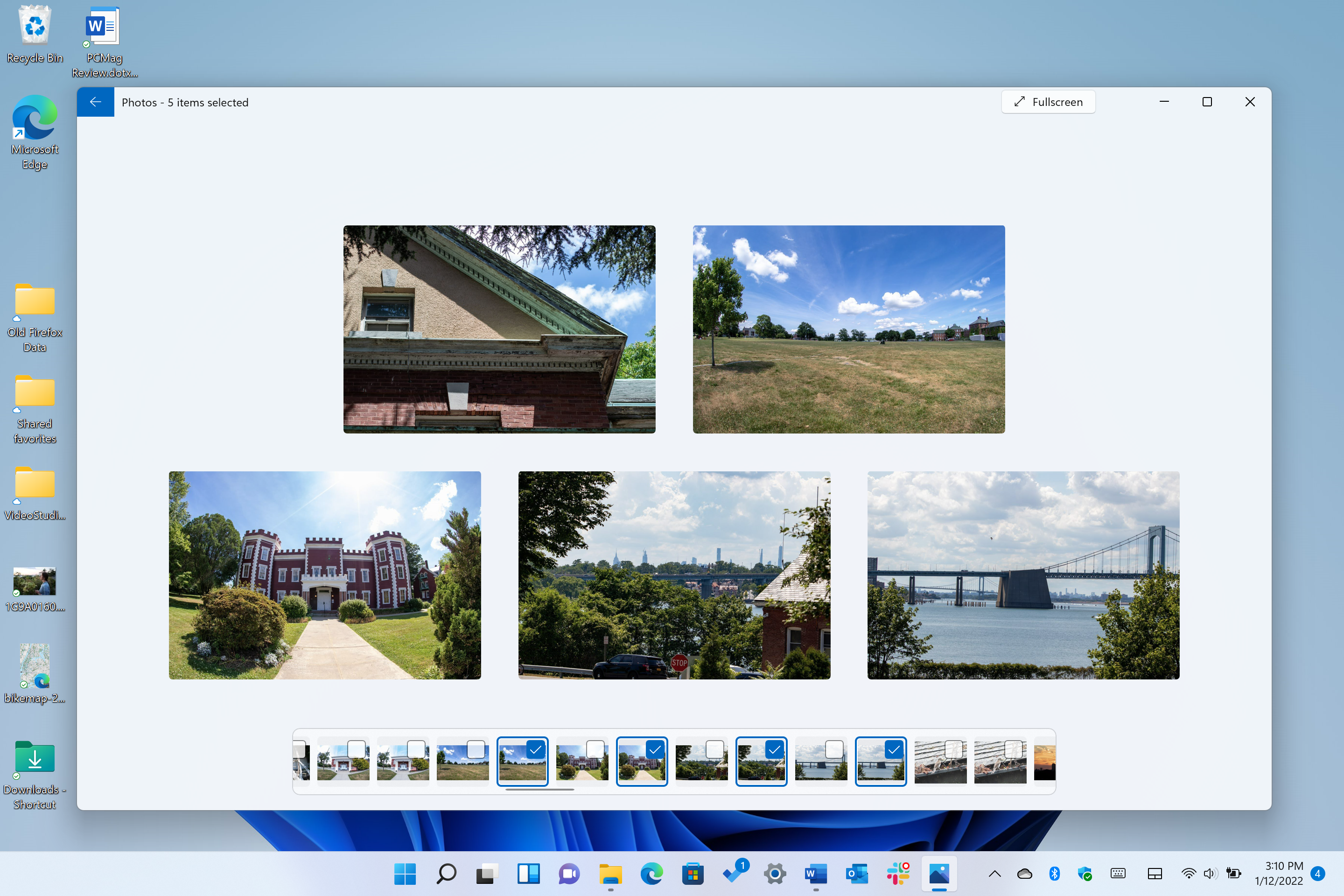
Completely new for Windows 11 is a multi-view option. Select several photos, and you can see them all in a collage view. You get it by selecting photos from the filmstrip view, but we wish you could simply select the photos’ checkboxes or use the Ctrl key. Multi-View also only works for photos in the same folder. When we were browsing photos synced from OneDrive, we didn’t get the filmstrip control. We’d prefer it to work for all photos as they appear in the Collection view and in the Album view.
New Editing Tools Add Power, Flexibility
The interfaces for cropping, adjustments, and filters have been rethought for Windows 11, too. They emphasize simplicity. Whereas in Windows 10 Photos you had to uncover the separate lighting adjustments—Brightness, Contrast, Shadows, and so on—in Windows 11 they're all just out there. You still can’t double-click a slider to return it to the original setting as you can in Adobe and some other companies’ products, however.
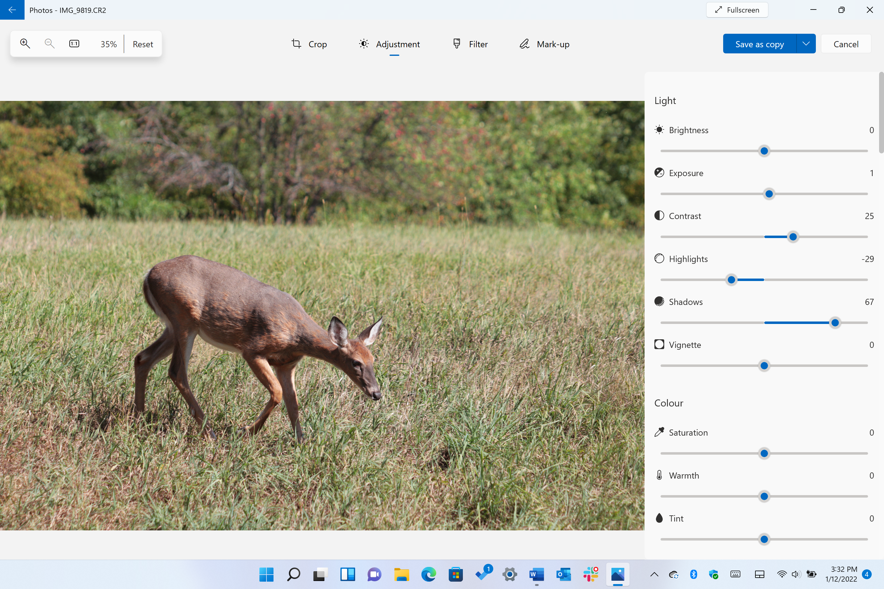
The new version dispenses with Windows 10’s overall lighting and color sliders, which we occasionally found helpful in testing. Here’s the Windows 10 Photos adjustment interface (which forces you to dark mode—a good thing) for comparison:

The Crop and Rotate view in Windows 11 moves the tools from the right side to the bottom:
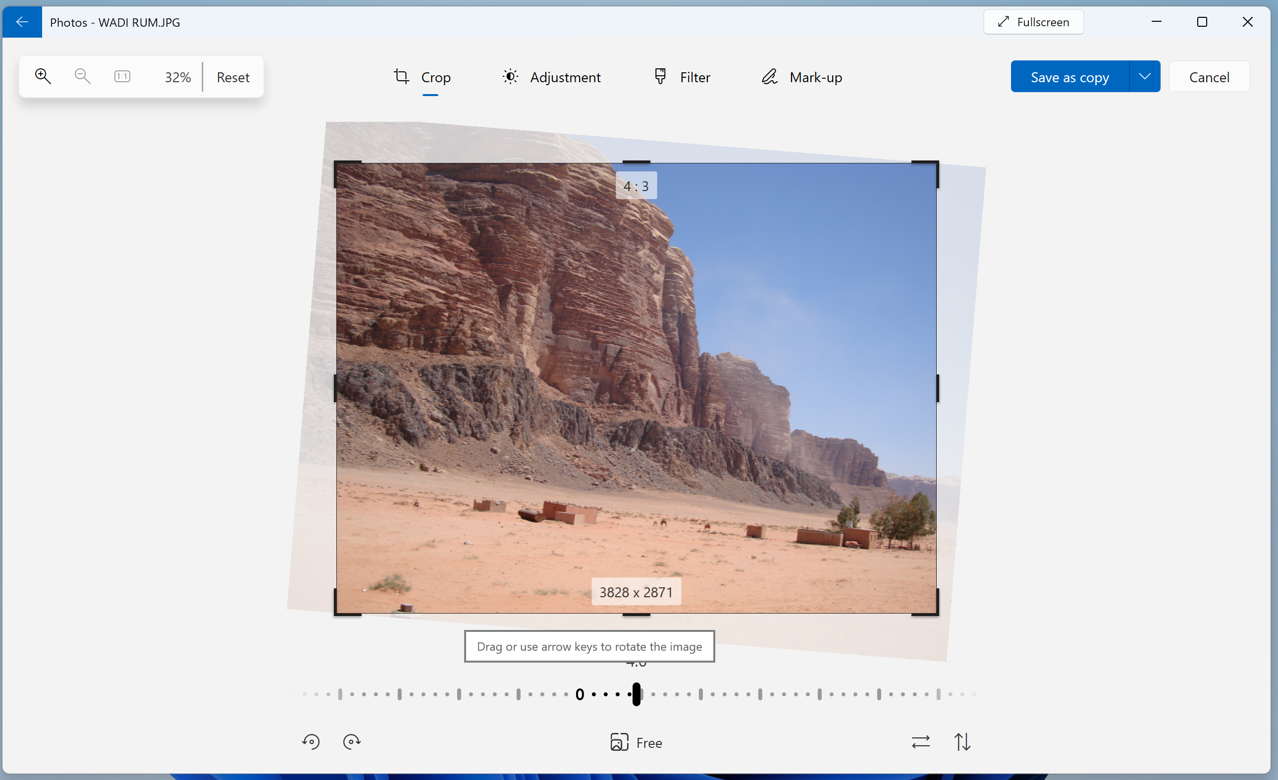
It uses corner outline handles instead of the more touch-friendly circles, and there’s still no auto-straighten like the one in Apple Photos. But we appreciate the way it shows you the final image with a shadow background of the original. You can also set standard aspect ratios like 16-by-9, 4-by-3, square, and so on by tapping the Free icon at bottom center. You can also flip a shot—handy for today’s smartphone selfie cameras that yield mirror images.
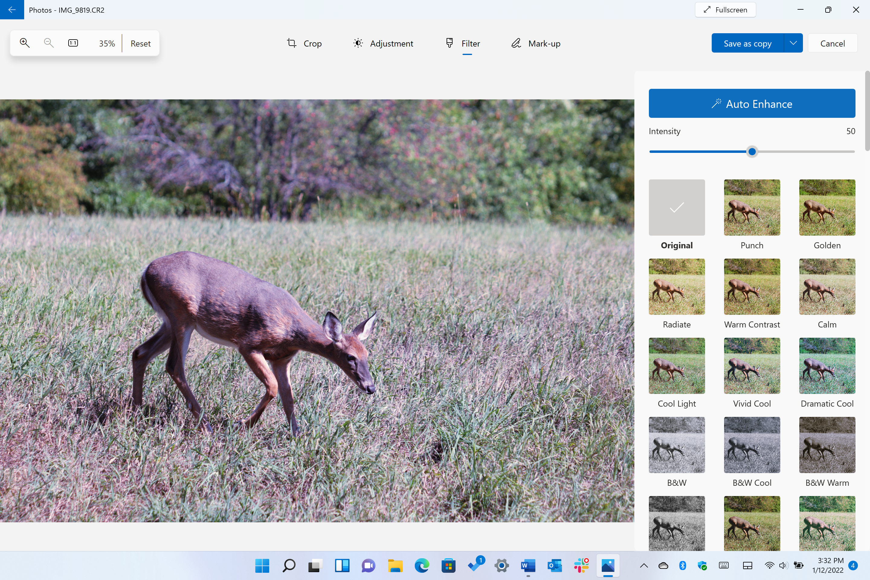
On the Filters tab you get a decent though not enormous selection of filters, but it's also where the all-important Auto Enhance tool lives. We like that you can use a slider to adjust the strength of any of the filters.
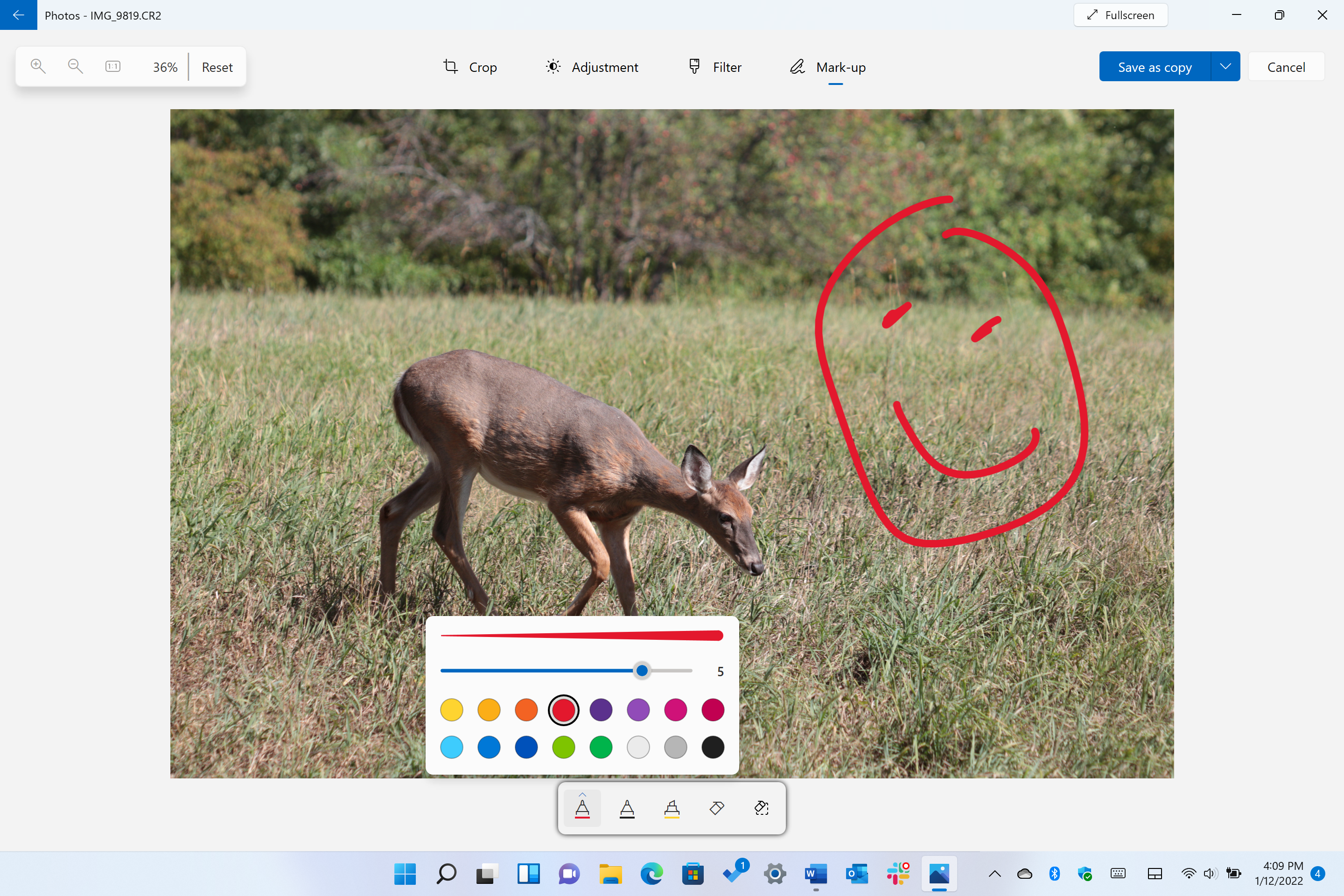
The Mark Up tool is little changed except that it used to be called Draw and now it’s available from the Editing page as well as from the initial photo view.
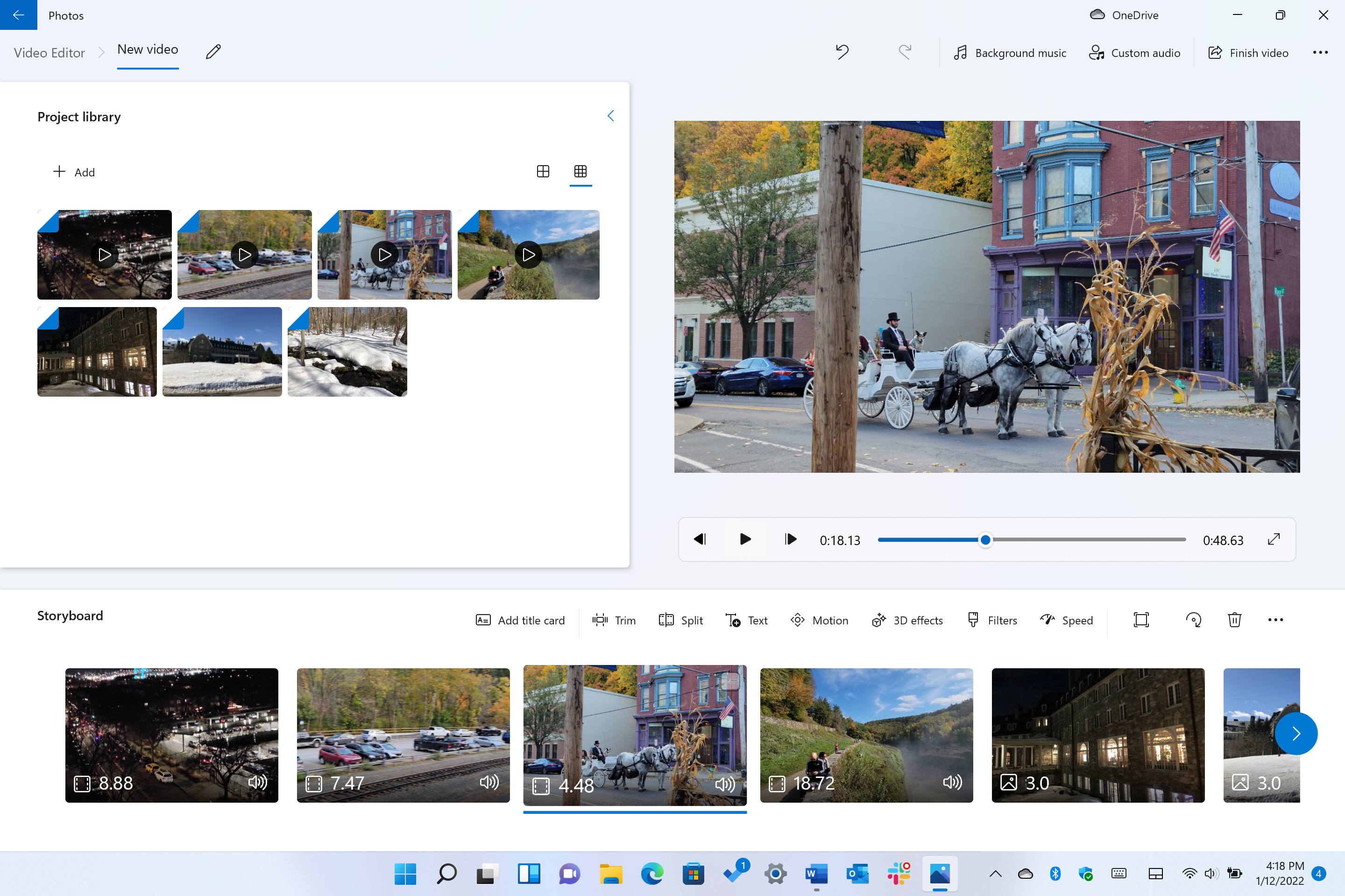
What About Video Editing in the Photos App?
As you may have guessed from the toolbar buttons mentioned above, Photos still includes all the video editing capabilities of its predecessor, both automatic and custom. You can still do trims and splits as well as add background music, speedups, slowdowns, titles, filters, motion, and even 3D overlays. It’s an impressive tool for one that most people probably don’t even realize exists since it’s tucked inside the Photos app rather than being a separate Videos app. Even if you don’t have videos, you can use it to make engaging slideshows.
The Automatic option lets you choose from several styles, and if you don’t like the first attempt, you can hit the Remix button for a whole new look and sound:
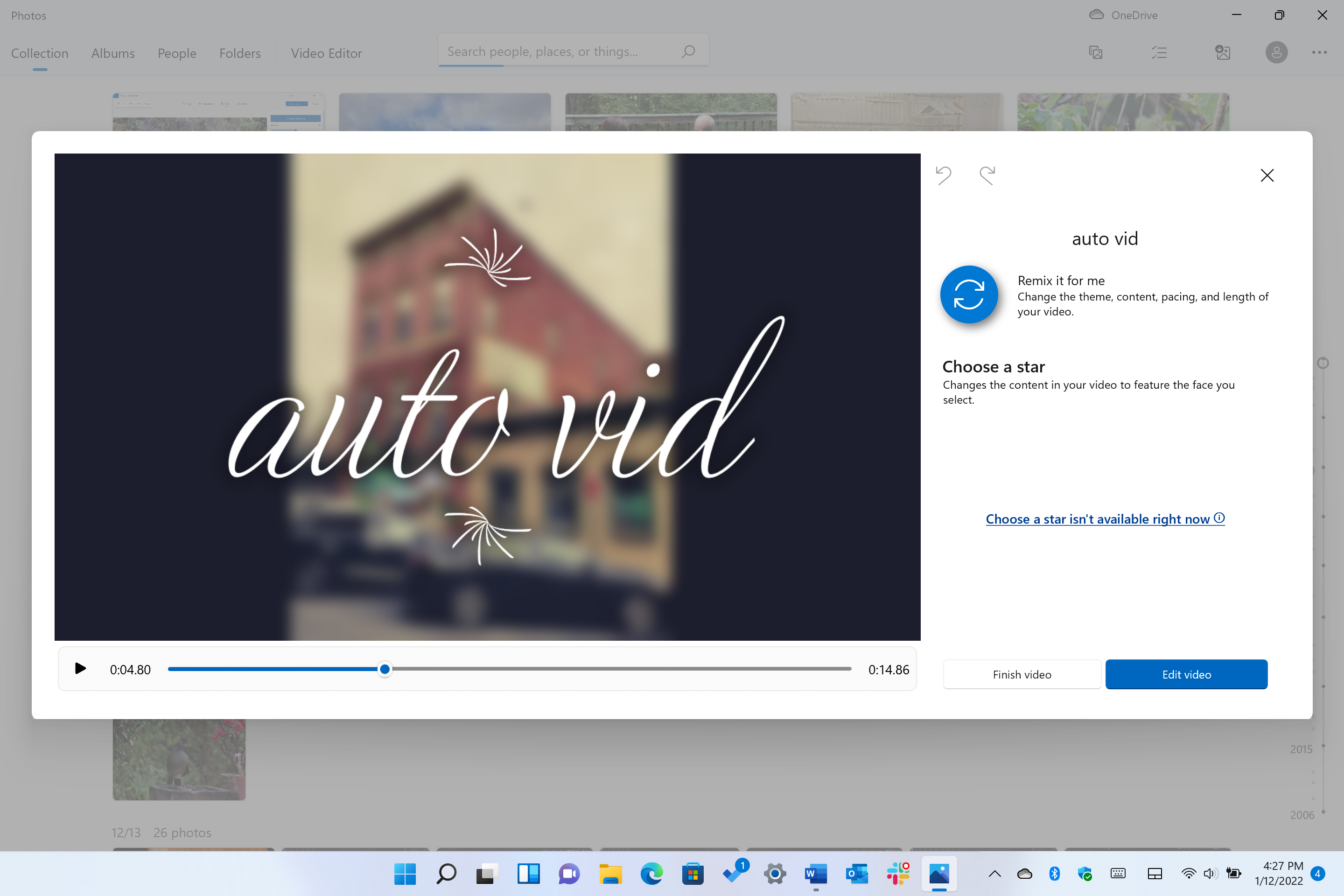
If you have several shots and clips with a person you want to highlight, Automatic lets you designate a Star to do just that.
Plenty of Good Stuff Stays the Same
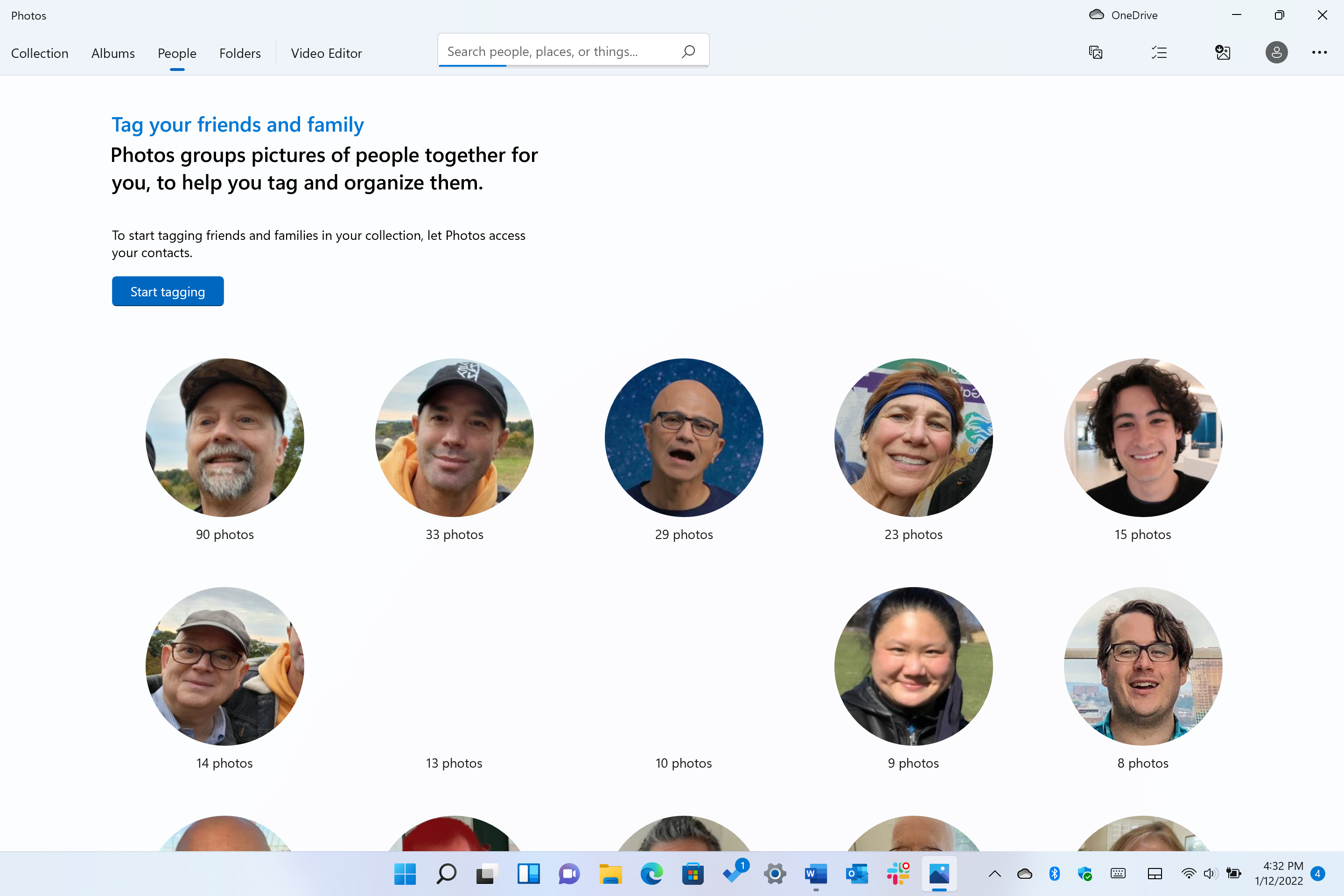
Video editing isn’t the only thing that retains all its capabilities. Like its predecessor, the new Photos app can display not only images on the local device, but also any you’ve synced to OneDrive. It can auto-create albums for you based on dates and events. It can identify faces that belong to a specific person and organize your collection that way, which is done on an opt-in basis, thankfully. Each of these functions gets spiffed up icons and slightly rearranged design, but the functionality remains identical.
There's More to Come for Microsoft Photos
The Photos app in Windows 11 is unlikely to remain exactly in its current form. Indeed, the Windows 10 version underwent many updates and redesigns over the years. We expect to see new features and interface designs as new Windows 11 updates drop. In the meantime, the existing app can serve those without demanding photo editing needs admirably, or at least as a tool for doing quick fixes to photos.
For the ultimate in photo editing, check out our Editors’ Choice winner, Adobe Photoshop, and for top workflow tools, the same company’s Lightroom is our pick. For some tips on taking better photos, read 10 Easy Tips and Tricks for Better Smartphone Photos.

