-
Pros
- Extensive sharing features let you play music and video in messages
- Media sent to you in Messages now available in other apps
- VPN-like relay hides your IP address when browsing
- Mail security features hide your IP address from advertisers
- Stereo-placement effects in FaceTime
- A new Focus feature fine-tunes Do Not Disturb options
-
Cons
- Initial release doesn't include Universal Control or sharing via FaceTime
- Some new features are either hard to find or slightly awkward to use
Apple has just released macOS Monterey, the latest version of its desktop and laptop operating system, as a free download for any supported Mac—just about any Mac bought new in the last five or six years. This follows four months of Monterey being available as a public beta and comes sooner than most of us expected.
To cut immediately to the chase, Monterey is a stable, secure upgrade that adds convenience and sharing features that almost every Mac owner will want. If your Mac supports Monterey, and you're running an earlier version, the System Preferences app will prompt you to upgrade to the new version. There's a lot to like in this new version of macOS, but that doesn't mean you need to rush to install it, however.
Thinking of Upgrading? There's No Hurry
As with every new macOS release, cautious users will wait a few weeks until at least the first point release update before upgrading any system used for work. Even with the vast number of beta testers who tried out Monterey, some obscure problem always slips through. You won't lose anything by waiting.
Another reason to wait is that some of Monterey’s coolest features aren’t included in the first release, and Apple says you have to wait until later this fall before you can use them. One of those delayed features is Universal Control, which will let you move your cursor back and forth between a Mac and an iPad, or between two Macs, and drag files between the two devices. Another is SharePlay, which lets you use FaceTime to share movies and music with friends. Note that Apple added SharePlay to the public beta of Monterey’s first point release, late in October. There’s no official word on when the point release will go public to everyone, but you can probably expect it by the middle of November.
The first public release of Monterey includes a related AirPlay to Mac feature that lets you use your Mac to display content from another device, in the same way you’re already able to use AirPlay to display content from your Mac or other device to a TV.
Which Monterey Is This?
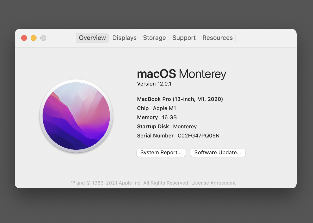
When you install Monterey, you’ll find that it’s version number is macOS 12.0.1. That extra 0.1 means that Apple installed version 12.0 on new MacBook models while they were in production, then apparently fixed bugs and tweaked the OS for the 0.1 version, all before Monterey was released. If you buy a Mac with 12.0 installed, expect Software Update to prompt you to update to 12.0.1.
Best on Apple Silicon, Still Excellent on Intel
Monterey runs on almost any Mac released in 2015 or later. It won’t run on the low-end 2015 MacBook, but it will run on a few older desktop machines, including the late-2014 Mac mini and the late 2013 Mac Pro.
I tested it on an M1 MacBook Pro made in 2020 and a 2015-vintage Intel MacBook Pro, where Monterey worked smoothly and quickly—and seemed to run at least as fast as earlier versions, perhaps even better, a sign that Apple hasn’t abandoned support of Intel Macs. Some Monterey features work only on M1 Macs, and I’ve mentioned the ones that I’ve noticed. Apple hasn’t spelled out all the differences between platforms, so some of these I found by accident. If you’re using an Intel Mac, you may find more. I haven’t had a chance to try out Monterey on the new new MacBook Pro models announced this month, the first hardware specifically designed for Monterey.
Apple’s macOS releases tend to follow a pattern that Apple has never talked about, but which is clearly how its developers think. The Mac gets a new OS release every year in the fall. In even-numbered years, the new version is a radical upgrade with a new look and major changes under the hood.
Last year’s macOS 11 Big Sur changed the interface to a more spacious modern design and was the first version to support for Apple Silicon hardware. That meant that on Apple Silicon (M1) Macs you could install many iOS apps and use them on a Mac in exactly the same way you use them on an iPhone or iPad.
In odd-numbered years, like 2021, Apple issues a more incremental release, like macOS 12 Monterey. It enhances macOS’s already ironclad security, but it looks almost identical to Big Sur, while adding convenience features. One notable convenience is a customizable Focus option that lets you filter out notifications from people or apps that you don’t want to hear from while you’re working. Another is Quick Note, which lets you create a note in the Notes app simply by pressing Fn+Q while working in any app, or by setting up a hot corner that opens a Quick Note window.
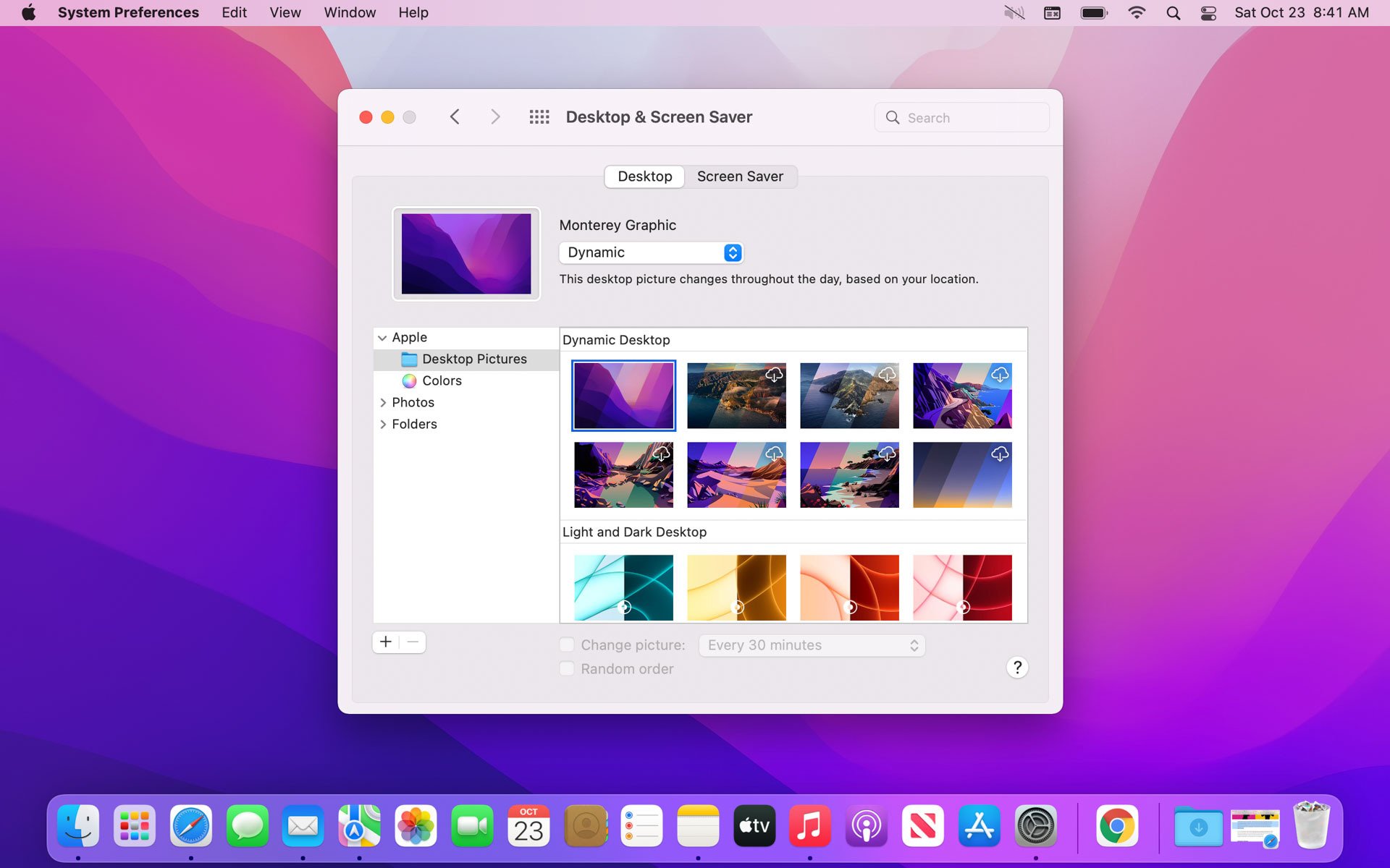
One change that you may have read about, even if you haven’t been running the beta, was a new design for Safari which combined the tab bar and the address bar in a single row. Apple’s idea seems to have been to save space for the browser window, but many users—including me—kept closing tabs instead of selecting them and found the new design awkward and confusing. In the final beta version, and now the release version, Apple relented and brought back the old separate address bar and tab bar, though the new layout is now available as an option.
Apple’s In-Your-Face Enhancements
Like every new release of a major OS, Monterey combines plenty of in-your-face enhancements that make for good publicity while also offering plenty of invisible improvements that matter more. I’ll talk about the visible ones first.
Apple’s PR emphasizes the new sharing features in FaceTime, and if you spend much of your time hanging out online with friends or pretending to enjoy collaborating at work, you’ll be glad to have these features. A Spatial Audio feature adds a stereo effect when more than one person is on the call, so the caller’s voice seems to emerge from their position in the FaceTime window. A new Wide Spectrum mode lets your mic capture all the sounds in the room, which Apple points out can be useful for music lessons.
Apple introduced this feature for movies and TV shows iOS and iPadOS 14, and later for Apple Music. Monterey brings it to FaceTime, both in headphones and in output from a Mac’s speakers (2018 and later models only). The technology is breathtakingly impressive and almost always convincing, and it makes FaceTime group conversations less anxiety-producing than (for example) Zoom, but I can’t shake the sense that it’s the sonic equivalent of an oversaturated photograph, something that feels more real than reality does.
Speaking of Zoom, FaceTime now offers a grid view that shows up to 18 faces, each in its own tile, and if you’re used to Zoom, you’ll feel right at home. After a year of staring at the tiny tiles in Zoom, I’m not sure I look forward to staring at them in FaceTime, but the feature will certainly be useful.
A surprising but welcome new feature lets you invite non-Apple users to join FaceTime calls via the latest versions of Chrome or Edge running on Windows or Android devices. It's a rare instance of Apple opening the door to the Appleverse to users outside, and it comes with a safety feature. When you send a link to join a FaceTime call in a browser, it might get into unwanted hands, so anyone already participating in the call can cut off access to a browser-based intruder in the first 30 seconds after the intruder joins.
Enhancements Still to Come
I can’t report on the other big in-your-face enhancements because they won’t arrive for a few weeks or months, but here’s a summary of what Apple promises.
SharePlay will let you play a music track, movie, or TV show in a FaceTime call, and anyone can add songs to a queue. You’ll also be able to share your screen as you can already do with apps like Zoom.
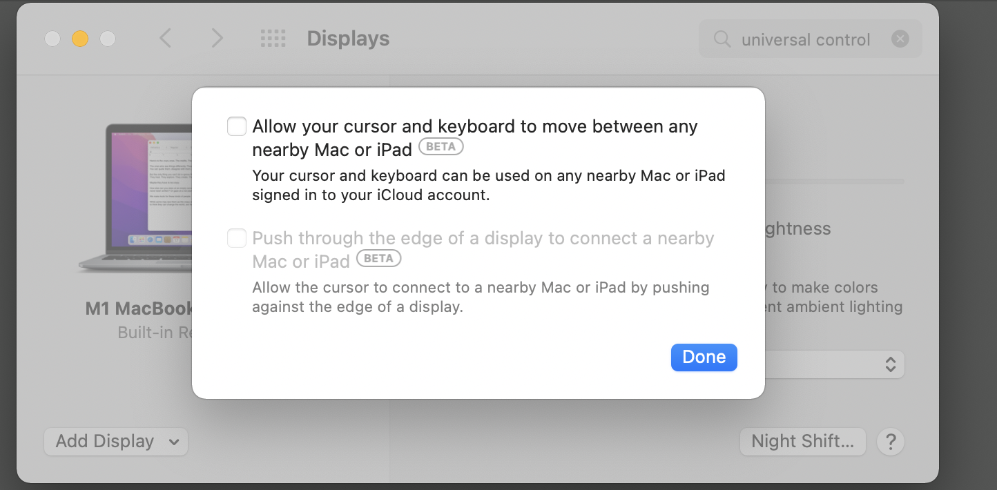
Universal Control, the feature that lets you move files or your cursor between adjacent devices, looks spectacular in Apple’s demos, and you can get a glimpse of its settings by going to the Displays pane in System Preferences and control-clicking on a display. A dialog pops up with checkboxes that enable Universal Control—but they have the word Beta next to them, and you can’t actually check them yet.
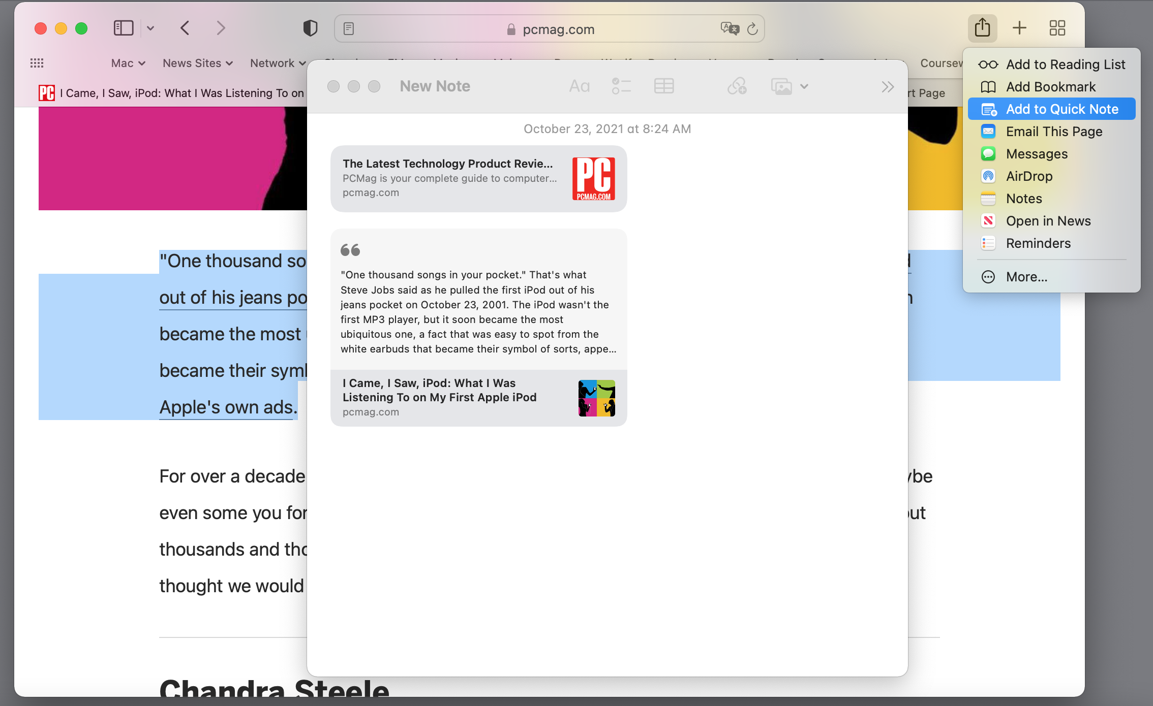
Safari now lets you create Tab Groups, as in Google Chrome, but in a more elegant and flexible way, because you can save and organize tab groups in Safari’s sidebar. If you enable Safari’s Compact tabs option in Preferences, you get the one-line combined tab bar and address bar that many users disliked, and you also get a feature that changes the color of the tab bar to match the background color of the page that’s open in the browser. If, like me, you find it distracting to see the tab bar change color when you open a new web page, you can turn this feature off in the Advanced pane of Safari’s Preferences.
The compact tab layout adds a three-dot icon that leads to submenus for the Share, Bookmark, and New Quick Note features. One reason I prefer the traditional separate-tabs option is that these menus appear in the upper right of the toolbar, where they’re easier to find. The New Quick Note menu item, by the way, adds a link to the current page to a Quick Note—a much easier method for remembering a page than whatever you’re using now.
If you’ve selected something in a web page and create a Quick Note, the selected text goes into the note along with a link to the page. On an M1 Mac (but not on an Intel Mac), when you later click on the note to open the page, any previously selected text is still selected with yellow highlighting. It can be useful, but I couldn’t figure out how to remove the highlight from the page until Apple told me that I could simply delete the link from the note and then refresh the page. This has two problems. If you’ve forgotten that you made a Quick Note from selected text on a page, you may waste a lot of time trying to remove the highlight in Safari. The OS obviously knows that the text is highlighted because it’s also in a Note, and I can’t see what’s stopping Apple from letting me control-click on the highlighted text and either jump to the Note or remove the highlighting. Maybe Apple will fix this someday, but meanwhile we can only hope. By the way, when you create Quick Note this way, it gets named New Note, and you may be frustrated to see that there’s no obvious way to rename it. The trick is to type a line of text at the top of the note, and that becomes the note’s name.
Live Text and 3D Earth
On an Apple Silicon Mac you can use Live Text in photos, a feature pioneered by Google Lens that lets you select text in a photo and send it by a message or, or if it’s an address, look it up in Maps. I’m deeply impressed by how fast and accurate Apple’s OCR is, even on distorted images. Monterey makes Apple’s Translate feature available systemwide, so you can select text in an image, right-click, and choose Translate from the pop-up menu. Apple’s Live Text, in my very informal testing, was generally as effective as Google Lens, and far more accurate than Microsoft’s entry in this field, Office Lens. Live Text is the only one of the three that’s available systemwide in a desktop OS. Google Lens is available only on mobile devices and inside the Google Photos app. Office Lens exists only on mobile devices.
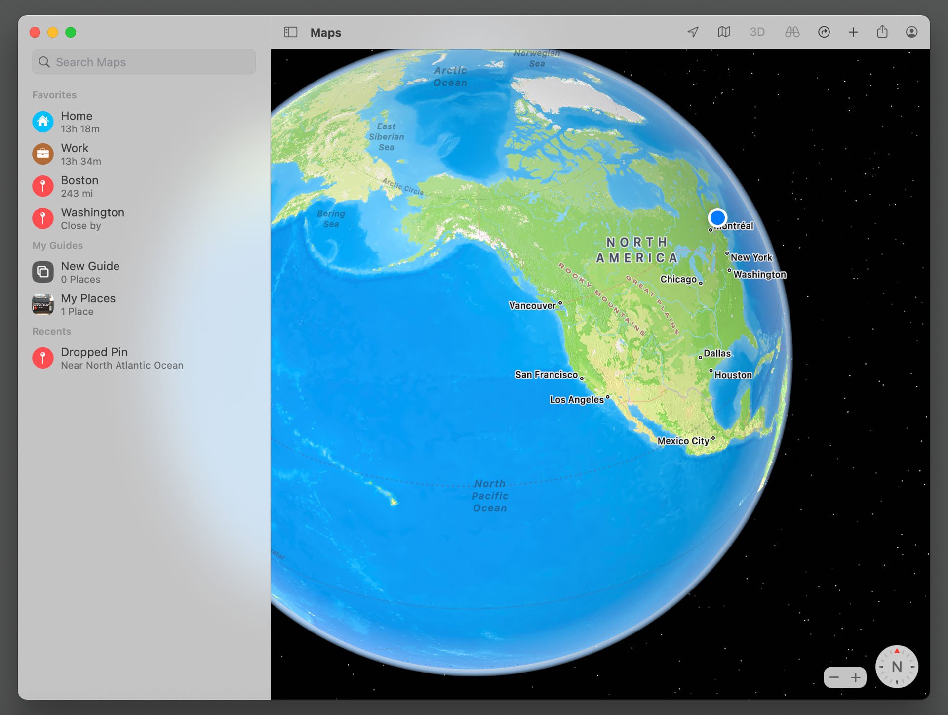
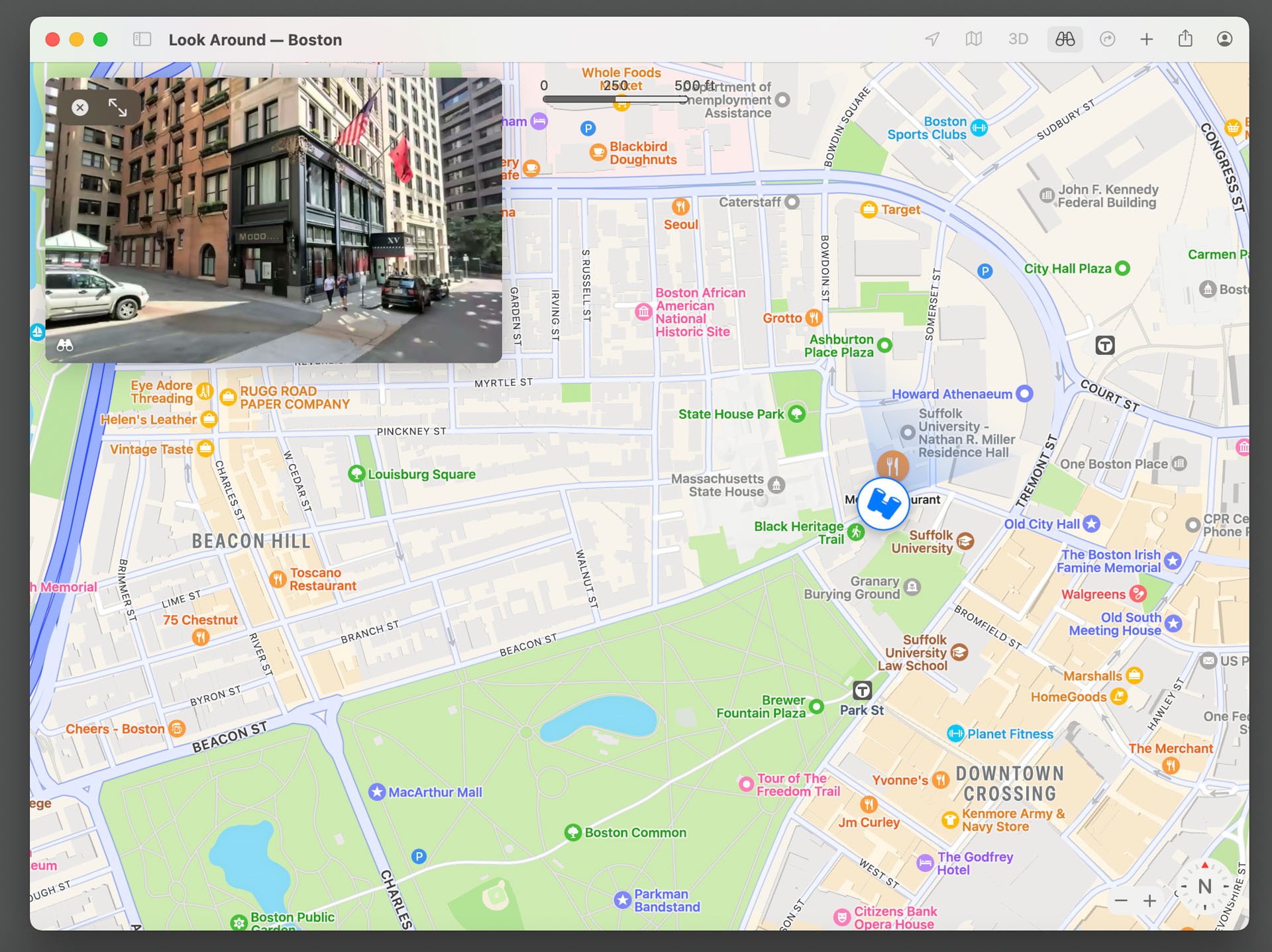
One visually impressive feature is a Google-Earth-style 3D globe in the Maps app, but it’s more fun than useful. What’s really useful in Maps is a 360-degree street view for selected cities, as in Google Maps, which appears in a picture-in-picture window in the corner of the Maps window but can expand to full-screen. Apple’s transit maps are clearer than ever, and Apple claims to include bus routes. In the parts of the world that I’ve visited, only a few bus routes are included, however. Of course, that may change in the future.
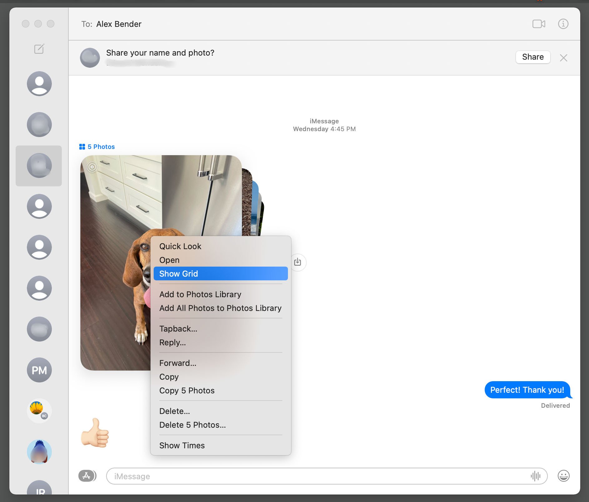
Messages gets lots of nifty new ways to share and display information. If someone sends you a batch of photographs, Messages displays them compactly as a stack of cards. You can control-click on the stack to display it as a grid. Someone at Apple has decided that it’s really good to share, so web content that someone shares with you via Messages is accessible from Safari’s start page and sidebar, and news stories that someone shares with you are clickable in the News app. This same open-handedness extends to photos and to movies and TV shows sent over Messages that appear in your Apple TV app. If you decide that your friends are over-sharing, you can fine-tune or turn off this feature in Messages’ Preferences in a new Shared with You tab.
I mentioned the new Focus option, which enhances and fine-tunes the existing Do Not Disturb, blocking text messages and optionally sending a canned reply to any messages that arrive when it’s turned on. Even better, you can set this option on your Mac or iOS device, and it will apply to all your other devices. You can adjust this feature to allow notifications from contacts or apps that you don’t want to block, and the Messages app will offer you a chance to mute an especially active thread that you’re not participating in.
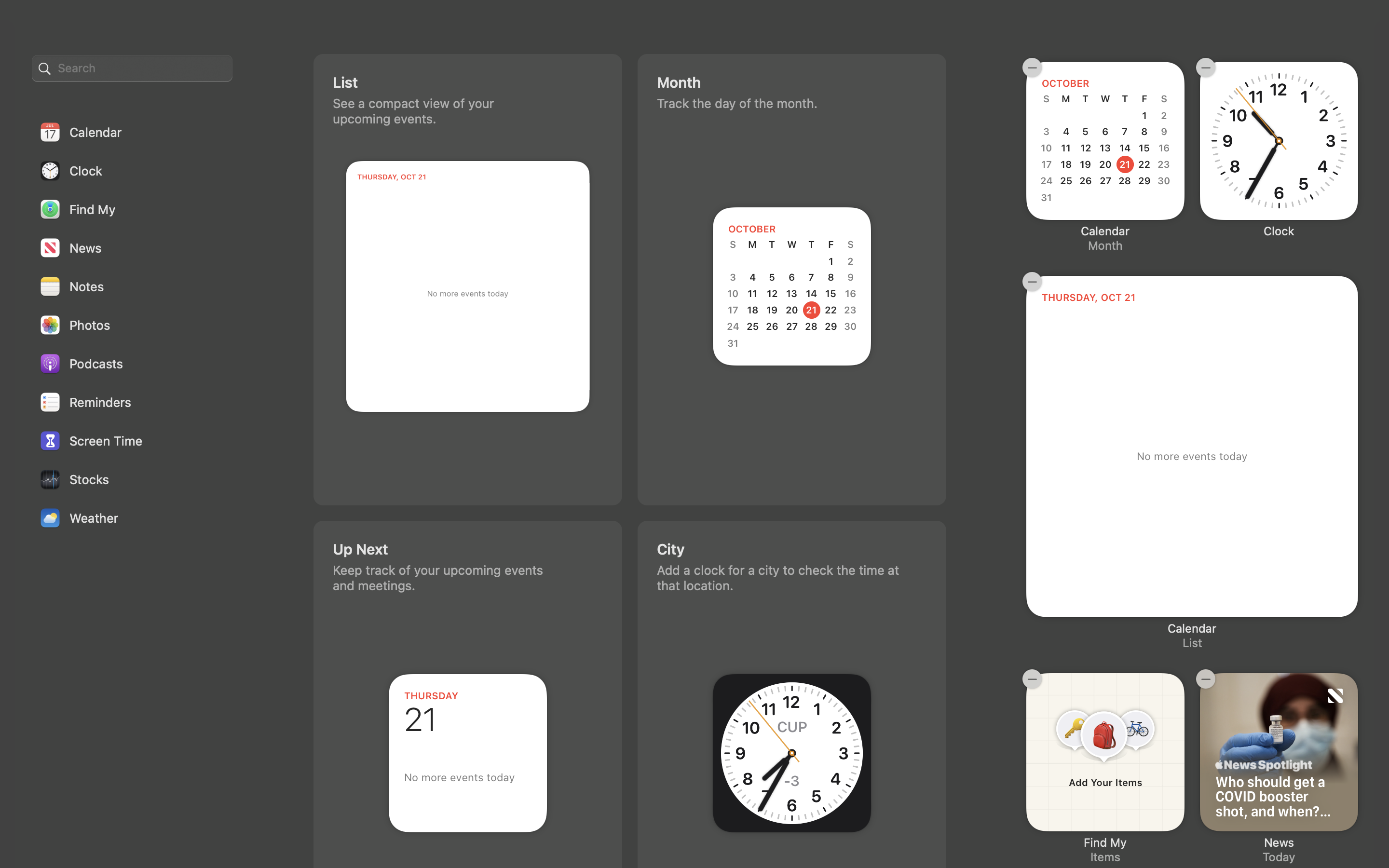
When you want to be distracted by a cornucopia of information, just click on the date and time in the upper right to open the Notification Center. One of the widgets that appears lets you add items that you’re tracking with the Find My app, including AirPods and AirTags. At the foot of the notification menu, a button leads to a gallery of widgets that you can add, including clocks for other cities, stock symbols, and quick links to apps like Notes and Reminders.
Take the Shortcut
If you’ve been using Shortcuts on iOS, you won’t be surprised to find them in Monterey. Here they have more power, including easy access to scripting features formerly available, awkwardly, through the Automator app or by writing AppleScript apps by hand, as only expert-level users can do.
Shortcuts propagate to your other devices that support them. After you find the settings menu for Shortcuts, you can add them to the top-line menu or Services menu. I’m impressed by how easy it is to create a basic Shortcut, but don’t expect the process to be intuitive. Spend some time studying Apple’s prebuilt examples. For example, I wanted to create a Shortcut that calculated a yearly cost by multiplying the number in the clipboard by 12. If you haven't had any programming experience, you may not realize that you can’t simply display the result of the calculation. You have to create a variable with the result and then navigate a few menus in order to create an alert that displays it.
Riches Under the Surface
Now for some of Monterey’s invisible or well-hidden features, which, for me at least, are just as significant as the visible ones.
One welcome but well-hidden feature in Safari is what Apple calls Intelligent Tracking, which appears in Safari’s Preferences as Hide IP Address, and is turned on by default. It prevents trackers and websites from seeing your IP address, which vastly improves your privacy. Apple does this by creating a private relay, much like a VPN, that conceals your address behind a temporary address. You can set this open to use a physical address close to your actual one, in order to get local content, or simply use the same country and time zone. Mail has a similar IP-hiding feature, accessible in its Preferences on the Privacy tab.
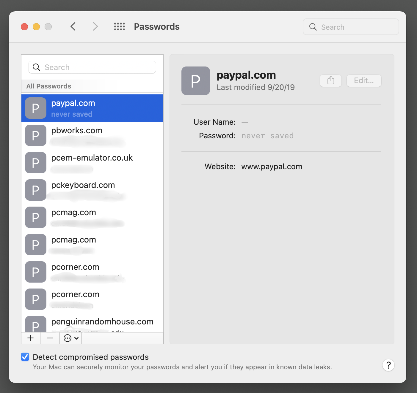
A small interface change that will make a big difference for many users is a new Passwords tab in System Preferences. Instead of navigating to the Keychain Access app or Safari’s Preferences pane, you get a one-stop list of passwords, complete with optional warnings about compromised or reused passwords. Otherwise, System Preferences seems to have no major surprises—or at least none jumped out at me.
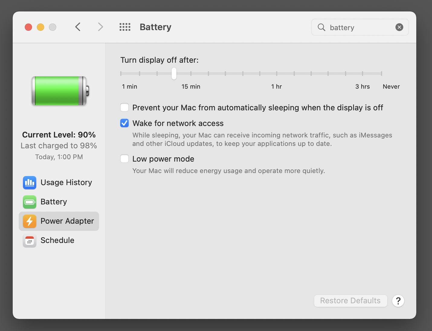
One small but welcome change in the Sounds preference pane lets you display the speaker icon on the menu bar only when an app is producing sound. Until now, the icon was either always visible or never visible. And options in the Battery preference let you turn on a low-power mode to preserve battery life and reduce noise, so it’s useful even when your laptop is connected to a power source. Thankfully, Apple designed this feature so that screen brightness is reduced only slightly when you enable low power mode.
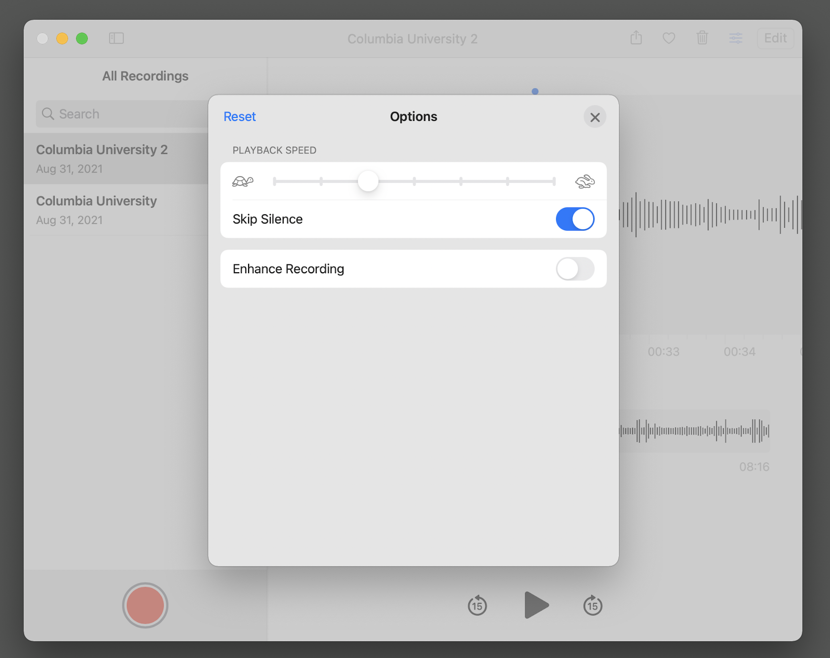
You’ll have to look closely to notice some other new features. For example, when an app is using your camera or microphone, a tiny red dot appears on the menu bar to the right of the Control Center icon. This can alert to when a rogue app is recording you, but I wish Apple had given me the option to use a larger and more obvious signal. In Voice Memos, you can now speed up or slow down playback of the current recording, but only if you’re curious enough to click the three-sliders icon in the upper right of the app’s toolbar. The app changes playback speed by adjusting the length of pauses between words so pitch doesn’t change when speed changes.
Easy Come, Easy Go
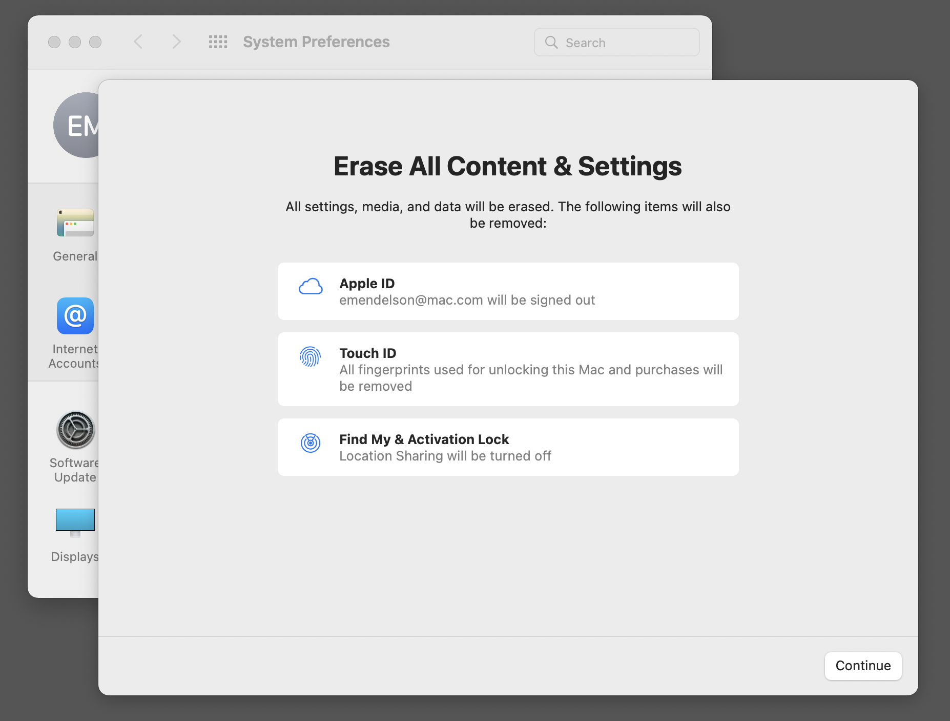
When it’s time to sell your Mac or if you want to start fresh with a new installation of the OS, the System Preferences now includes an option to erase all your settings and data, including fingerprint data. You won’t need to boot up to the Recovery Environment and erase the disk, as you did with previous versions.
The erase-all-data option is hidden in the System Preference app’s top-line menu, so you won’t stumble across it while exploring the app’s less dangerous options. If you open the option’s wizard and accept a series of warnings, the System Preferences app will instantly wipe your data. You don’t have to wait for your disk to be erased in the slow, familiar way. The app performs this trick by irreversibly clearing a hidden decryption password that macOS applies by default to your disk, so that when the password is cleared, no one can read the data on your disk. Nothing else in any other operating system comes close to this feature in its combination of security and ease.
As in the previous Big Sur version, Monterey lets you set up Accessibility features when installing the OS, so you don’t have to navigate to the System Preferences app after installing. Also, as in Big Sur, if you dual-boot your Intel Mac with a pre-Big Sur version like Mojave, you won’t be able to see the contents of your Monterey system when you boot to your Mojave system. Apple introduced a more secure disk format with Catalina, and never updated Mojave to be able to read the new format.
There's one side-effect to keep in mind if you’re a developer or an IT manager who needs a dual-boot system. Because a Mojave system can’t see the contents of a Big Sur or Monterey system, you can’t select a Big Sur or Monterey system as your startup disk when you’re running Mojave. The only way to reboot from Mojave to Big Sur or Monterey is to hold down the Option key when restarting your Mac and choose your Monterey or Big Sur volume from the menu.
Is Monterey Right for You?
There’s a lot more to be said about the fine touches and satisfying details in Monterey. When I run apps built for Intel macs on an Apple Silicon Mac running Monterey, Apple’s Rosetta2 system invisibly makes the Intel apps run almost as quickly as native Apple Silicon apps, and Monterey’s Rosetta2 feels subjectively faster than Big Sur’s Rosetta2. Thanks to Rosetta2, I was even able to run many Windows apps in Monterey on an Apple Silicon Mac using the Wineskin Winery emulation system that I wrote about in here. There were some bumpy moments in early Monterey betas when some arcane apps that I rely on wouldn’t run at all, but Apple ironed out every bug that I encountered.
Microsoft's shiny new Windows 11 belatedly adopts some of Apple's security measures—which is why Windows 11 officially requires up-to-date hardware that has security features built-in. Windows 11 also looks more like recent macOS versions, with elegantly rounded corners on dialog boxes and more subtle colors. You've probably decided long ago whether you'll use Windows or a Mac, and no one should convince you to switch. When I'm relaxing with a computer, I always pick up a Mac because for me it's a far more relaxing and enjoyable than Windows has ever been. Some of my friends and colleagues have opposite opinions.
I use Windows on my desktop machines, mostly because the heavy-duty text-processing apps that I use every day either exist only on Windows or (like Microsoft Office or ABBYY FineReader) have Windows versions that are more powerful than their Mac counterparts. If you create music, video, or graphics, you'll probably want a high-powered Mac. Windows 11 is more elegant and coherent than Windows 10 was, but it's still far behind macOS in elegance, coherence, and ease of use. And nothing matches the tight integration of macOS and iOS and iPadOS.
With its initial release, Monterey isn't feature-complete, but it's still a significant advance over last year's macOS Big Sur, and already the most solid, speedy, and reliable version of macOS I've tested. That applies to older Intel Macs but especially to the new Apple Silicon M1 Macs, where Monterey adds features like Live Text that you can't find anywhere else. Monterey already deserves our Editor's Choice rating. We'll update this review when Monterey's Universal Control and SharePlay features arrive later this fall, but those features will likely only be added icing on already terrific cake.

