Today here at @iamscicomm I'm focusing a bit on my world - the world of science adjacent #sciart and #sciviz folks who support researchers with graphic #scicomm.
I mentioned yesterday I stared down a STEM career path, but found what I really loved was communicating that science!
So where does a person go from there? For the record, everyone thought this was a poor career choice. I 1. Dropped my minor 2. Dropped the weed-out pre-med courses 3. Started drawing every day 4. Started teaching myself software 5. Started contacting #sciviz folks for advice
Asking advice is important when considering a #STEM career. I had access to a lot of people in research and medicine to talk to and help me.
Unfortunately, this is not as easy for everyone. How do you make yourself accessible for students or potential entrants to your field? ❓
Contact with professionals helps would-be's weight the trade-offs, and better prepare, or pivot.
What #outreach can #STEM professionals do to make sure we're reaching ALL these hopefuls, not the privileged❓
What do you wish you'd known before you stared down your career path❓
Image ALT TEXT: Stick figure comic with students titled "the future" about to start on a treacherous path of pitfalls to "professional". Mentor has placed danger signs for them.
Image ALT TEXT: Stick figure comic with students titled "the future" about to start on a treacherous path of pitfalls to "professional".
• • •
Missing some Tweet in this thread? You can try to
force a refresh
Thanks for being brave and helping us learn @AryaCampaigns! Here's my redesign!
Your focus is ACCESS. Currently that is buried and obscured. Suggest a #stackedbarchart#infographic to show your avg access, then break down by low and high health literate.
cont...
honestly, in this case, your graphics are fighting your message, and I'd just get down to clearly showing your data. I'd also rather have labels than icons here, because I'm struggling to understand exactly what some of the icons are.
cont...
Possible to bring some images back in what I've labled demographics, but you may want to ask yourself what those are doing to help your message. Some of the side info could be cut.
Like text, images hold info. I like to think of my images in terms of question-centered design as well. Here's a system of levels I've made to help me organize images:
1. Observational, descriptive. What something is, its inherent form, materials and characteristics. (what, who)
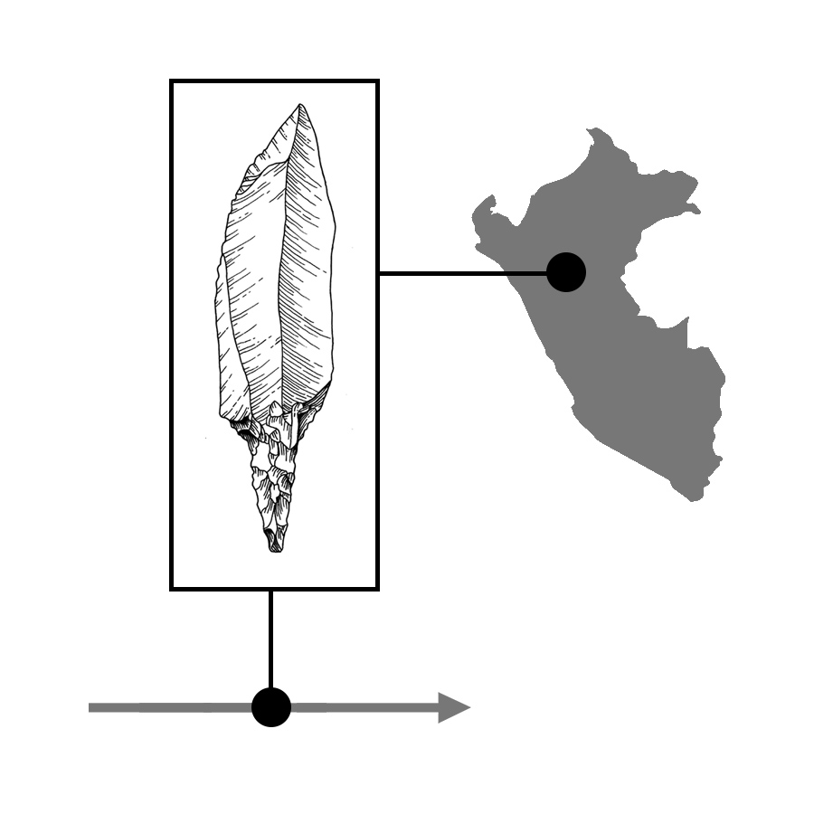
2. Contextual, locative. Puts the subject in a setting, either placing it in geographic or temporal space. Gives us the position relative to time or location. (where, when)
Add contrast!
Color is an easy way to do it.
Be careful of using full saturation elements-will battle each other on the page.
Grays are your base, desaturated hues are tools for differentiation and categorization, and your brights are for emphasis!
Or course, you need to be mindful of colorblindness! There are lots of materials you can check on making your #sciviz accessible!
It is important to check your tone
(if you made your image black and white, would there be a range of whites to darks? Would your key elements read as the same or different shades of gray?)
as an additional differentiating factor!
Ditch the academic writing structure, it is passive voice, and so actions are usually backwards. You need to describe actions linearly, and then you can get more creative once you have that structure.
Don't forget your labels. Often I think people treat labels as an afterthought, but they're very important.
Try and consider these early in your design of a figure or slide.
What does your audience already know? What is obvious and can be cut?
...
Can I confess something? Nothing bothers me more than a figure with A-K or something labeled in the caption. You're going to make me look down there 11 freakin' times?
Hardly any instances where this is okay. If you can fit a letter, you can fit a label. #sciviz#scicomm
Maybe science caption craziness is a vestige of old print techniques with type and image setting or something or something, when changing a label in your graphic was HARD! Now it is so so so EASY. So put those labels on the stuff where they belong. #sciviz#scicomm#design
Ahhh #storyboarding! Will touch on this a bit later this week! But a teaser...
Don't worry about the hero's journey first.
Start with a #narrative timeline: 1. Who is your protagonist? Immune cells? 2. Antagonist or supporting players? Bacteria? 3. Define setting...
(1 of 5)
... where are you? The lungs? (maybe start with a wide angle, then zoom in, and in). 4. Define your problem. Bacterial infection spreading! 5. Counter action. Immune system attacks! 6. Overcoming, or reaction. Bacterial infection shrinks? 7. Wrap up ...
(2 of 5)
... call to action? moral? "That's how..." explainer
Basically, the thing to remember with animation, #1 mistake is writing out of linear time order. Unlike text, your timeline is more rigid. Can't see the immune cells attack until that character is introduced to us.