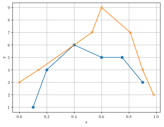
You will need to interpolate your data to fill in the values between your measured data points. There are a number of different methods to do this. The most straightforward is linear interpolation, where we draw a straight line between each pair of points in a sequence and takes the value of y from the line for each value of x between the actual points of data.
Here we are sampling the data from 0 to 1 at 0.05 steps. The samples are shown in black and the average is the dashed green line.
import numpy as np
import matplotlib.pyplot as plt

x1 = [0.1, 0.2, 0.4, 0.6, 0.75, 0.9]
x2 = [0, 0.14, 0.53, 0.6, 0.81, 0.9, 0.98]

y1 = [1, 4, 6, 5, 5, 3]
y2 = [3, 4, 7, 9, 7, 4, 2]

x_samples = np.arange(0, 1, 0.05)
y1_interp = np.interp(x_samples, x1, y1)
y2_interp = np.interp(x_samples, x2, y2)
y_avg = (y1_interp + y2_interp) / 2

plt.plot(x1, y1, marker='none')
plt.plot(x2, y2, marker='none')
plt.scatter(x_samples, y1_interp, c='k', s=16, marker='x', zorder=10)
plt.scatter(x_samples, y2_interp, c='k', s=16, marker='^', zorder=10)
plt.plot(x_samples, y_avg, c='green', marker='none', linestyle='dashed')
plt.grid()
plt.xlabel('x')
plt.ylabel('y')
plt.show()

As you can see, when sampling outside of the values of the data, it simply takes the closest points.
If you want a smoother transition between points, you can use a spline. Here we are creating a cubic spline object for each set of measurements. Then we can interpolate the data at any sample point using the splines. The original data is shown as the X and O marker, with the splines as the gray dotted lines between them. The average is again the green dashed line.
import numpy as np
import matplotlib.pyplot as plt
from scipy.interpolate import CubicSpline


x1 = [0.1, 0.2, 0.4, 0.6, 0.75, 0.9]
x2 = [0, 0.14, 0.53, 0.6, 0.81, 0.9, 0.98]

y1 = [1, 4, 6, 5, 5, 3]
y2 = [3, 4, 7, 9, 7, 4, 2]

x_samples = np.arange(0, 1.01, 0.05)
cspline_1 = CubicSpline(x1, y1)
cspline_2 = CubicSpline(x2, y2)
y1_interp = cspline_1(x_samples)
y2_interp = cspline_2(x_samples)
y_avg = (y1_interp + y2_interp) / 2

plt.scatter(x1, y1, marker='o')
plt.scatter(x2, y2, marker='x')
plt.plot(x_samples, y1_interp, c='gray', marker='none', linestyle='dotted', linewidth=1)
plt.plot(x_samples, y2_interp, c='gray', marker='none', linestyle='dotted', linewidth=1)
plt.plot(x_samples, y_avg, c='green', marker='none', linestyle='dashed')
plt.grid()
plt.xlabel('x')
plt.ylabel('y')
plt.show()


