Bounty Ended with 50 reputation awarded by CommunityBot
added second cleaner workaround. Numeration of dataframes and plot objects
Source Link
pholzm
  • 1.8k
  • 5
  • 11

Looking at the plotly code here (excerpt below), it seems that the raster is only defined for any values of x and y available in the dataset - and whatever happens in between is up the the rest of the plotly code.

geom2trace.GeomTile <- function(data, params, p) {
  x <- sort(unique(data[["x"]]))
  y <- sort(unique(data[["y"]]))
  # make sure we're dealing with a complete grid
  g <- expand.grid(x = x, y = y)
  g$order <- seq_len(nrow(g))
  g <- merge(g, data, by = c("x", "y"), all.x = TRUE)
  g <- g[order(g$order), ]
...

For the example data this code generates the following data, where gray areas are NA, and blank areas are simply undefined. And all the distortions/stretching happens in the undefined areas.

ggplot(g, aes(x = x, y = y, fill = value)) + geom_tile()

enter image description here

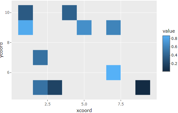
With this, one possible workaround (outside the plotly package) would be to manually ensure there are (NA) data available across the whole x/y range, so expand.grid generates a sufficiently dense grid when the plot is translated to plotly.

set.seed(1)
XX1 <- data.frame(xcoord = c(sample(1:10, n, replace = TRUE), 1:10),
                ycoord = c(sample(1:10, n, replace = TRUE), 1:10),
                value = c(runif(n), rep(NA, 10)))
gggg1 <- ggplot(XX1) + geom_tile(aes(x = xcoord, y = ycoord, fill = value))
ggplotly(gggg1)

enter image description here

Update

While the example above demonstrates it is sufficient to have a single value for any x and y in the dataset, I'll also add an arguably cleaner solution as suggested by Waldi in the comments. By (automatically) generating the full grid in advance, there is less reliance on quirks from the plotly translation. For grid spacing different than 1, the sequence of course needs to be adjusted.

# X: original dataframe as defined in the question
X2 <- tidyr::expand_grid(
  xcoord = seq(min(X$xcoord), max(X$xcoord)), 
  ycoord = seq(min(X$ycoord),max(X$ycoord))
  ) %>%    
  dplyr::left_join(X, by=c('xcoord','ycoord'))
gg2 <- ggplot(X2) + geom_tile(aes(x = xcoord, y = ycoord, fill = value))
ggplotly(gg2)

enter image description here

Looking at the plotly code here (excerpt below), it seems that the raster is only defined for any values of x and y available in the dataset - and whatever happens in between is up the the rest of the plotly code.

geom2trace.GeomTile <- function(data, params, p) {
  x <- sort(unique(data[["x"]]))
  y <- sort(unique(data[["y"]]))
  # make sure we're dealing with a complete grid
  g <- expand.grid(x = x, y = y)
  g$order <- seq_len(nrow(g))
  g <- merge(g, data, by = c("x", "y"), all.x = TRUE)
  g <- g[order(g$order), ]
...

For the example data this code generates the following data, where gray areas are NA, and blank areas are simply undefined. And all the distortions/stretching happens in the undefined areas.

ggplot(g, aes(x = x, y = y, fill = value)) + geom_tile()

enter image description here

With this, one possible workaround (outside the plotly package) would be to manually ensure there are (NA) data available across the whole x/y range, so expand.grid generates a sufficiently dense grid when the plot is translated to plotly.

set.seed(1)
X <- data.frame(xcoord = c(sample(1:10, n, replace = TRUE), 1:10),
                ycoord = c(sample(1:10, n, replace = TRUE), 1:10),
                value = c(runif(n), rep(NA, 10)))
gg <- ggplot(X) + geom_tile(aes(x = xcoord, y = ycoord, fill = value))
ggplotly(gg)

enter image description here

Looking at the plotly code here (excerpt below), it seems that the raster is only defined for any values of x and y available in the dataset - and whatever happens in between is up the the rest of the plotly code.

geom2trace.GeomTile <- function(data, params, p) {
  x <- sort(unique(data[["x"]]))
  y <- sort(unique(data[["y"]]))
  # make sure we're dealing with a complete grid
  g <- expand.grid(x = x, y = y)
  g$order <- seq_len(nrow(g))
  g <- merge(g, data, by = c("x", "y"), all.x = TRUE)
  g <- g[order(g$order), ]
...

For the example data this code generates the following data, where gray areas are NA, and blank areas are simply undefined. And all the distortions/stretching happens in the undefined areas.

ggplot(g, aes(x = x, y = y, fill = value)) + geom_tile()

enter image description here

With this, one possible workaround (outside the plotly package) would be to manually ensure there are (NA) data available across the whole x/y range, so expand.grid generates a sufficiently dense grid when the plot is translated to plotly.

set.seed(1)
X1 <- data.frame(xcoord = c(sample(1:10, n, replace = TRUE), 1:10),
                ycoord = c(sample(1:10, n, replace = TRUE), 1:10),
                value = c(runif(n), rep(NA, 10)))
gg1 <- ggplot(X1) + geom_tile(aes(x = xcoord, y = ycoord, fill = value))
ggplotly(gg1)

enter image description here

Update

While the example above demonstrates it is sufficient to have a single value for any x and y in the dataset, I'll also add an arguably cleaner solution as suggested by Waldi in the comments. By (automatically) generating the full grid in advance, there is less reliance on quirks from the plotly translation. For grid spacing different than 1, the sequence of course needs to be adjusted.

# X: original dataframe as defined in the question
X2 <- tidyr::expand_grid(
  xcoord = seq(min(X$xcoord), max(X$xcoord)), 
  ycoord = seq(min(X$ycoord),max(X$ycoord))
  ) %>%    
  dplyr::left_join(X, by=c('xcoord','ycoord'))
gg2 <- ggplot(X2) + geom_tile(aes(x = xcoord, y = ycoord, fill = value))
ggplotly(gg2)
enter image description here

Source Link
pholzm
  • 1.8k
  • 5
  • 11

Looking at the plotly code here (excerpt below), it seems that the raster is only defined for any values of x and y available in the dataset - and whatever happens in between is up the the rest of the plotly code.

geom2trace.GeomTile <- function(data, params, p) {
  x <- sort(unique(data[["x"]]))
  y <- sort(unique(data[["y"]]))
  # make sure we're dealing with a complete grid
  g <- expand.grid(x = x, y = y)
  g$order <- seq_len(nrow(g))
  g <- merge(g, data, by = c("x", "y"), all.x = TRUE)
  g <- g[order(g$order), ]
...

For the example data this code generates the following data, where gray areas are NA, and blank areas are simply undefined. And all the distortions/stretching happens in the undefined areas.

ggplot(g, aes(x = x, y = y, fill = value)) + geom_tile()

enter image description here

With this, one possible workaround (outside the plotly package) would be to manually ensure there are (NA) data available across the whole x/y range, so expand.grid generates a sufficiently dense grid when the plot is translated to plotly.

set.seed(1)
X <- data.frame(xcoord = c(sample(1:10, n, replace = TRUE), 1:10),
                ycoord = c(sample(1:10, n, replace = TRUE), 1:10),
                value = c(runif(n), rep(NA, 10)))
gg <- ggplot(X) + geom_tile(aes(x = xcoord, y = ycoord, fill = value))
ggplotly(gg)

enter image description here