17

Chess community! I’m Chloe, the designer at Stack Exchange who’s working on the upcoming Chess site theme for you. I reviewed your responses to my initial post, and below you'll find the site design I came up with, based on your ideas and input.

Your site design

We want to give you your own theme that reflects your topic, culture, and community. This will help brand your site as unique, even while you share common elements with other sites that show you are part of a bigger Stack Exchange family.

Color scheme

Creating the logo and color scheme was a little tricky, as I wanted them to feel different than the large chess websites. In the initial information gathering post, one of you suggested using a color scheme of light and dark brown, taken from many wooden chess boards. Here’s where we ended up:

proposed Chess SE color scheme

The darkest brown is used as the primary color in the logo and for the site buttons, and the lighter browns are used for background elements.

Logo

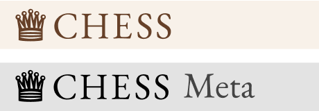
I wanted to create a simple, recognizable banner for you all that works at small sizes and doesn't mimic any existing chess sites. I went with a stylized illustration of a queen and used the font Garamond, which feels classical and is reminiscent of the typography used in a newspaper chess puzzle:

proposed logos for Chess SE and Chess Meta

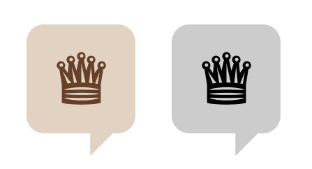
The favicons would then look like this:

proposed favicons for Chess SE and Chess meta

Page designs

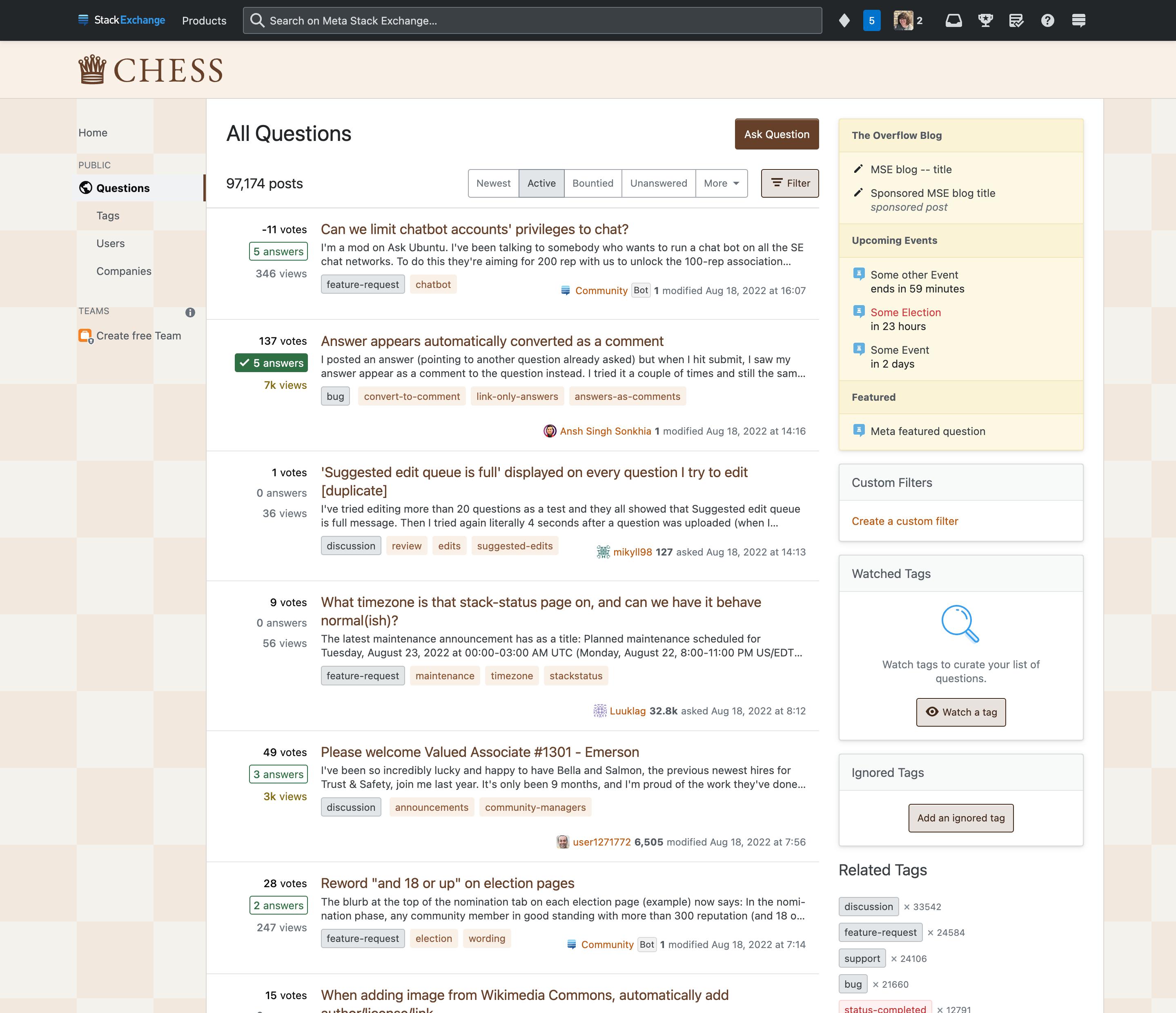
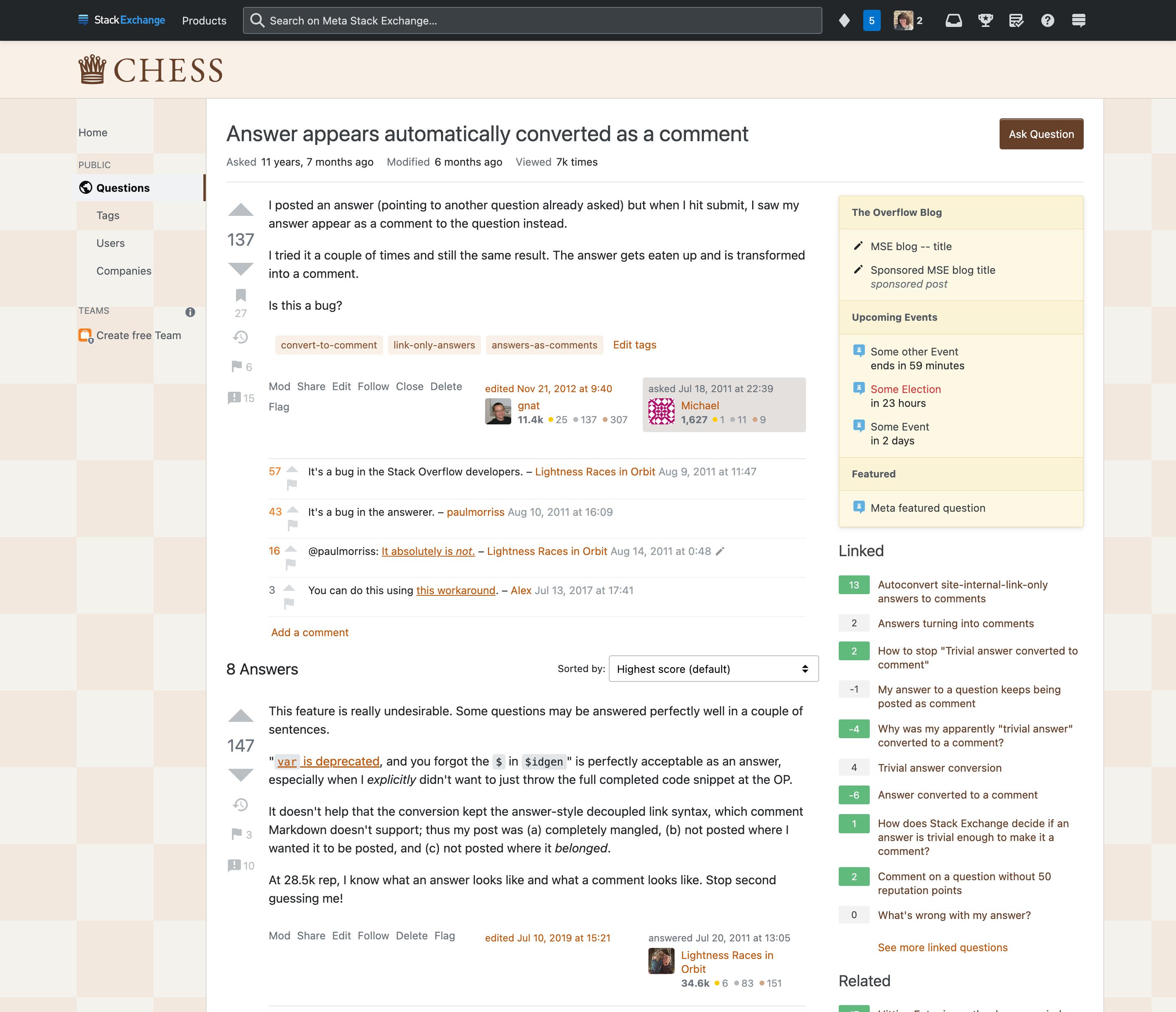
Putting it all together, here’s what we get for the main site:

proposed home page for Chess SE

proposed question page for Chess SE

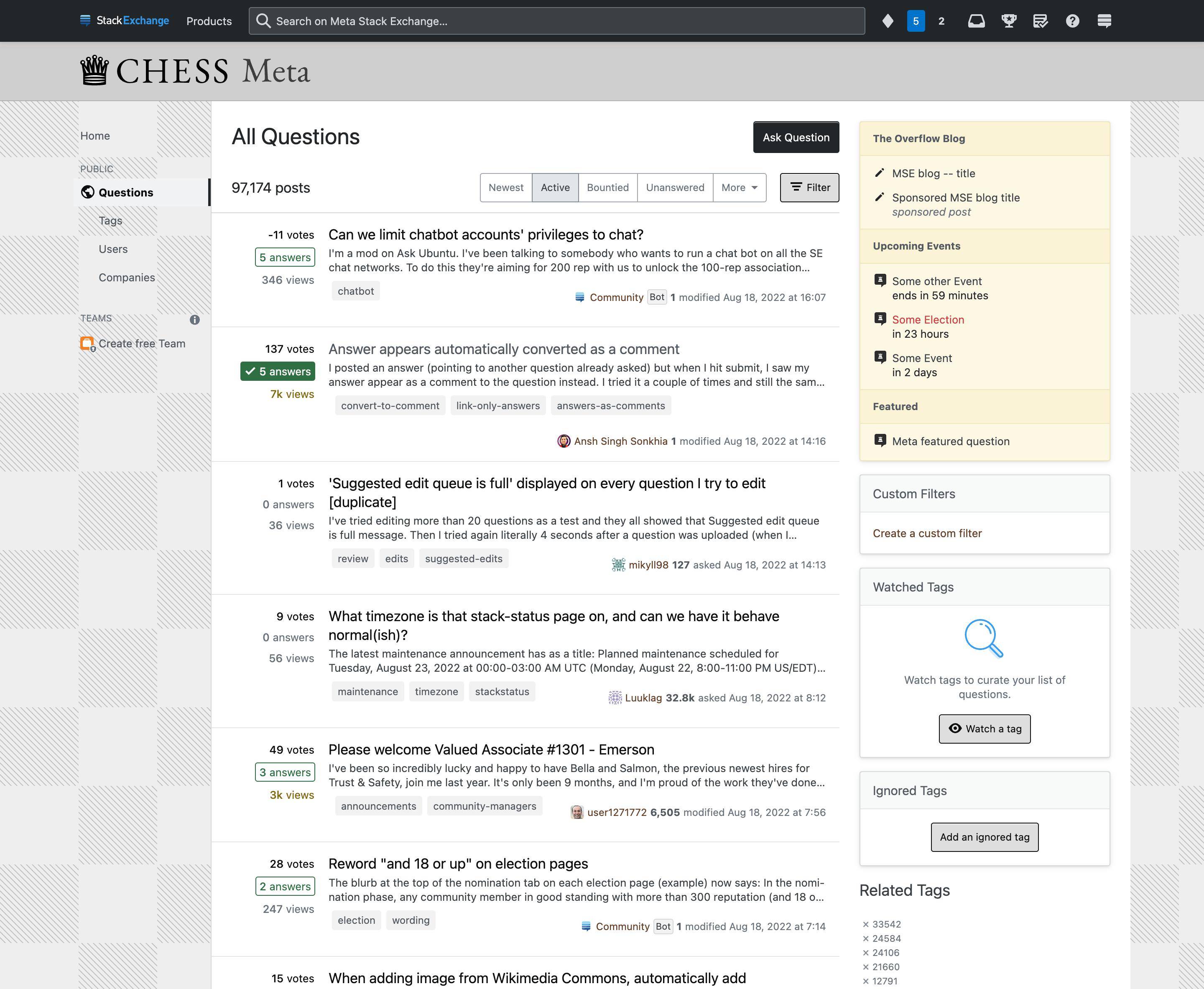
And following the tradition of our meta sites being a grayscale version of the main site, these are the designs I created. The subtle change in the background is also inspired by newspaper chess puzzles:

proposed home page for Chess Meta

proposed question page for Chess Meta

Thoughts?

We hope you enjoy this design, but if something doesn’t feel right, now is your chance to share your feedback. This window for feedback will be open for one week. We will then work to incorporate feedback as best as we can, finalize things on our end, and lastly, deliver the design to your site.

2
  • 3
    You've done really well. The background feels like chess without being obstructive nor over-complicated; the logo is distinct but still obviously a queen and is easily identifiable with "chess"; and using the grayscale newspaper style for meta in particular seems like such a natural decision now that I've seen it. Commented Mar 5, 2023 at 13:15
  • Update: Your new site design is live!
    – V2Blast StaffMod
    Commented Apr 13, 2023 at 19:11

3 Answers 3

13

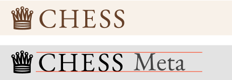
It looks great, thanks a lot! I just have my doubts about the vertical alignment of CHESS Meta - it looks like Meta has been misplaced by one pixel.

enter image description here

1
  • 4
    You're correct—good eye! I'll fix that.
    – Chloe Staff
    Commented Feb 15, 2023 at 20:45
6

Do you plan to style the badge symbols as well? For instance music.SE has little quavers and notes.

3
  • 8
    That's a great idea. Maybe a pawn for bronze, rook for silver, queen for gold?
    – Chloe Staff
    Commented Feb 16, 2023 at 19:30
  • 1
    @Chloe Sounds good! Or whichever pieces look better at that very small size. Commented Feb 16, 2023 at 22:40
  • 2
    @Chloe Or maybe for king for gold (despite being top brass), queen for silver, and a pawn for bronze, symbolizing potential. Commented Feb 20, 2023 at 9:58
1

I'd like a darker background but would not like a brighter one.

I am visually impaired, so, to enable text to be clear against background, I use Windows with a dark mode theme. What suits my eyes is something like EL&U.SE. The site branding is at the top but there is no bright background elsewhere. Bright backgrounds distract. Brighter browns are more prominent than darker browns, so if you went for bright, that would lead me to have to make my browser window narrower or put up with bright background stripes to the left and right of the text area, as with Mathematics SE.

In order to show us how the site would look with a proposed new design, would it be possible to show that design in actual web pages with actual HTML? Images such as you show in your question show how your browser running on your device would render a page on your screen. I'm concerned with how it would look on my screen once my browser's rendered it.

1
  • 2
    Unfortunately we don't have a way for folks to preview the new theme as live pages. Does it help to know that none of the HTML has been changed? The only things this new theme changes are CSS variables and a couple images. Regarding the rest of your feedback, the colors of this design are very similar to EL&U—I actually used that theme as a starting point for this one. Are you saying that in general you prefer darker browns or that the browns in this theme specifically are too bright? And would it be better if the background of the text area were brown instead of white?
    – Chloe Staff
    Commented Mar 13, 2023 at 14:02

You must log in to answer this question.

Not the answer you're looking for? Browse other questions tagged .