Which color scale to use when visualizing data - Datawrapper Blog
A fascinating four-part series by Lisa Charlotte Muth on colour in data visualisations:
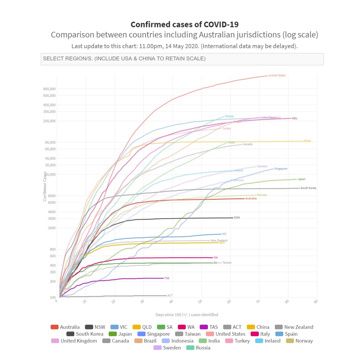
I must admit I’ve been wincing a little every time I see a graph with a logarithmic scale in a news article about COVID-19. It takes quite a bit of cognitive work to translate to a linear scale and get the real story.

A fascinating four-part series by Lisa Charlotte Muth on colour in data visualisations:
Chris has made sonic sparklines on his site too, but they’re far more musical than mine. Here’s his explanation of how he did it.
There are some beautiful illustrations in this online exhibition of data visualisation in the past few hundred years.
Correlation does not imply causation.
I quite like Phil’s idea of having charts like this. It might be a fun project for Homebrew Website Club to do something like this for my site.