Journal tags: webapp

40

sparkline

Going Offline is online …for free

I wrote a book about service workers. It’s called Going Offline. It was first published by A Book Apart in 2018. Now it’s available to read for free online.

If you want you can read the book as a PDF, an ePub, or .mobi, but I recommend reading it in your browser.

Needless to say the web book works offline. Once you go to goingoffline.adactio.com you can add it to the homescreen of your mobile device or add it to the dock on your Mac. After that, you won’t need a network connection.

The book is free to read. Properly free. Not the kind of “free” where you have to supply an email address first. Why would I make you go to the trouble of generating a burner email account?

The site has no analytics. No tracking. No third-party scripts of any kind whatsover. By complete coincidence, the site is fast. Funny that.

For the styling of this web book, I tweaked the stylesheet I used for HTML5 For Web Designers. I updated it a little bit to use logical properties, some fluid typography and view transitions.

In the process of converting the book to HTML, I got reaquainted with what I had written almost seven years ago. It was kind of fun to approach it afresh. I think it stands up pretty darn well.

Ethan wrote about his feelings when he put two of his books online, illustrated by that amazing photo that always gives me the feels:

I’ll miss those days, but I’m just glad these books are still here. They’re just different than they used to be. I suppose I am too.

Anyway, if you’re interested in making your website work offline, have a read of Going Offline. Enjoy!

Going Offline

Docks and home screens

Back in June I documented a bug on macOS in how Spaces (or whatever they call they’re desktop management thingy now) works with websites added to the dock.

I’m happy to report that after upgrading to Sequoia, the latest version of macOS, the bug has been fixed! Excellent!

Not only that, but there’s another really great little improvement…

Let’s say you’ve installed a website like The Session by adding it to the dock. Now let’s say you get an email in Apple Mail that includes a link to something on The Session. It used to be that clicking on that link would open it in your default web browser. But now clicking on that link opens it in the installed web app!

It’s a lovely little enhancement that makes the installed website truly feel like a native app.

Websites in the dock also support the badging API, which is really nice!

Like I said at the time:

I wonder if there’s much point using wrappers like Electron any more? I feel like they were mostly aiming to get that parity with native apps in having a standalone application launched from the dock.

Now all you need is a website.

The biggest issue remains discovery. Unless you already know that it’s possible to add a website to the dock, you’re unlikely to find out about it. That’s why I’ve got a page with installation instructions on The Session.

Still, the discovery possibilities on Apples’s desktop devices are waaaaay better than on Apple’s mobile devices.

Apple are doing such great work on their desktop operating system to make websites first-class citizens. Meanwhile, they’re doing less than nothing on their mobile operating system. For a while there, they literally planned to break all websites added to the homescreen. Fortunately they were forced to back down.

But it’s still so sad to see how Apple are doing everything in their power to prevent people from finding out that you can add websites to your homescreen—despite (or perhaps because of) the fact that push notifications on iOS only work if the website has been added to the home screen!

So while I’m really happy to see the great work being done on installing websites for desktop computers, I’m remain disgusted by what’s happening on mobile:

At this point I’ve pretty much given up on Apple ever doing anything about this pathetic situation.

Web App install API

My bug report on Apple’s websites-in-the-dock feature on desktop has me thinking about how starkly different it is on mobile.

On iOS if you want to add a website to your home screen, good luck. The option is buried within the “share” menu.

First off, it makes no sense that adding something to your homescreen counts as sharing. Secondly, how is anybody supposed to know that unless they’re explicitly told.

It’s a similar situation on Android. In theory you can prompt the user to install a progressive web app using the botched BeforeInstallPromptEvent. In practice it’s a mess. What it actually does is defer the installation prompt so you can offer it a more suitable time. But it only works if the browser was going to offer an installation prompt anyway.

When does Chrome on Android decide to offer the installation prompt? It’s a mix of required criteria—a web app manifest, some icons—and an algorithmic spell determined by the user’s engagement.

Other browser makers don’t agree with this arbitrary set of criteria. They quite rightly say that a user should be able to add any website to their home screen if they want to.

What we really need is an installation API: a way to programmatically invoke the add-to-homescreen flow.

Now, I know what you’re going to say. The security and UX implications would be dire. But this should obviously be like geolocation or notifications, only available in secure contexts and gated by user interaction.

Think of it like adding something to the clipboard: it’s something the user can do manually, but the API offers a way to do it programmatically without opening it up to abuse.

(I’d really love it if this API also had a declarative equivalent, much like I want button type="share" for the Web Share API. How about button type="install"?)

People expect this to already exist.

The beforeinstallprompt flow is an absolute mess. Users deserve better.

Space dock

Apple announced some stuff about artificial insemination at their WorldWide Developer Conference, none of which interests me one whit. But we did get a twitch of the webkit curtains to let us know what’s coming in Safari. That does interest me.

I’m really pleased to see that on desktop, websites that have been added to the dock will be able to intercept links for that domain:

Now, when a user clicks a link, if it matches the scope of a web app that the user has added to their Dock, that link will open in the web app instead of their default web browser.

Excellent! This means that if I click on a link to thesession.org from, say, my Mastodon site-in-the-dock, it will open in The Session site-in-the-dock. Make sure you’ve got the scope property set in your web app manifest.

I have a few different sites added to my dock: The Session, Mastodon, Google Calendar. Sure beats the bloat of Electron apps.

I have encountered a small bug. I’ll describe it here because I have no idea where to file it.

It’s to do with Spaces, Apple’s desktop management thingy. Maybe they don’t call it Spaces anymore. Maybe it’s called Mission Control now. Or Stage Manager. I can’t keep track.

Anyway, here are the steps to reproduce:

  1. In Safari on Mac, go to a website like adactio.com
  2. From either the File menu or the share icon, select Add to dock.
  3. Click on the website’s icon in the dock to open it.
  4. Using Apple’s desktop management (Spaces?) available through the F3 key, drag that window to a desktop other than desktop 1.
  5. Right click on the site’s icon in the dock and select Options, then Assign To, then This Desktop.
  6. Quit the app/website.
  7. Return to desktop 1.

Expected behaviour: when I click on the icon in the dock to open the site, it will open in the desktop that it has been assigned to.

Observed behaviour: focus moves to the desktop that the site has been assigned to, but it actually opens in desktop 1.

If someone from Apple is reading, I hope that’s useful.

On the one hand, I hope this isn’t one of those bugs that only I’m experiencing because then I’ll feel foolish. On the other hand, I hope this is one of those bugs that only I’m experiencing because then others don’t have to put up with the buggy behaviour.

Rotten Apple

The European Union’s Digital Markets Act is being enforced and Apple aren’t happy about it.

Most of the discussion around this topic has centred on the requirement for Apple to provision alternative app stores. I don’t really care about that because I don’t really care about native apps. With one exception: I care about web browsers.

That’s the other part of the DMA that’s being enforced: Apple finally have to allow alternative browsing engines. Hallelujah!

Instead of graciously acknowledging that this is what’s best for users, Apple are throwing a tantrum.

First of all, they’re going to ringfence any compliance to users in the European Union. Expect some very interesting edge cases to emerge in a world where people don’t spent their entire lives in one country.

Secondly, Apple keep insisting that this will be very, very bad for security. You can read Apple’s announcement on being forced to comply but as you do you so, I’d like you to remember one thing: every nightmare scenario they describe for the security of users in the EU is exactly what currently happens on Macs everywhere in the world.

This includes risks from installing software from unknown developers that are not subject to the Apple Developer Program requirements, installing software that compromises system integrity with malware or other malicious code, the distribution of pirated software, exposure to illicit, objectionable, and harmful content due to lower content and moderation standards, and increased risks of scams, fraud, and abuse.

Users of macOS everywhere are currently exposed to all the risks that will supposedly overwhelm iOS users in the European Union. Weirdly, the sky hasn’t fallen.

It’s the same with web browsers. I just got a new Mac. It came with one browser pre-installed: Safari. It’s a good browser. But I also have the option of installing another browser, like Firefox (which I’ve done). A lot of people just use Safari. That’s good. That’s choice. Everyone wins.

Now Apple need to provide parity on iOS, at least for users in the EU. Again, Apple are decribing this coming scenario as an absolute security nightmare. But again, the conditions they’re describing are what already exist on macOS.

All Apple is being asked to do is offer than the same level of choice on mobile that everyone already enjoys on their computers. Rather than comply reasonably, Apple have found a way to throw their toys out of the pram.

As of the next update to iOS, users in the EU will no longer have homescreen apps. Those web apps will now launch in a browser window. Presumably they’ll also lose the ability to send push notifications: being a homescreen app was a prerequisite for that functionality.

This is a huge regression that only serves to harm and confuse users.

I have a website about traditional Irish music. Guess where a significant amount of the audience is based? That’s right: Ireland. In the European Union.

There is no native app for The Session, but you can install it on your phone nonetheless. Lots of people have done that. After a while they forget that they didn’t install it from an app store: it behaves just like any other app on their homescreen.

That’s all about to change. I’m going to get a lot of emails from confused users wondering why their app is broken, now opening in a regular browser window. And I won’t be able to do anything about it, other than to tell them to take it up with Apple.

Presumably Apple is hoping that users will direct their anger at the EU commission instead. They’re doing their best to claim that they’re being forced to make this change. That’s completely untrue. A lie:

This is emphatically not required by the EU’s Digital Markets Act (DMA). It’s a circumvention of both the spirit and the letter of the Act, and if the EU allows it, then the DMA will have failed in its aim to allow fair and effective browser and web app competition.

Throughout all their communications on this topic, Apple are sticking to their abuser logic:

Look what you made me do!

This is going to hurt me more than it hurts you.

Apple’s petulant policy of malicious compliance is extremely maddening. What they’re about to do to users in the EU is just nasty.

This is a very dark time for the web.

I feel bad for the Safari team. They’ve been working really hard recently to make Safari a very competitive browser with great standards support with a quicker release cycle than we’ve seen before. Then it all gets completely torpedoed at the level of the operating system.

I really hope that Apple won’t get away with their plan to burn down web apps on iOS in the EU. But hope isn’t enough. We need to tell the EU commission how much damage this will do.

If you’ve ever built a web app, then your users will suffer. Remember, it’s a world wide web, including the European Union.

Create a PDF with the following information:

  • Your company’s name.
  • Your name.
  • That your company operates or services the EU.
  • How many users your service has in the EU (approximately).
  • The level of impact this will have on your business.
  • The problems this will cause your business.
  • Whether or not the submission is confidential.

The submission can be as short or long as you want. Send it to [email protected], ideally before Monday, February 19th.

I know that’s a lot to ask of you on your weekend, but this really matters for the future of the web.

At the very least, I encourage to get involved with the great work being done by the Open Web Advocacy group. They’re also on Discord.

Please don’t let Apple bully an entire continent of users.

Stuck in the dock

I was impressed with how Safari now allows you to add websites to the dock:

It feels great to have websites that act just like other apps. I like that some of the icons in my dock are native, some are web apps, and I mostly don’t notice the difference.

Trys liked it too:

For all intents and purposes, this is a desktop application created without a single line of Swift or Objective-C, or any heavy Electron wrappers.

Oh, and the application can work offline! Service workers, and browser storage are more than stable enough to handle a variety of offline loading patterns. These are truly exciting times to be building for the web!

There was one aspect that I was particularly pleased with. External links:

Links within a Safari-installed web app respect your default browser choice.

Excellent! Except it’s no longer true. At least not in some cases. The behaviour is inconsisent but I’m running the latest version of Safari on the latest version of Sonoma, and now external links in a Safari-installed web app are broken. They just stay in the same application.

I thought maybe it was related to whether the website’s manifest file has the display value set to “standalone” rather than, say, “minimal ui”. Maybe the “standalone” instruction is being taken literally? But even when I change the value I’m still getting the broken behaviour.

This may sound like a small thing, but it completely changes the feel of using the web app. Instead of feeling like “I’m using an app that just happens to be on the web”, it now feels like “I’m using a web browser but with fewer features.”

I’ve been loving having Mastodon as a standalone app in my dock. It used to be that if I clicked on a link in a Mastodon post, it would open in my browser of choice (Firefox) where I could then bookmark it, or do any other tasks that my browser offers me. Now if I click on a link in Mastodon, I’m stuck in the same “app”. It feels horribly stifling.

I can right-click on a link and get options that still keep me in the same app, like “Open link” or “Open Link in New Window.” To actually open the link in my web browser, I have to select “Copy Link”, then go to my web browser, open a new tab, and paste the link in there.

This is broken. I hope it isn’t intentional. Maybe I’m just at the receiving end of some weird glitch. If this stays this way, I’ll probably just remove the Safari-installed web apps from my dock. They feel pointless if they’re just roach motels.

I’d love to file a bug for this, but this isn’t a Webkit bug, it’s a Safari bug (and the Webkit bug tracker is at pains to point out that Webkit and Safari are not the same thing). But have you ever tried to file a bug with Apple? Good luck!

Anyway, I sincerely hope that this change will be walked back. Otherwise websites in the dock are dead in the water.

Websites in the dock

I updated my Mac to the newest operating system, Sonoma. I did this to try out the new “add to Dock” feature in Safari. It’s like the “add to Homescreen” action on iOS.

Before I get into what’s good, I have to start by ranting about a big problem on both desktop and mobile: discovery.

First of all, you have to know that a square with an arrow sticking out of it means “share”.

Okay, I can buy it. It’s no better or worse than the three horizontal lines of a hamburger icon, or the three horizontal dots of a kebab icon. And whereas the hamburger and kebab icons are used as a catch-all cupboard to sweep all your rubbish into, at least this icon has a specific meaning. It means share, right?

Well, it used to. But now it’s also home to “add to Homescreen” and “add to Dock”. Neither of those actions are sharing.

Stretching semantics, I suppose you could say you’re sharing something with yourself.

Anyway, this is the biggest issue with progressive web apps on both iOS and Mac. Regardless of how well they work, there’s not much point if most people don’t know the option exists.

(Update: Jen rightly points out that you can also get to “add to Dock” from the file menu. Doh! How did I miss that‽)

Discovery aside, I was interested to see how Safari handles web apps on desktop compared to how Chrome does it.

I’ve had one or two web apps in my dock for a while, installed through Chrome. Google Meet is one of them. I use it quite a bit, and honestly it feels no different to using a native desktop app.

One annoyance is that the Chrome browser also automatically launches whenever I launch the Google Meet icon in my dock. This wouldn’t matter if Chrome were my default browser, but I use Firefox. So whenever I’m using the Google Meet web app, there’s a Google Chrome icon hanging around in my dock, saying “gizza job, I can do that.”

I opened Google Meet in Safari and then selected “add to Dock” from the square with an arrow sticking out of it. Then I quit Safari. I was delighted to see that when I launched the Google Meet web app from the dock, it didn’t automatically launch Safari! Excellent!

Even better, links within a Safari-installed web app respect your default browser choice. What I mean is, previously when I had Google Meet installed via Chrome, if I clicked an external link in Google Meet it opened in Chrome. But now with the Google Meet installed via Safari, external links open in Firefox, my browser of choice. Very good!

But the Safari-installed version of Google Meet is, alas, over-zealous with permissions. I have to grant access to my microphone and camera every single time I launch it. Previously—with the version installed via Chrome—it remembered my choice.

Now I don’t know if the behaviour in the Safari-installed version is a deliberate choice made for security reasons, or if it’s a bug. I suspect it’s a bug. After all, on iOS you get access to more permissions if a site is added to the homescreen—it’s the only way to ask for permissions for notifications, for example.

I added a few more sites to my dock: mastodon.social and thesession.org. They both work really well as standalone apps.

Interestingly, if I click a link to thesession.org from within the mastodon.social standalone web app (or the other way around), the link opens in my default browser. So the web apps don’t “own” the domains. That’s fine, although I wonder if it violates the principle of least surprise—perhaps the expectation is that the installed web app is the preffered owner of that link.

I also tried adding Google Calendar to my dock. Ironically, I can only do this with Safari. For some reason, Google have chosen not to make their calendar a progressive web app …which means there’s no option to install it from Google Chrome.

They’re missing a trick there. It’s the perfect candidate for being a standalone app.

Actually, I take that back. Gmail is the perfect candidate for being a standalone app …and yet it’s not a progressive web app. Very odd!

With Safari, you can add any website to the dock. It doesn’t need to be a progressive web app. But the installation experience works best if there’s a manifest file pointing to some nice icons.

As it turned out, Google Calendar runs like an absolute dog in Safari (and therefore as a Safari-installed web app). Before you cry conspiracy, note that it runs absolutely fine in Firefox. I know because I use it in Firefox every day. But I can’t add it to my dock from Firefox because Mozilla turned their back on progressive web apps a while back. A bad decision.

Google Calendar isn’t the only thing that runs slowly in Safari’s engine. This page on The Session has a very large DOM and a badly-coded in-page search (I know, I know, I need to improve it). It works fine in other browsers but Safari struggles mightily.

(Update: I tried using Google Calendar from Safari again and it seems to be running just fine now. Maybe I caught it on a bad day? In any case, I’ve added it to the dock now and it’s feeling good as a standalone app.)

Still, aside from a few annoying little things around permissions and performance—and the situation with discovery—it feels great to have websites that act just like other apps. I like that some of the icons in my dock are native, some are web apps, and I mostly don’t notice the difference.

I wonder if there’s much point using wrappers like Electron any more? I feel like they were mostly aiming to get that parity with native apps in having a standalone application launched from the dock.

Now all you need is a website.

Read-only web apps

The most cartoonish misrepresentation of progressive enhancement is that it means making everything work without JavaScript.

No. Progressive enhancement means making sure your core functionality works without JavaScript.

In my book Resilient Web Design, I quoted Wilto:

Lots of cool features on the Boston Globe don’t work when JS breaks; “reading the news” is not one of them.

That’s an example where the core functionality is readily identifiable. It’s a newspaper. The core functionality is reading the news.

It isn’t always so straightforward though. A lot of services that self-identify as “apps” will claim that even their core functionality requires JavaScript.

Surely I don’t expect Gmail or Google Docs to provide core functionality without JavaScript?

In those particular cases, I actually do. I believe that a textarea in a form would do the job nicely. But I get it. That might take a lot of re-engineering.

So how about this compromise…

Your app should work in a read-only mode without JavaScript.

Without JavaScript I should still be able to read my email in Gmail, even if you don’t let me compose, reply, or organise my messages.

Without JavaScript I should still be able to view a document in Google Docs, even if you don’t let me comment or edit the document.

Even with something as interactive as Figma or Photoshop, I think I should still be able to view a design file without JavaScript.

Making this distinction between read-only mode and read/write mode could be very useful, especially at the start of a project.

Begin by creating the read-only mode that doesn’t require JavaScript. That alone will make for a solid foundation to build upon. Now you’ve built a fallback for any unexpected failures.

Now start adding the read/write functionally. You’re enhancing what’s already there. Progressively.

Heck, you might even find some opportunities to provide some read/write functionality that doesn’t require JavaScript. But if JavaScript is needed, that’s absolutely fine.

So if you’re about to build a web app and you’re pretty sure it requires JavaScript, why not pause and consider whether you can provide a read-only version.

Push

Push notifications are finally arriving on iOS—hallelujah! Like I said last year, this is my number one wish for the iPhone, though not because I personally ever plan to use the feature:

When I’m evangelising the benefits of building on the open web instead of making separate iOS and Android apps, I inevitably get asked about notifications. As long as mobile Safari doesn’t support them—even though desktop Safari does—I’m somewhat stumped. There’s no polyfill for this feature other than building an entire native app, which is a bit extreme as polyfills go.

With push notifications in mobile Safari, the arguments for making proprietary apps get weaker. That’s good.

The announcement post is a bit weird though. It never uses the phrase “progressive web apps”, even though clearly the entire article is all about progressive web apps. I don’t know if this down to Not-Invented-Here syndrome by the Apple/Webkit team, or because of genuine legal concerns around using the phrase.

Instead, there are repeated references to “Home Screen apps”. This distinction makes some sense though. In order to use web push on iOS, your website needs to be added to the home screen.

I think that would be fair enough, if it weren’t for the fact that adding a website to the home screen remains such a hidden feature that even power users would be forgiven for not knowing about it. I described the steps here:

  1. Tap the “share” icon. It’s not labelled “share.” It’s a square with an arrow coming out of the top of it.
  2. A drawer pops up. The option to “add to home screen” is nowhere to be seen. You have to pull the drawer up further to see the hidden options.
  3. Now you must find “add to home screen” in the list
  • Copy
  • Add to Reading List
  • Add Bookmark
  • Add to Favourites
  • Find on Page
  • Add to Home Screen
  • Markup
  • Print

As long as this remains the case, we can expect usage of web push on iOS to be vanishingly low. Hardly anyone is going to add a website to their home screen when their web browser makes it so hard.

If you’d like to people to install your progressive web app, you’ll almost certainly need to prompt people to do so. Here’s the page I made on thesession.org with instructions on how to add to home screen. I link to it from the home page of the site.

I wish that pages like that weren’t necessary. It’s not the best user experience. But as long as mobile Safari continues to bury the home screen option, we don’t have much choice but to tackle this ourselves.

In between

I was chatting with my new colleague Alex yesterday about a link she had shared in Slack. It was the Nielsen Norman Group’s annual State of Mobile User Experience report.

There’s nothing too surprising in there, other than the mention of Apple’s app clips and Google’s instant apps.

Remember those?

Me neither.

Perhaps I lead a sheltered existence, but as an iPhone user, I don’t think I’ve come across a single app clip in the wild.

I remember when they were announced. I was quite worried about them.

See, the one thing that the web can (theoretically) offer that native can’t is instant access to a resource. Go to this URL—that’s it. Whereas for a native app, the flow is: go to this app store, find the app, download the app.

(I say that the benefit is theoretical because the website found at the URL should download quickly—the reality is that the bloat of “modern” web development imperils that advantage.)

App clips—and instant apps—looked like a way to route around the convoluted install process of native apps. That’s why I was nervous when they were announced. They sounded like a threat to the web.

In reality, the potential was never fulfilled (if my own experience is anything to go by). I wonder why people didn’t jump on app clips and instant apps?

Perhaps it’s because what they promise isn’t desirable from a business perspective: “here’s a way for users to accomplish their tasks without downloading your app.” Even though app clips can in theory be a stepping stone to installing the full app, from a user’s perspective, their appeal is the exact opposite.

Or maybe they’re just too confusing to understand. I think there’s an another technology that suffers from the same problem: progressive web apps.

Hear me out. Progressive web apps are—if done well—absolutely amazing. You get all of the benefits of native apps in terms of UX—they even work offline!—but you retain the web’s frictionless access model: go to a URL; that’s it.

So what are they? Are they websites? Yes, sorta. Are they apps? Yes, sorta.

That’s confusing, right? I can see how app clips and instant apps sound equally confusing: “you can use them straight away, like going to a web page, but they’re not web pages; they’re little bits of apps.”

I’m mostly glad that app clips never took off. But I’m sad that progressive web apps haven’t taken off more. I suspect that their fates are intertwined. Neither suffer from technical limitations. The problem they both face is inertia:

The technologies are the easy bit. Getting people to re-evaluate their opinions about technologies? That’s the hard part.

True of progressive web apps. Equally true of app clips.

But when I was chatting to Alex, she made me look at app clips in a different way. She described a situation where somebody might need to interact with some kind of NFC beacon from their phone. Web NFC isn’t supported in many browsers yet, so you can’t rely on that. But you don’t want to make people download a native app just to have a quick interaction. In theory, an app clip—or instant app—could do the job.

In that situation, app clips aren’t a danger to the web—they’re polyfills for hardware APIs that the web doesn’t yet support!

I love having my perspective shifted like that.

The specific situations that Alex and I were discussing were in the context of museums. Musuems offer such interesting opportunities for the physical and the digital to intersect.

Remember the pen from Cooper Hewitt? Aaron spoke about it at dConstruct 2014—a terrific presentation that’s well worth revisiting and absorbing.

The other dConstruct talk that’s very relevant to this liminal space between the web and native apps is the 2012 talk from Scott Jenson. I always thought the physical web initiative had a lot of promise, but it may have been ahead of its time.

I loved the thinking behind the physical web beacons. They were deliberately dumb, much like the internet itself. All they did was broadcast a URL. That’s it. All the smarts were to be found at the URL itself. That meant a service could get smarter over time. It’s a lot easier to update a website than swap out a piece of hardware.

But any kind of technology that uses Bluetooth, NFC, or other wireless technology has to get over the discovery problem. They’re invisible technologies, so by default, people don’t know they’re even there. But if you make them too discoverable— intrusively announcing themselves like one of the commercials in Minority Report—then they’re indistinguishable from spam. There’s a sweet spot of discoverability right in the middle that’s hard to get right.

Over the past couple of years—accelerated by the physical distancing necessitated by The Situation—QR codes stepped up to the plate.

They still suffer from some discoverability issues. They’re not human-readable, so you can’t be entirely sure that the URL you’re going to go to isn’t going to be a Rick Astley video. But they are visible, which gives them an advantage over hidden wireless technologies.

They’re cheaper too. Printing a QR code sticker costs less than getting a plastic beacon shipped from China.

QR codes turned out to be just good enough to bridge the gap between the physical and digital for those one-off interactions like dining outdoors during a pandemic:

I can see why they chose the web over a native app. Online ordering is the only way to place your order at this place. Telling people “You have to go to this website” …that seems reasonable. But telling people “You have to download this app” …that’s too much friction.

Ironically, the nail in the coffin for app clips and instant apps might’ve been hammered in by Apple and Google when they built QR-code recognition into their camera software.

Web notifications on iOS

I’ve mentioned before that I don’t enable notifications on my phone. Text messages are the only exception. I don’t want to get notified if a new email arrives (I avoid email on my phone completely) and I certainly don’t want some social media app telling me somebody liked or faved something.

But the number one feature I’d like to see in Safari on iOS is web notifications.

It’s not for me personally, see. It’s because it’s the number one reason why people are choosing not to go all in progressive web apps.

Safari on iOS is the last holdout. But that equates to enough marketshare that many companies feel they can’t treat notifications as a progressive enhancement. While I may not agree with that decision myself, I get it.

When I’m evangelising the benefits of building on the open web instead of making separate iOS and Android apps, I inevitably get asked about notifications. As long as mobile Safari doesn’t support them—even though desktop Safari does—I’m somewhat stumped. There’s no polyfill for this feature other than building an entire native app, which is a bit extreme as polyfills go.

And of course, unlike on your Mac, you don’t have the option of using a different browser on your iPhone. As long as mobile Safari doesn’t support web notifications, nothing on iOS can support web notifications.

I’ve got progressive web apps on the home screen of my phone that match their native equivalents feature-for-feature. Twitter. Instagram. They’re really good. In some ways they’re superior to the native apps; the Twitter website is much calmer, and the Instagram website has no advertising. But if I wanted to get notifications from any of those sites, I’d have to keep the native apps installed just for that one feature.

So in the spirit of complaining about web browsers in a productive way, I just want to throw this plea out there: Apple, please support web notifications in mobile Safari!

The good news is that web notifications on iOS might be on their way. Huzzah!

Alas, we’re reliant on Maximiliano’s detective work to even get a glimpse of a future feature like this. Apple has no public roadmap for Safari. There’s this status page on the Webkit blog but it’s incomplete—web notifications don’t appear at all. In any case, WebKit and Safari aren’t the same thing. The only way of knowing if a feature might be implemented in Safari is if it shows up in Safari Technology Preview, at which point it’s already pretty far along.

So while my number one feature request for mobile Safari is web notifications, a close second would be a public roadmap.

It only seems fair. If Apple devrels are asking us developers what features we’d like to see implemented—as they should!—then shouldn’t those same developers also be treated with enough respect to share a roadmap with them? There’s not much point in us asking for features if, unbeknownst to us, that feature is already being worked on.

But, like I said, my number one request remains: web notifications on iOS …please!

Screenshots

I wrote about how I created a page on The Session with instructions for installing the site to your home screen. When I said that I included screenshots on that page, I may have underplayed the effort involved. It was real faff.

I’ve got an iPhone so generating screenshots (and video) from that wasn’t too bad. But I don’t have access to an Android phone. I found myself scouring the web for templates that I could use to mockup a screenshot of the address bar.

That got me thinking…

Wouldn’t it be cool if there were a service that generated those screenshots for you? You give it a URL, and it spits out screenshots of the site complete with overlays showing the installation flow on Android and iOS. It could even generate the img markup, complete with differently-scaled images for the srcset attribute.

Download the images. Copy that markup. Paste it into a page on your site. Boom! Now you’ve got somewhere to point your visitors to if you’d like them to install your progressive web app.

There are already some services out there for generating screenshots of mobile phones but they’re missing is the menu overlays for adding to home screen.

The devrels at both Google and Microsoft have been doing a great job of promoting progressive web apps. They’ve built tools to help you with tasks like generating icons or creating your web app manifest. It would be sooooo nifty if those tools also generated instructional screenshots for adding to home screen!

Media queries with display-mode

It’s said that the best way to learn about something is to teach it. I certainly found that to be true when I was writing the web.dev course on responsive design.

I felt fairly confident about some of the topics, but I felt somewhat out of my depth when it came to some of the newer modern additions to browsers. The last few modules in particular were unexplored areas for me, with topics like screen configurations and media features. I learned a lot about those topics by writing about them.

Best of all, I got to put my new-found knowledge to use! Here’s how…

The Session is a progressive web app. If you add it to the home screen of your mobile device, then when you launch the site by tapping on its icon, it behaves just like a native app.

In the web app manifest file for The Session, the display-mode property is set to “standalone.” That means it will launch without any browser chrome: no address bar and no back button. It’s up to me to provide the functionality that the browser usually takes care of.

So I added a back button in the navigation interface. It only appears on small screens.

Do you see the assumption I made?

I figured that the back button was most necessary in the situation where the site had been added to the home screen. That only happens on mobile devices, right?

Nope. If you’re using Chrome or Edge on a desktop device, you will be actively encourged to “install” The Session. If you do that, then just as on mobile, the site will behave like a standalone native app and launch without any browser chrome.

So desktop users who install the progressive web app don’t get any back button (because in my CSS I declare that the back button in the interface should only appear on small screens).

I was alerted to this issue on The Session:

It downloaded for me but there’s a bug, Jeremy - there doesn’t seem to be a way to go back.

Luckily, this happened as I was writing the module on media features. I knew exactly how to solve this problem because now I knew about the existence of the display-mode media feature. It allows you to write media queries that match the possible values of display-mode in a web app manifest:

.goback {
  display: none;
}
@media (display-mode: standalone) {
  .goback {
    display: inline;
  }
}

Now the back button shows up if you “install” The Session, regardless of whether that’s on mobile or desktop.

Previously I made the mistake of inferring whether or not to show the back button based on screen size. But the display-mode media feature allowed me to test the actual condition I cared about: is this user navigating in standalone mode?

If I hadn’t been writing about media features, I don’t think I would’ve been able to solve the problem. It’s a really good feeling when you’ve just learned something new, and then you immediately find exactly the right use case for it!

Safari 15

If you download Safari Technology Preview you can test drive features that are on their way in Safari 15. One of those features, announced at Apple’s World Wide Developer Conference, is coloured browser chrome via support for the meta value of “theme-color.” Chrome on Android has supported this for a while but I believe Safari is the first desktop browser to add support. They’ve also added support for the media attribute on that meta element to handle “prefers-color-scheme.”

This is all very welcome, although it does remind me a bit of when Internet Explorer came out with the ability to make coloured scrollbars. I mean, they’re nice features’n’all, but maybe not the most pressing? Safari is still refusing to acknowledge progressive web apps.

That’s not quite true. In her WWDC video Jen demonstrates how you can add a progressive web app like Resilient Web Design to your home screen. I’m chuffed that my little web book made an appearance, but when you see how you add a site to your home screen in iOS, it’s somewhat depressing.

The steps to add a website to your home screen are:

  1. Tap the “share” icon. It’s not labelled “share.” It’s a square with an arrow coming out of the top of it.
  2. A drawer pops up. The option to “add to home screen” is nowhere to be seen. You have to pull the drawer up further to see the hidden options.
  3. Now you must find “add to home screen” in the list
  • Copy
  • Add to Reading List
  • Add Bookmark
  • Add to Favourites
  • Find on Page
  • Add to Home Screen
  • Markup
  • Print

It reminds of this exchange in The Hitchhiker’s Guide To The Galaxy:

“You hadn’t exactly gone out of your way to call attention to them had you? I mean like actually telling anyone or anything.”

“But the plans were on display…”

“On display? I eventually had to go down to the cellar to find them.”

“That’s the display department.”

“With a torch.”

“Ah, well the lights had probably gone.”

“So had the stairs.”

“But look you found the notice didn’t you?”

“Yes,” said Arthur, “yes I did. It was on display in the bottom of a locked filing cabinet stuck in a disused lavatory with a sign on the door saying ‘Beware of The Leopard.’”

Safari’s current “support” for adding progressive web apps to the home screen feels like the minimum possible …just enough to use it as a legal argument if you happen to be litigated against for having a monopoly on app distribution. “Hey, you can always make a web app!” It’s true in theory. In practice it’s …suboptimal, to put it mildly.

Still, those coloured tab bars are very nice.

It’s a little bit weird that this stylistic information is handled by HTML rather than CSS. It’s similar to the meta viewport value in that sense. I always that the plan was to migrate that to CSS at some point, but here we are a decade later and it’s still very much part of our boilerplate markup.

Some people have remarked that the coloured browser chrome can make the URL bar look like part of the site so people might expect it to operate like a site-specific search.

I also wonder if it might blur “the line of death”; that point in the UI where the browser chrome ends and the website begins. Does the unified colour make it easier to spoof browser UI?

Probably not. You can already kind of spoof browser UI by using the right shade of grey. Although the removal any kind of actual line in Safari does give me pause for thought.

I tend not to think of security implications like this by default. My first thought tends to be more about how I can use the feature. It’s only after a while that I think about how bad actors might abuse the same feature. I should probably try to narrow the gap between those thoughts.

Future Sync 2020

I was supposed to be in Plymouth yesterday, giving the opening talk at this year’s Future Sync conference. Obviously, that train journey never happened, but the conference did.

The organisers gave us speakers the option of pre-recording our talks, which I jumped on. It meant that I wouldn’t be reliant on a good internet connection at the crucial moment. It also meant that I was available to provide additional context—mostly in the form of a deluge of hyperlinks—in the chat window that accompanied the livestream.

The whole thing went very smoothly indeed. Here’s the video of my talk. It was The Layers Of The Web, which I’ve only given once before, at Beyond Tellerrand Berlin last November (in the Before Times).

As well as answering questions in the chat room, people were also asking questions in Sli.do. But rather than answering those questions there, I was supposed to respond in a social medium of my choosing. I chose my own website, with copies syndicated to Twitter.

Here are those questions and answers…

The first few questions were about last years’s CERN project, which opens the talk:

Based on what you now know from the CERN 2019 WorldWideWeb Rebuild project—what would you have done differently if you had been part of the original 1989 Team?

I responded:

Actually, I think the original WWW project got things mostly right. If anything, I’d correct what came later: cookies and JavaScript—those two technologies (which didn’t exist on the web originally) are the source of tracking & surveillance.

The one thing I wish had been done differently is I wish that JavaScript were a same-origin technology from day one:

https://adactio.com/journal/16099

Next question:

How excited were you when you initially got the call for such an amazing project?

My predictable response:

It was an unbelievable privilege! I was so excited the whole time—I still can hardly believe it really happened!

https://adactio.com/journal/14803

https://adactio.com/journal/14821

Later in the presentation, I talked about service workers and progressive web apps. I got a technical question about that:

Is there a limit to the amount of local storage a PWA can use?

I answered:

Great question! Yes, there are limits, but we’re generally talking megabytes here. It varies from browser to browser and depends on the available space on the device.

But files stored using the Cache API are less likely to be deleted than files stored in the browser cache.

More worrying is the announcement from Apple to only store files for a week of browser use:

https://adactio.com/journal/16619

Finally, there was a question about the over-arching theme of the talk…

Great talk, Jeremy. Do you encounter push-back when using the term “Progressive Enhancement”?

My response:

Yes! …And that’s why I never once used the phrase “progressive enhancement” in my talk. 🙂

There’s a lot of misunderstanding of the term. Rather than correct it, I now avoid it:

https://adactio.com/journal/9195

Instead of using the phrase “progressive enhancement”, I now talk about the benefits and effects of the technique: resilience, universality, etc.

Future Sync Distributed 2020

Apple’s attack on service workers

Apple aren’t the best at developer relations. But, bad as their communications can be, I’m willing to cut them some slack. After all, they’re not used to talking with the developer community.

John Wilander wrote a blog post that starts with some excellent news: Full Third-Party Cookie Blocking and More. Safari is catching up to Firefox and disabling third-party cookies by default. Wonderful! I’ve had third-party cookies disabled for a few years now, and while something occassionally breaks, it’s honestly a pretty great experience all around. Denying companies the ability to track users across sites is A Good Thing.

In the same blog post, John said that client-side cookies will be capped to a seven-day lifespan, as previously announced. Just to be clear, this only applies to client-side cookies. If you’re setting a cookie on the server, using PHP or some other server-side language, it won’t be affected. So persistent logins are still doable.

Then, in an audacious example of burying the lede, towards the end of the blog post, John announces that a whole bunch of other client-side storage technologies will also be capped to seven days. Most of the technologies are APIs that, like cookies, can be used to store data: Indexed DB, Local Storage, and Session Storage (though there’s no mention of the Cache API). At the bottom of the list is this:

Service Worker registrations

Okay, let’s clear up a few things here (because they have been so poorly communicated in the blog post)…

The seven day timer refers to seven days of Safari usage, not seven calendar days (although, given how often most people use their phones, the two are probably interchangable). So if someone returns to your site within a seven day period of using Safari, the timer resets to zero, and your service worker gets a stay of execution. Lucky you.

This only applies to Safari. So if your site has been added to the home screen and your web app manifest has a value for the “display” property like “standalone” or “full screen”, the seven day timer doesn’t apply.

That piece of information was missing from the initial blog post. Since the blog post was updated to include this clarification, some people have taken this to mean that progressive web apps aren’t affected by the upcoming change. Not true. Only progressive web apps that have been added to the home screen (and that have an appropriate “display” value) will be spared. That’s a vanishingly small percentage of progressive web apps, especially on iOS. To add a site to the home screen on iOS, you need to dig and scroll through the share menu to find the right option. And you need to do this unprompted. There is no ambient badging in Safari to indicate that a site is installable. Chrome’s install banner isn’t perfect, but it’s better than nothing.

Just a reminder: a progressive web app is a website that

  • runs on HTTPS,
  • has a service worker,
  • and a web manifest.

Adding to the home screen is something you can do with a progressive web app (or any other website). It is not what defines progressive web apps.

In any case, this move to delete service workers after seven days of using Safari is very odd, and I’m struggling to find the connection to the rest of the blog post, which is about technologies that can store data.

As I understand it, with the crackdown on setting third-party cookies, trackers are moving to first-party technologies. So whereas in the past, a tracking company could tell its customers “Add this script element to your pages”, now they have to say “Add this script element and this script file to your pages.” That JavaScript file can then store a unique idenitifer on the client. This could be done with a cookie, with Local Storage, or with Indexed DB, for example. But I’m struggling to understand how a service worker script could be used in this way. I’d really like to see some examples of this actually happening.

The best explanation I can come up with for this move by Apple is that it feels like the neatest solution. That’s neat as in tidy, not as in nifty. It is definitely not a nifty solution.

If some technologies set by a specific domain are being purged after seven days, then the tidy thing to do is purge all technologies from that domain. Service workers are getting included in that dragnet.

Now, to be fair, browsers and operating systems are free to clean up storage space as they see fit. Caches, Local Storage, Indexed DB—all of those are subject to eventually getting cleaned up.

So I was curious. Wanting to give Apple the benefit of the doubt, I set about trying to find out how long service worker registrations currently last before getting deleted. Maybe this announcement of a seven day time limit would turn out to be not such a big change from current behaviour. Maybe currently service workers last for 90 days, or 60, or just 30.

Nope:

There was no time limit previously.

This is not a minor change. This is a crippling attack on service workers, a technology specifically designed to improve the user experience for return visits, whether it’s through improved performance or offline access.

I wouldn’t be so stunned had this announcement come with an accompanying feature that would allow Safari users to know when a website is a progressive web app that can be added to the home screen. But Safari continues to ignore the existence of progressive web apps. And now it will actively discourage people from using service workers.

If you’d like to give feedback on this ludicrous development, you can file a bug (down in the cellar in the bottom of a locked filing cabinet stuck in a disused lavatory with a sign on the door saying “Beware of the Leopard”).

No doubt there will still be plenty of Apple apologists telling us why it’s good that Safari has wished service workers into the cornfield. But make no mistake. This is a terrible move by Apple.

I will say this though: given The Situation we’re all living in right now, some good ol’ fashioned Hot Drama by a browser vendor behaving badly feels almost comforting.

Install prompt

There’s an interesting thread on Github about the tongue-twistingly named beforeinstallpromt JavaScript event.

Let me back up…

Progressive web apps. You know what they are, right? They’re websites that have taken their vitamins. Specifically, they’re responsive websites that:

  1. are served over HTTPS,
  2. have a web app manifest, and
  3. have a service worker handling the offline scenario.

The web app manifest—a JSON file of metadata—is particularly useful for describing how your site should behave if someone adds it to their home screen. You can specify what icon should be used. You can specify whether the site should launch in a browser or as a standalone app (practically indistinguishable from a native app). You can specify which URL on the site should be used as the starting point when the site is launched from the home screen.

So progressive web apps work just fine when you visit them in a browser, but they really shine when you add them to your home screen. It seems like pretty much everyone is in agreement that adding a progressive web app to your home screen shouldn’t be an onerous task. But how does the browser let the user know that it might be a good idea to “install” the web site they’re looking at?

The Samsung Internet browser does ambient badging—a + symbol shows up to indicate that a website can be installed. This is a great approach!

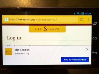
I hope that Chrome on Android will also use ambient badging at some point. To start with though, Chrome notified users that a site was installable by popping up a notification at the bottom of the screen. I think these might be called “toasts”.

Getting the “add to home screen” prompt for https://huffduffer.com/ on Android Chrome. And there’s the “add to home screen” prompt for https://html5forwebdesigners.com/ HTTPS + manifest.json + Service Worker = “Add to Home Screen” prompt. Add to home screen.

Needless to say, the toast notification wasn’t very effective. That’s because we web designers and developers have spent years teaching people to immediately dismiss those notifications without even reading them. Accept our cookies! Sign up to our newsletter! Install our native app! Just about anything that’s user-hostile gets put in a notification (either a toast or an overlay) and shoved straight in the user’s face before they’ve even had time to start reading the content they came for in the first place. Users will then either:

  1. turn around and leave, or
  2. use muscle memory reach for that X in the corner of the notification.

A tiny fraction of users might actually click on the call to action, possibly by mistake.

Chrome didn’t abandon the toast notification for progressive web apps, but it did change when they would appear. Rather than the browser deciding when to show the prompt—usually when the user has just arrived on the site—a new JavaScript event called beforeinstallprompt can be used.

It’s a bit weird though. You have to “capture” the event that fires when the prompt would have normally been shown, subdue it, hold on to that event, and then re-release it when you think it should be shown (like when the user has completed a transaction, for example, and having your site on the home screen would genuinely be useful). That’s a lot of hoops. Here’s the code I use on The Session to only show the installation prompt to users who are logged in.

The end result is that the user is still shown a toast notification, but at least this time it’s the site owner who has decided when it will be shown. The Chrome team call this notification “the mini-info bar”, and Pete acknowledges that it’s not ideal:

The mini-infobar is an interim experience for Chrome on Android as we work towards creating a consistent experience across all platforms that includes an install button into the omnibox.

I think “an install button in the omnibox” means ambient badging in the browser interface, which would be great!

Anyway, back to that thread on Github. Basically, neither Apple nor Mozilla are going to implement the beforeinstallprompt event (well, technically Mozilla have implemented it but they’re not going to ship it). That’s fair enough. It’s an interim solution that’s not ideal for all reasons I’ve already covered.

But there’s a lot of pushback. Even if the details of beforeinstallprompt are troublesome, surely there should be some way for site owners to let users know that can—or should—install a progressive web app? As a site owner, I have a lot of sympathy for that viewpoint. But I also understand the security and usability issues that can arise from bad actors abusing this mechanism.

Still, I have to hand it to Chrome: even if we put the beforeinstallprompt event to one side, the browser still has a mechanism for letting users know that a progressive web app can be installed—the mini info bar. It’s not a great mechanism, but it’s better than nothing. Nothing is precisely what Firefox and Safari currently offer (though Firefox is experimenting with something).

In the case of Safari, not only do they not provide a mechanism for letting the user know that a site can be installed, but since the last iOS update, they’ve buried the “add to home screen” option even deeper in the “sharing sheet” (the list of options that comes up when you press the incomprehensible rectangle-with-arrow-emerging-from-it icon). You now have to scroll below the fold just to find the “add to home screen” option.

So while I totally get the misgivings about beforeinstallprompt, I feel that a constructive alternative wouldn’t go amiss.

And that’s all I have to say about that.

Except… there’s another interesting angle to that Github thread. There’s talk of allowing sites that are launched from the home screen to have access to more features than a site inside a web browser. Usually permissions on the web are explicitly granted or denied on a case-by-case basis: geolocation; notifications; camera access, etc. I think this is the first time I’ve heard of one action—adding to the home screen—being used as a proxy for implicitly granting more access. Very interesting. Although that idea seems to be roundly rejected here:

A key argument for using installation in this manner is that some APIs are simply so powerful that the drive-by web should not be able to ask for them. However, this document takes the position that installation alone as a restriction is undesirable.

Then again:

I understand that Chromium or Google may hold such a position but Apple’s WebKit team may not necessarily agree with such a position.

The Web Share API in Safari on iOS

I implemented the Web Share API over on The Session back when it was first available in Chrome in Android. It’s a nifty and quite straightforward API that allows websites to make use of the “sharing drawer” that mobile operating systems provide from within a web browser.

I already had sharing buttons that popped open links to Twitter, Facebook, and email. You can see these sharing buttons on individual pages for tunes, recordings, sessions, and so on.

I was already intercepting clicks on those buttons. I didn’t have to add too much to also check for support for the Web Share API and trigger that instead:

if (navigator.share) {
  navigator.share(
    {
      title: document.querySelector('title').textContent,
      text: document.querySelector('meta[name="description"]').getAttribute('content'),
      url: document.querySelector('link[rel="canonical"]').getAttribute('href')
    }
  );
}

That worked a treat. As you can see, there are three fields you can pass to the share() method: title, text, and url. You don’t have to provide all three.

Earlier this year, Safari on iOS shipped support for the Web Share API. I didn’t need to do anything. ‘Cause that’s how standards work. You can make use of APIs before every browser supports them, and then your website gets better and better as more and more browsers add support.

But I recently discovered something interesting about the iOS implementation.

When the share() method is triggered, iOS provides multiple ways of sharing: Messages, Airdrop, email, and so on. But the simplest option is the one labelled “copy”, which copies to the clipboard.

Here’s the thing: if you’ve provided a text parameter to the share() method then that’s what’s going to get copied to the clipboard—not the URL.

That’s a shame. Personally, I think the url field should take precedence. But I don’t think this is a bug, per se. There’s nothing in the spec to say how operating systems should handle the data sent via the Web Share API. Still, I think it’s a bit counterintuitive. If I’m looking at a web page, and I opt to share it, then surely the URL is the most important piece of data?

I’m not even sure where to direct this feedback. I guess it’s under the purview of the Safari team, but it also touches on OS-level interactions. Either way, I hope that somebody at Apple will consider changing the current behaviour for copying Web Share data to the clipboard.

In the meantime, I’ve decided to update my code to remove the text parameter:

if (navigator.share) {
  navigator.share(
    {
      title: document.querySelector('title').textContent,
      url: document.querySelector('link[rel="canonical"]').getAttribute('href')
    }
  );
}

If the behaviour of Safari on iOS changes, I’ll reinstate the missing field.

By the way, if you’re making progressive web apps that have display: standalone in the web app manifest, please consider using the Web Share API. When you remove the browser chrome, you’re removing the ability for users to easily share URLs. The Web Share API gives you a way to reinstate that functionality.

Ch-ch-ch-changes

It’s browser updatin’ time! Firefox 65 just dropped. So did Chrome 72. Safari 12.1 is shipping with iOS 12.2.

It’s interesting to compare the release notes for each browser and see the different priorities reflected in them (this is another reason why browser diversity is A Good Thing).

A lot of the Firefox changes are updates to dev tools; they just keep getting better and better. In fact, I’m not sure “dev tools” is the right word for them. With their focus on layout, typography, and accessibility, “design tools” might be a better term.

Oh, and Firefox is shipping support for some CSS properties that really help with print style sheets, so I’m disproportionately pleased about that.

In Safari’s changes, I’m pleased to see that the datalist element is finally getting implemented. I’ve been a fan of that element for many years now. (Am I a dork for having favourite HTML elements? Or am I a dork for even having to ask that question?)

And, of course, it wouldn’t be a Safari release without a new made up meta tag. From the people who brought you such hits as viewport and apple-mobile-web-app-capable, comes …supported-color-schemes (Apple likes to make up meta tags almost as much as Google likes to make up rel values).

There’ll be a whole bunch of improvements in how progressive web apps will behave once they’ve been added to the home screen. We’ll finally get some state persistence if you navigate away from the window!

Updated the behavior of websites saved to the home screen on iOS to pause in the background instead of relaunching each time.

Maximiliano Firtman has a detailed list of the good, the bad, and the “not sure yet if good” for progressive web apps on iOS 12.2 beta. Thomas Steiner has also written up the progress of progressive web apps in iOS 12.2 beta. Both are published on Ev’s blog.

At first glance, the release notes for Chrome 72 are somewhat paltry. The big news doesn’t even seem to be listed there. Maximiliano Firtman again:

Chrome 72 for Android shipped the long-awaited Trusted Web Activity feature, which means we can now distribute PWAs in the Google Play Store!

Very interesting indeed! I’m not sure if I’m ready to face the Kafkaesque process of trying to add something to the Google Play Store just yet, but it’s great to know that I can. Combined with the improvements coming in iOS 12.2, these are exciting times for progressive web apps!

Greater expectations

I got an intriguing email recently from someone who’s a member of The Session, the community website about Irish traditional music that I run. They said:

When I recently joined, I used my tablet to join. Somewhere I was able to download The Session app onto my tablet.

But there is no native app for The Session. Although, as it’s a site that I built, it is, a of course, progressive web app.

They went on to say:

I wanted to put the app on my phone but I can’t find the app to download it. Can I have the app on more than one device? If so, where is it available?

I replied saying that yes, you can absolutely have it on more than one device:

But you don’t find The Session app in the app store. Instead you go to the website https://thesession.org and then add it to your home screen from your browser.

My guess is that this person had added The Session to the home screen of their Android tablet, probably following the “add to home screen” prompt. I recently added some code to use the window.beforeinstallprompt event so that the “add to home screen” prompt would only be shown to visitors who sign up or log in to The Session—a good indicator of engagement, I reckon, and it should reduce the chance of the prompt being dismissed out of hand.

So this person added The Session to their home screen—probably as a result of being prompted—and then used it just like any other app. At some point, they didn’t even remember how the app got installed:

Success! I did it. Thanks. My problem was I was looking for an app to download.

On the one hand, this is kind of great: here’s an example where, in the user’s mind, there’s literally no difference between the experience of using a progressive web app and using a native app. Win!

But on the other hand, the expectation is still that apps are to be found in an app store, not on the web. This expectation is something I wrote about recently (and Justin wrote a response to that post). I finished by saying:

Perhaps the inertia we think we’re battling against isn’t such a problem as long as we give people a fast, reliable, engaging experience.

When this member of The Session said “My problem was I was looking for an app to download”, I responded by saying:

Well, I take that as a compliment—the fact that once the site is added to your home screen, it feels just like a native app. :-)

And they said:

Yes, it does!