Journal tags: usability

10

sparkline

Authentication

Two-factor authentication is generally considered A Good Thing™️ when you’re logging in to some online service.

The word “factor” here basically means “kind” so you’re doing two kinds of authentication. Typical factors are:

  • Something you know (like a password),
  • Something you have (like a phone or a USB key),
  • Something you are (biometric Black Mirror shit).

Asking for a password and an email address isn’t two-factor authentication. They’re two pieces of identification, but they’re the same kind (something you know). Same goes for supplying your fingerprint and your face: two pieces of information, but of the same kind (something you are).

None of these kinds of authentication are foolproof. All of them can change. All of them can be spoofed. But when you combine factors, it gets a lot harder for an attacker to breach both kinds of authentication.

The most common kind of authentication on the web is password-based (something you know). When a second factor is added, it’s often connected to your phone (something you have).

Every security bod I’ve talked to recommends using an authenticator app for this if that option is available. Otherwise there’s SMS—short message service, or text message to most folks—but SMS has a weakness. Because it’s tied to a phone number, technically you’re only proving that you have access to a SIM (subscriber identity module), not a specific phone. In the US in particular, it’s all too easy for an attacker to use social engineering to get a number transferred to a different SIM card.

Still, authenticating with SMS is an option as a second factor of authentication. When you first sign up to a service, as well as providing the first-factor details (a password and a username or email address), you also verify your phone number. Then when you subsequently attempt to log in, you input your password and on the next screen you’re told to input a string that’s been sent by text message to your phone number (I say “string” but it’s usually a string of numbers).

There’s an inevitable friction for the user here. But then, there’s a fundamental tension between security and user experience.

In the world of security, vigilance is the watchword. Users need to be aware of their surroundings. Is this web page being served from the right domain? Is this email coming from the right address? Friction is an ally.

But in the world of user experience, the opposite is true. “Don’t make me think” is the rallying cry. Friction is an enemy.

With SMS authentication, the user has to manually copy the numbers from the text message (received in a messaging app) into a form on a website (in a different app—a web browser). But if the messaging app and the browser are on the same device, it’s possible to improve the user experience without sacrificing security.

If you’re building a form that accepts a passcode sent via SMS, you can use the autocomplete attribute with a value of “one-time-code”. For a six-digit passcode, your input element might look something like this:

<input type="text" maxlength="6" inputmode="numeric" autocomplete="one-time-code">

With one small addition to one HTML element, you’ve saved users some tedious drudgery.

There’s one more thing you can do to improve security, but it’s not something you add to the HTML. It’s something you add to the text message itself.

Let’s say your website is example.com and the text message you send reads:

Your one-time passcode is 123456.

Add this to the end of the text message:

@example.com #123456

So the full message reads:

Your one-time passcode is 123456.

@example.com #123456

The first line is for humans. The second line is for machines. Using the @ symbol, you’re telling the device to only pre-fill the passcode for URLs on the domain example.com. Using the # symbol, you’re telling the device the value of the passcode. Combine this with autocomplete="one-time-code" in your form and the user shouldn’t have to lift a finger.

I’m fascinated by these kind of emergent conventions in text messages. Remember that the @ symbol and # symbol in Twitter messages weren’t ideas from Twitter—they were conventions that users started and the service then adopted.

It’s a bit different with the one-time code convention as there is a specification brewing from representatives of both Google and Apple.

Tess is leading from the Apple side and she’s got another iron in the fire to make security and user experience play nicely together using the convention of the /.well-known directory on web servers.

You can add a URL for /.well-known/change-password which redirects to the form a user would use to update their password. Browsers and password managers can then use this information if they need to prompt a user to update their password after a breach. I’ve added this to The Session.

Oh, and on that page where users can update their password, the autocomplete attribute is your friend again:

<input type="password" autocomplete="new-password">

If you want them to enter their current password first, use this:

<input type="password" autocomplete="current-password">

All of the things I’ve mentioned—the autocomplete attribute, origin-bound one-time codes in text messages, and a well-known URL for changing passwords—have good browser support. But even if they were only supported in one browser, they’d still be worth adding. These additions do absolutely no harm to browsers that don’t yet support them. That’s progressive enhancement.

Installing Progressive Web Apps

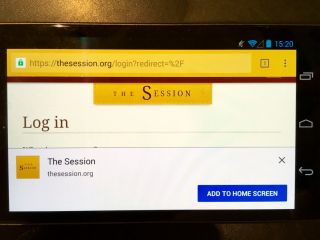
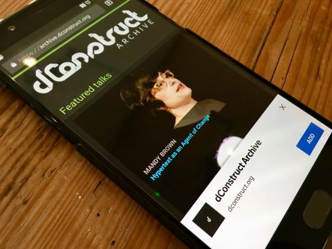
When I was testing the dConstruct Audio Archive—which is now a Progressive Web App—I noticed some interesting changes in how Chrome on Android offers the “add to home screen” prompt.

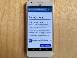
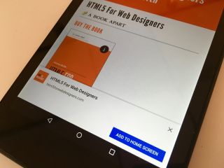
It used to literally say “add to home screen.”

Getting the “add to home screen” prompt for https://huffduffer.com/ on Android Chrome. And there’s the “add to home screen” prompt for https://html5forwebdesigners.com/ HTTPS + manifest.json + Service Worker = “Add to Home Screen” prompt. Add to home screen.

Now it simply says “add.”

The dConstruct Audio Archive is now a Progressive Web App

I vaguely remember there being some talk of changing the labelling, but I could’ve sworn it was going to change to “install”. I’ve got to be honest, just having the word “add” doesn’t seem to provide much context. Based on the quick’n’dirty usability testing I did with some co-workers, it just made things confusing. “Add what?” “What am I adding?”

Additionally, the prompt appeared immediately on the first visit to the site. I thought there was supposed to be an added “engagement” metric in order for the prompt to appear; that the user needs to visit the site more than once.

You’d think I’d be happy that users will be presented with the home-screen prompt immediately, but based on the behaviour I saw, I’m not sure it’s a good thing. Here’s what I observed:

  1. The user types the URL archive.dconstruct.org into the address bar.
  2. The site loads.
  3. The home-screen prompt slides up from the bottom of the screen.
  4. The user immediately moves to dismiss the prompt (cue me interjecting “Don’t close that!”).

This behaviour is entirely unsurprising for three reasons:

  1. We web designers and web developers have trained users to dismiss overlays and pop-ups if they actually want to get to the content. Nobody’s going to bother to actually read the prompt if there’s a 99% chance it’s going to say “Sign up to our newsletter!” or “Take our survey!”.
  2. The prompt appears below the “line of death” so there’s no way to tell it’s a browser or OS-level dialogue rather than a JavaScript-driven pop-up from the site.
  3. Because the prompt now appears on the first visit, no trust has been established between the user and the site. If the prompt only appeared on later visits (or later navigations during the first visit) perhaps it would stand a greater chance of survival.

It’s still possible to add a Progressive Web App to the home screen, but the option to do that is hidden behind the mysterious three-dots-vertically-stacked icon (I propose we call this the shish kebab icon to distinguish it from the equally impenetrable hamburger icon).

I was chatting with Andreas from Mozilla at the View Source conference last week, and he was filling me in on how Firefox on Android does the add-to-homescreen flow. Instead of a one-time prompt, they’ve added a persistent icon above the “line of death” (the icon is a combination of a house and a plus symbol).

When a Firefox 58 user arrives on a website that is served over HTTPS and has a valid manifest, a subtle badge will appear in the address bar: when tapped, an “Add to Home screen” confirmation dialog will slide in, through which the web app can be added to the Android home screen.

This kind of badging also has issues (without the explicit text “add to home screen”, the user doesn’t know what the icon does), but I think a more persistently visible option like this works better than the a one-time prompt.

Firefox is following the lead of the badging approach pioneered by the Samsung Internet browser. It provides a plus symbol that, when pressed, reveals the options to add to home screen or simply bookmark.

What does it mean to be an App?

I don’t think Chrome for Android has any plans for this kind of badging, but they are working on letting the site authors provide their own prompts. I’m not sure this is such a good idea, given our history of abusing pop-ups and overlays.

Sadly, I feel that any solution that relies on an unrequested overlay is doomed. That’s on us. The way we’ve turned browsing the web—especially on mobile—into a frustrating chore of dismissing unwanted overlays is a classic tragedy of the commons. We blew it. Users don’t trust unrequested overlays, and I can’t blame them.

For what it’s worth, my opinion is that ambient badging is a better user experience than one-time prompts. That opinion is informed by a meagre amount of testing though. I’d love to hear from anyone who’s been doing more detailed usability testing of both approaches. I assume that Google, Mozilla, and Samsung are doing this kind of testing, and it would be really great to see the data from that (hint, hint).

But it might well be that ambient badging is just too subtle to even be noticed by the user.

On one end of the scale you’ve got the intrusiveness of an add-to-home-screen prompt, but on the other end of the scale you’ve got the discoverability problem of a subtle badge icon. I wonder if there might be a compromise solution—maybe a badge icon that pulses or glows on the first or second visit?

Of course that would also need to be thoroughly tested.

Testing

It’s tempting to think of testing with screen-readers as being like testing with browsers. With browser testing, you’re checking to see how a particular piece of software deals with the code you’re throwing at it. A screen reader is a piece of software too, so it makes sense to approach it the same way, right?

I don’t think so. I think it’s really important that if someone is going to test your site with a screen reader, it should be someone who uses a screen reader every day.

Think of it this way: you wouldn’t want a designer or developer to do usability testing by testing the design or code on themselves. That wouldn’t give you any useful data. They’re already familiar with what problems the design is supposed to be solving, and how the interface works. That’s why you need to do usability testing with someone from outside, someone who wasn’t involved in the design or development process.

It’s no different when it comes to users of assistive technology. You’re not trying to test their technology; you’re trying to test how well the thing you’re building works for the person using the technology.

In short:

Don’t think of screen-reader testing as a form of browser testing; think of it as a form of usability testing.

Jared Spool: The Secret Lives of Links

The final speaker of the first day of An Event Apart in Boston is Jared Spool. Now, when Jared gives a talk …well, you really have to be there. So I don’t know how well liveblogging is going to work but here goes anyway.

The talk is called The Secret Lives of Links. He starts by talking about one of the pre-eminent young scientists in the USA: Lisa Simpson. One day, she lost a tooth, put it in a bowl and when she later examined it under a microscope, she discovered a civilisation going about its business, all the citizens with their secret lives.

The web is like that.

Right before the threatened government shutdown, Jared was looking at news sites and how they were updating their links. Jared suggests that CNN redesign its site to simply have this list of links:

  1. The most important story.
  2. The second most important story.
  3. The third most important story.
  4. An unimportant, yet entertaining story.
  5. The Charlie Sheen story.

But of course it doesn’t work like that. The content of the links tells the importance. Links secretly live to drive the user to their content.

Compare the old CNN design to the current one. The visual design is different but the underlying essence is the same. The links work the same way.

All the news sites were reporting the imminent government shutdown with links that had different text but were all doing the same thing.

Jared has been working on the web since 1995. That whole time, he’s been watching users use websites. The pattern he has seen is that the content speaks to the user through the links. Everything hinges on the links. They provide the scent of information.

This goes back to a theory at Xerox PARC: if you modelled user behaviour when searching for information, it’s very much like a fox sniffing a trail. The users are informavores.

We can see this in educational websites. The designs may change but links are the constant.

http://xkcd.com/773/

We’ve all felt the pain of battling the site owner who wants to prioritise content that the users aren’t that interested in.

The Walgreens site is an interesting example. One fifth of the visitors follow the “photo” link. 16% go to search. The third most important link is about refilling prescriptions. The fourth is the pharmacy link. The fifth most used links is finding the physical stores. Those five links add up to 59% of the total traffic …but those links take up just 3.8% of the page.

This violates Fitts’s Law:

The speed that a user can acquire a target is proportional to the size of the target and indirectly proportional to the distance from the target.

Basically, the bigger and closer, the easier to hit. The Walgreens site violates that. Now, it would look ugly if the “photo” link was one fifth of the whole page, but the point remains: there’s a lot of stuff being foisted on the user by the business.

Another example of Fitts’s Law are those annoying giant interstitial ads that have tiny “close” links.

Deliver users to their desired objective. Give them links that communicate scent in a meaningful way. Make the real estate reflect the user’s desires.

Let’s go back to an educational web site: Ohio State. People come to websites for all sorts of reasons. Most people don’t just go to a website just to see how it looks (except for us). People go to the Ohio State website to get information about grades and schedules. The text of these links are called trigger words: the trigger an action from the user. When done correctly, trigger words lead the user to their desired goal.

It’s hard to know when your information scent is good, but it’s easy to know when your information scent is bad. User behaviour will let you know: using the back button, pogo-sticking, and using search.

Jared has seen the same patterns across hundreds of sites that he’s watched people using. They could take all the clickstreams that succeeded and all the clickstreams that failed. For 15 years there’s a consistent 58% failure rate. That’s quite shocking.

One pattern that emerges in the failed clickstreams is the presence of the back button. If a user hits the back button, the failure rate of those clickstreams rises to above 80%. If a user hits the back button twice, the failure rate rises to 98%.

The back button is the button of doom.

The user clicks the back button when they run out of scent, just like a fox circling back. But foxes succeed ‘cause rabbits are stupid and they go back to where they live and eat, so the fox can go back there and wait. Users hit the back button hoping that the page will somehow have changed when they get back.

Pay attention to the back button. The user is telling you they’ve lost the scent.

Another behaviour is pogo-sticking, hopping back and forward from a “gallery” page with a list of links to the linked pages. Pogo-sticking results in a failure rate of 89%. There’s a myth with e-commerce sites that users want to pogo-stick between product pages to compare product pages but it’s not true: the more a user pogo-sticks, the less likely they are to find what they want and make a purchase.

Users scan a page looking for trigger words. If they find a trigger word, they click on it but if they don’t find it, they go to search. That’s the way it works on 99% of sites, although Amazon is an exception. That’s because Amazon has done a great job of training users to know that absolutely nothing on the home page is of any use.

Some sites try to imitate Google and just have a search box. Don’t to that.

A more accurate name for the search box would be B.Y.O.L.: Bring Your Own Link. What do people type into this box: trigger words!

Pro tip: your search logs are completely filled with trigger words. Have you looked there lately? Your users are telling you what your trigger words should be. If you’re tracking where searches come from, you even know on what pages you should be putting those trigger words.

The key thing to understand is that people don’t want to search. There’s a myth that some people prefer to search. It’s the design of the site that forces them to search. The failure rate for search is 70%.

Jared imagines an experiment called the 7-11 milk experiment. Imagine that someone has run out of milk. We take them to the nearest 7-11. We give them the cash to buy milk. There should be a 100% milk-purchasing result.

That’s what Jared does with websites. He gives people the cash to buy a product, brings them to the website and asks them to purchase the product. Ideally you should see a 100% spending rate. But the best performing site—The Gap—got a 66% spending. The worst site got 6%.

The top variables that contributed to this pattern are: the ratio of number of pages to purchase. Purchases were made at Gap.com in 11.9 pages. On the worst performers, the ratio was 51 pages per purchase. You know what patterns they saw in the worst performers: back button usage, pogo-sticking and search.

Give users information they want. Pages that we would describe as “cluttered” don’t appear that way to a user if the content is what the user wants. Clutter is a relative term based on how much you are interested in the content.

It’s hard to show you good examples of information scent because you’re not the user looking for something specific. Good design is invisible. You don’t notice air conditioning when it’s set just right, only when it’s too hot or too cold. We don’t notice good design.

Links secretly live to look good …while still looking like links. There was a time when the prevailing belief was that links are supposed to be blue and underlined. We couldn’t have made a worse choice. Who decided that? Not designers. Astrophysicists at CERN decided. As it turns, blue is the hardest colour to perceive. Men start to lose the ability to perceive blue at 40. Women start to lose the ability at 55 …because they’re better. Underlines change the geometry of a word, slowing down reading speed.

Thankfully we’ve moved on and we can have “links of colour.” But sometimes we take it far, like the LA Times, where it’s hard to figure out what is and isn’t a link. Users have to wave their mouse around on the page hoping that the browser will give them the finger.

Have a consistent vocabulary. Try to make it clear which links leads to a different page and which links perform on action on the current page.

We confuse users with things that look like links, but aren’t.

Links secretly live to do what the user expects.

Place your links wisely. Don’t put links to related articles in the middle of an article that someone is reading.

Don’t use mystery meat navigation. Users don’t move their mouse until they know what they’re going to click on so don’t hide links behind a mouseover: by the time those links are revealed, it’s too late: users have already made a decision on what they’re going to click. Flyout menus are the worst.

Some of Jared’s favourite links are “Stuff our lawyers made us put here”, “Fewer choices” and “Everything else.”

In summary, this is what links secretly want to do:

  • Deliver users to their desired objective.
  • Emit the right scent.
  • Look good, while still looking like a link.
  • Do what the user expects.

Caveat

This is a disclaimer.

I have been writing and talking a lot about responsive web design, a pattern that I think emerges naturally from the principle of universal design. I will continue to write and talk about responsive and universal design in the future and I will continue to advocate a “one web” approach to treating all users fairly regardless of ability or device.

But here’s the thing: I am fully aware that there is no one correct answer to every situation. So even though I’m going to continue to bang the drum of one web, I’m not actually foolish enough to think that it’s a cure-all. I’m taking a deliberately Friedian approach in order to back up a stance that I think is woefully under-represented in most discussions of modern web development.

If you’re looking for the more honest, truthful answer to pretty much any question on web design and usability, here it is:

It depends.

I now return you to your regular schedule of absolutist self-righteous claims.

Silverbacking

It’s been a busy week for Clearleft. I wasn’t in the office for the start of the week though; I was in up north delivering some Ajax training to the good people at the Library of the University of Liverpool. Alas, due to construction work, I didn’t have the chance to peruse the world-famous science fiction collection. I’ll just have to return to Merseyside sometime when the builders are gone.

I made it back to Brighton in time to press the proverbial button and launch the website of Silverback, the project that’s been keeping a portion of Clearleft very busy for a while now.

It’s been fascinating to watch Silverback take shape from the spark of an idea from Andy to the conflagration that is desktop software development. It’s been a learning experience for everyone involved. If you want to delve into all the details, be sure to read Garrett’s in-depth look at Silverback.

I didn’t have that much to do with the development. In fact, all I did was mark up and style the website (oh, and integrate the PayPal stuff …joy). Still, I’ve found myself caught up in the excitement of an honest-to-goodness product launch. We’ve all been tracking the feedback on Twitter and on blogs. On the whole, it seems like people really, really like it. But what’s far more important than whether people do or don’t buy this piece of software is the fact that people are talking about usability testing.

Silverback is all about usability testing — Rich has summed up exactly what Silverback does nicely. It’s a Mac app that we built to scratch our own itch. We wanted a way to be able to run usability tests quickly and cheaply.

Usability testing is one of those things that always seems to be amongst the first to get cut from projects, usually because of cost or time concerns. Maybe Silverback can help tip the balance back in favour of doing at least some usability testing even if it’s really quick’n’dirty.

I’m constantly amazed by just how far a little user-testing goes. The analysis of the results needn’t be time-consuming either. Having a handful of people try out your wireframes can lead to forehead-slapping revelations of obvious issues.

So I’m really happy that, if nothing else, Silverback will encourage more people to think about doing some quick usability tests. I guarantee that after just one round, the benefits will be so self-evident that usability testing will become indispensable.

There’s one other forthcoming release that I’m hoping will spur on the growth of usability testing. It’s not another piece of software. A little birdie tells me that Steve Krug—author of the classic Don’t Make Me Think—is writing a new book on… yup, quick and easy usability testing.

The rewards of usability testing are within reach for the price of one book and one piece of ~$50 dollar software.

Outgoing

As a web developer, I get annoyed by interaction design implementations all the time: Why is that a link instead of a form button?, Why doesn’t that scale when I bump up the font size?, Why am I being asked to enter this unnecessary information?… Usually I can brush off these annoyances and continue my journey along the threads of the World Wide Web but there’s one “feature” that has irked me to point of distraction and it’s all the more irritating for being on a site I use habitually: Upcoming.

As an Upcoming user, I have a default location. In my case it’s Brighton. This location is important. My location determines what content gets served up to me on the front page of the site—a useful way of discovering local events of interest.

The site also has a search feature. The search form has two components: what I’m searching for and where I’m searching for it. The “where” field defaults to my location, which is a handy little touch. If I want to search for something outside my current location—say the Future of Web Design conference in London this April—I can enter “Future of Web Design” in the “what” field and delete “Brighton” from the “where” field, replacing it with “London”. That works: I have now narrowed down my search to the location “London.”

Here’s the problem: if I now return to the front page I will find that my location is London. That’s right: simply by searching in a place, the system assumes that I now want that to be my location. You know what they say about assumptions, right? In this case, not only has it made an ass out of me, it has, over time, instilled a fear of searching.

I’ll be in San Francisco at the end of this month so I’d like to see what’s going on while I’m there. But once I’ve finished my searching I must remember to reset my location back to Brighton. Knowing this makes me hesitant to use the search form. No doubt the justification for this unexpected behaviour in the search is to second-guess what people really want: do as I want, not as I say. But when I search, I really just want to search. I suspect the same is true of most people.

Normally I wouldn’t rant about an obviously-flawed feature but in this case it’s a feature that can be easily fixed by simply being removed. Here is the current flow:

  1. The user enters a search term in the “what” field, a location in the “where” field and submits the search form.
  2. The system returns a list of search results for the specified term in the specified place.
  3. The system changes the user’s location to the specified place.

That third step is completely unnecessary. Its omission would not harm the search functionality one whit and it would make the search interface more truthful and less duplicitous.

I’ve already mentioned this on the Upcoming suggestion board. If you can think of a good reason why the current behaviour should stay, please add your justification there. If, like me, you’d like to see a search feature that actually just searches, please let your voice be heard there too.

Please Leonard, Neil, I kvetch because I care. I use Upcoming all the time. It would be a butt-kicking service if it weren’t for this one glaring flaw… even without a liquid layout.

Update: Fixed!

Weak signal

Remember when I went off an a big rant a while back about some very badly-designed pedestrian signals? My opinion has only strengthened since I wrote that diatribe.

Those signals of insanity appear to be slowly taking over the whole country. I was in Norwich last week to talk about DOM Scripting and Ajax with the good folks at Norwich Union, two of whom I had already met at the dConstruct microformats workshop. While I was out and about in downtown Norwich during a lunch break, I couldn’t help but notice that the city was infested with the aforementioned signals.

I brought them up during the Ajax workshop—they’re a perfect example of terrible affordances and even worse feedback; both very relevant aspects of Ajax interface design. Nobody had a kind word to say about the devices. One of the attendees described how, just that day, he had managed to stop an elderly couple from getting run over by a bus; they were understandably confused by the awful pedestrian signals.

It’s quite gratifying that I everybody I talk to about this feels the same as I do. Those excruciatingly awfully-designed objects are going to cause fatalities, if they haven’t already.

I couldn’t help but feel vindicated when, walking down Norwich’s wonderfully-named Rampant Horse Street, I saw signs attached to the pedestrian signals on both sides of the road that read:

PEDESTRIANS—YOUR RED/GREEN MAN SIGNAL IS ON THE POLE NEXT TO YOU

Signs of a bad UI

Apart from providing a good giggle about what a “man signal” might be, these public-facing instructions are a damning indictment of terrible interaction design. If I need to RTFM before crossing the street, something is seriously wrong with the user interface. I’m tempted to apend my own all-caps message to the signs:

DO NOT WANT

The tyranny of mouseover

If I click on a link, I am initiating an action. If I fill in a form and press a submit button, I am initiating an action. But if I move my mouse over a page element, I am not initiating an action. Chances are I’m on my way to initiating an action (like clicking a link or pressing a button) but if I brush past a link on the way, that does not mean that I want something to happen in response.

Most browsers display the value of a title attribute as a tool-tip after a suitable pause. Generally this works pretty well as long as the tool-tip is relatively small and self-contained. Ever come across an instance of a title attribute with a large amount of text? It just feels wrong. There are economies of scale when it comes to displaying information triggered by a mouseover.

All of this is by way of introduction to the topic of those bloody annoying Snap previews that are quite literally popping up all over the place.

I’m not alone in my annoyance. Lorelle VanFossen has put together an excellent list of the problems caused by these rude and intrusive interlopers. As well as listing the accessibility issues for low-vision and motor-impaired users, she makes the very valid point that these pop-ups actively destroy the act of reading:

There’s a small author-part of me that hopes what I write resembles some action-packed-page-turning-thriller and that people are glued to their screens eagerly embracing every word I write. I’d hate to have that experience be interrupted by an annoying pop-up window of any kind. Destroys the interaction of the reader with the written word, doesn’t it?

The way that the developers at Snap view web pages reminds of the Far Side cartoon:

Blah blah LINK blah blah blah blah blah blah blah blah LINK blah blah blah blah blah…

Lorelle’s frustration is particularly acute because the Snap previews showed up on her Wordpress.com blog because Matt thought it would be cool to roll out this “feature” to 10% of Wordpress.com users.

Luckily, Lorelle and other hijacked blogs can turn the feature off. As pointed out by John Gruber, Jason Kottke and Michael Heilemann, the rest of us can also deactivate these annoying things. I should also point out that you can deactivate them directly from a preview by clicking on the “options” link in the pop-up and setting either a local or a global cookie to switch off the previews.

But this is like opt-out spam. I shouldn’t be confronted by these intrusive and annoying pop-ups to begin with. Offering them as a feature to users who want them strikes me as a perfectly reasonable implementation. This is the perfect example of something that should have been implemented like a Greasemonkey script: give users the choice and the power to activate this flashy feature. But don’t foist it on us and then claim it’s our responsibility to disable it.

If you haven’t seen the Snap previews in action, you can find them on TechCrunch and Vitamin, to give just two examples. Their presence on TechCrunch isn’t really surprising given that the site is devoted to pointing out all that is flashy and pointless on the web. But the gang over at Vitamin really ought to know better.

Mixed signals

When I attended Reboot 8 earlier this year, it was my first time visiting Denmark. From the moment I left the airport in Copenhagen, I was struck by how smoothly everything seemed to work.

On the train journey into town, Tom and I found all sorts of nice usability features in our carriage. You can tell a lot about a country from its public transport system and, based on my experiences, Denmark was like a country that had been designed by Apple.

One week previously, I had been in Manchester delivering an Ajax workshop. There I saw a shockingly badly designed object.

Red pedestrian signal

I had heard about these new pedestrian signals but nothing could have prepared me for how awful they are.

Most pedestrian signals around the world work much the same way. The signal is positioned across the road from the user above head height. The control for the signal is on the same side of the road as the user. The exact design of the signal and the control can vary enormously from place to place but the basic principle is the same.

When the signal changes (red to green, “don’t walk” to “walk”, etc.), the pedestrian moves towards the signal. Because the signal is placed in the location that the user is trying to reach, it serves a dual purpose. It acts as an indicator of safety and as a goal.

The pedestrian signals I saw in Manchester are placed at waist height. As soon as two or more people are waiting to cross the road, the signal is blocked.

Green pedestrian signal

Worst of all, the signal and the control share the same space. Once the pedestrian begins walking, there is no safety indicator. When you’re halfway across the road, you have no idea whether or not it is safe.

Oh, and there’s no audio signal either. That’s a feature built in to most of the older pedestrian signals in England that has been removed from these newer models. If you’re visually impaired, you are well and truly screwed. Even if you’re not, you’re missing a valuable safety cue. As is so often the case, accessibility features end up benefiting everyone.

I cannot understand how these pedestrian signals made it off the drawing board, much less on to the streets of Manchester and other towns in the UK. It’s not just bad design, it’s dangerous design.

Richard once told me about a risk assessment from his previous incarnation as an engineer. He had to determine whether workers on a pipeline above the arctic circle would be safe from polar bear attacks. The results showed that there was a chance that 1.5 people could be killed every thousand years. That was deemed unsafe. Human life is valuable.

These pedestrian signals have clearly not been assessed for risks or tested for usability.

Let’s be clear about this. These signals are new. They are inferior to the old signals. It costs money to remove the old pedestrian signals and replace them with the newer, more craptactular ones.

It beggars belief.

Kathy Sierra wrote recently about differences between US and European design. This is something I’ve written about before. I don’t necessarily belief that design is better or worse on either continent, just that cultural differences underpin what is considered good design. It’s clear to me now that the design differences within Europe itself might be wider than the Atlantic ocean.

The attitude towards design in the UK seems to reflect the attitude towards life; a grumbling acceptance that putting up with inconvenience is all part of the human condition. Perhaps secretly it’s the grumbling that we enjoy. The weather may be beyond human control, but the queuing, the public transport and the quality of beer aren’t.

The Design of Everyday Things by Donald A. Norman would be a much shorter book had he never lived in England. Almost all of the examples of bad design are drawn from everyday life in this country, including the infamous slam-door trains.

Terry Gilliam’s Brazil is a wonderful dystopian vision extrapolated from the England of today. As well as the usual repressive regime of all Orwellian futures, it depicts a life filled with beaureacracy, inconvenience and unusable design.

Ray Bradbury once said of science-fiction:

We do this not to predict the future but to prevent it.

I want to find out who is responsible for designing the new pedestrian signals, who is responsible for — forgive the pun — giving them the green light, and who is responsible for deciding where they are implemented. I don’t want to see these things on the streets of Brighton.