Notice
We’ve been doing a lot of soul-searching at Clearleft recently; examining our values; trying to make implicit unspoken assumptions explicit and spoken. That process has unearthed some activities that have been at the heart of our company from the very start—sharing, teaching, and nurturing. After all, Clearleft would never have been formed if it weren’t for the generosity of people out there on the web sharing with myself, Andy, and Richard.
One of the values/mottos/watchwords that’s emerging is “Share what you learn.” I like that a lot. It echoes the original slogan of the World Wide Web project, “Share what you know.” It’s been a driving force behind our writing, speaking, and events.
In the same spirit, we’ve been running internship programmes for many years now. John is the latest of a long line of alumni that includes Anna, Emil, and James.
By the way—and this should go without saying, but apparently it still needs to be said—the internships are always, always paid. I know that there are other industries where unpaid internships are the norm. I’ve even heard otherwise-intelligent people defend those unpaid internships for the experience they offer. But what kind of message does it send to someone about the worth of their work when you withhold payment for it? Our industry is young. Let’s not fall foul of the pernicious traps set by older industries that have habitualised exploitation.
In the past couple of years, Andy concocted a new internship scheme:
So this year we decided to try a different approach by scouring the end of year degree shows for hot new talent. We found them not in the interaction courses as we’d expected, but from the worlds of Product Design, Digital Design and Robotics. We assembled a team of three interns , with a range of complementary skills, gave them a space on the mezzanine floor of our new building, and set them a high level brief.
The first such programme resulted in Chüne. The latest Clearleft internship project has just come to an end. The result is Notice.
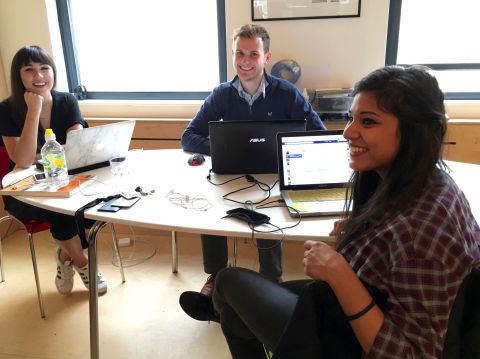
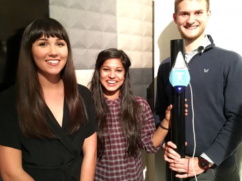
This time ‘round, the three young graduates were Chloe, Chris and Monika. They each have differing but complementary skill sets: Chloe is a user interface designer; Chris is a product designer; Monika is an artist who knows her way around hardware hacking and coding.
Once again, they were set a fairly loose brief. They should come up with something “to enrich the lives of local residents” and it should have a physical and digital component to it.
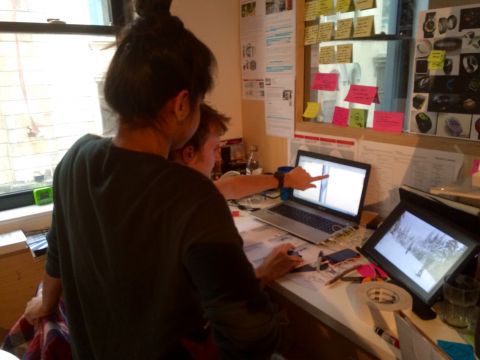
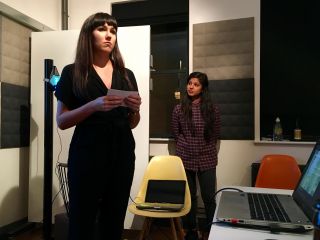
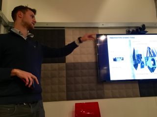
They got stuck in to researching and brainstorming ideas. At the end of each week, we’d all gather together to get a playback of what they were coming up with. It was at these playbacks that the interns were introduced to a concept that they will no doubt encounter again in their professional lives: seagulling AKA the swoop and poop. For once, it was the Clearlefties who were in the position of being swoop-and-poopers, rather than swoop-and-poopies.

As the midway point of the internship approached, there were some interesting ideas, but no clear “winner” to pursue. Something else was happening around this time too: dConstruct 2015.

The interns pitched in with helping out at the event, and in return, we kidnapped some of the speakers—namely John Willshire and Chris Noessel—to offer them some guidance.
There was also plenty of inspiration to be had from the dConstruct talks themselves. One talk in particular struck a chord: Dan Hill’s The City Of Things …especially the bit where he railed against the terrible state of planning application notices:
Most of the time, it ends up down the bottom of the lamppost—soiled and soggy and forgotten. This should be an amazing thing!
Hmm… sounds like something that could enrich the lives of local residents.
Not long after that, Matt Webb came to visit. He encouraged the interns to focus in on just the two ideas that really excited them rather then the 5 or 6 that they were considering. So at the next playback, they presented two potential projects—one about biking and the other about city planning. They put it to a vote and the second project won by a landslide.
That was the genesis of Notice. After that, they pulled out all the stops.
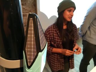
Not content with designing one device, they came up with a range of three devices to match the differing scope of planning applications. They set about making a working prototype of the device intended for the most common applications.

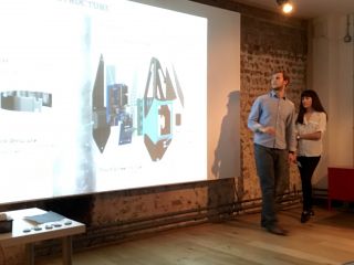
Last week marked the end of the project and the grand unveiling.
They’ve done a great job. All the details are on the website, including this little note I wrote about the project:
This internship programme was an experiment for Clearleft. We wanted to see what would happen if you put through talented young people in a room together for three months to work on a fairly loose brief. Crucially, we wanted to see work that wasn’t directly related to our day-to-day dealings with web design.
We offered feedback and advice, but we received so much more in return. Monika, Chloe, and Chris brought an energy and enthusiasm to the Clearleft office that was invigorating. And the quality of the work they produced together exceeded our wildest expectations.
We hereby declare this experiment a success!
Personally, I think the work they’ve produced is very strong indeed. It would be a shame for it to end now. Perhaps there’s a way that it could be funded for further development. Here’s hoping.


As impressed as I am with the work, I’m even more impressed with the people. They’re not just talented and hard work—they’re a jolly nice bunch to have around.
