Journal tags: redesign

5

sparkline

Two decades of thesession.org

On June 3rd, 2001, I launched thesession.org. Happy twentieth birthday to The Session!

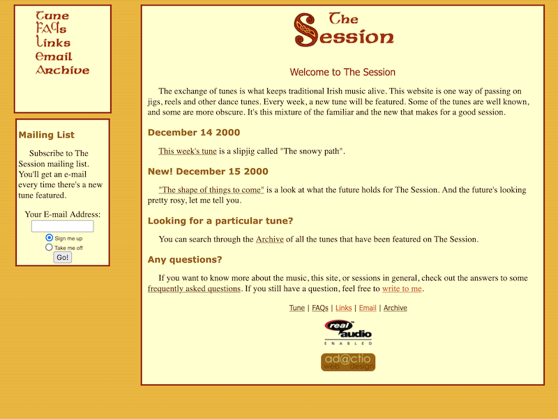
Although actually The Session predates its domain name by a few years. It originally launched as a subdirectory here on adactio.com with the unwieldly URL /session/session.shtml

A screenshot of the first version of The Session

That incarnation was more like a blog. I’d post the sheetmusic for a tune every week with a little bit of commentary. That worked fine until I started to run out of tunes. That’s when I made the site dynamic. People could sign up to become members of The Session. Then they could also post tunes and add comments.

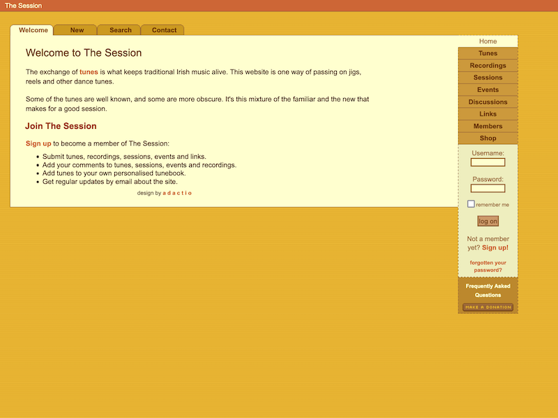
A screenshot of the second version of The Session

That’s the version that is two decades old today.

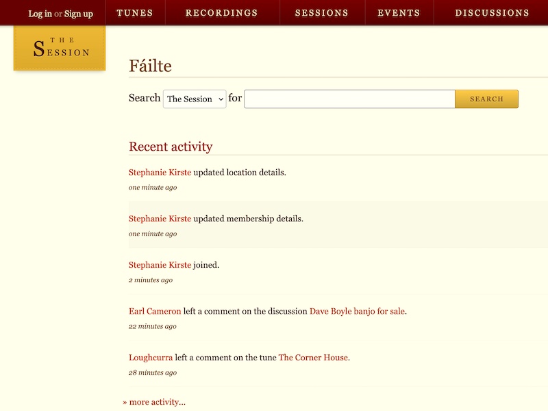
The last really big change to the site happened in 2012. As well as a complete redesign, I introduced lots of new functionality.

A screenshot of the current version of The Session

In all of those incarnations, the layout was fluid …long before responsive design swept the web. That was quite unusual twenty years ago, but I knew it was the webby thing to do.

What’s also unusual is just keeping a website going for twenty years. Keeping a community website going for twenty years is practically unheard of. I’m very proud of The Session. Although, really, I’m just the caretaker. The site would literally be nothing without all the contributions that people have made.

I’ve more or less adopted a Wikipedia model for contributions. Some things, like tune settings, can only be edited by the person who submitted it But other things, like the track listing of a recording, or the details of a session, can be edited by any member of the site. And of course anyone can add a comment to any listing. There’s a certain amount of risk to that, but after testing it for two decades, it’s working out very nicely.

What’s really nice is when I get to meet my fellow members of The Session in meatspace. If I’m travelling somewhere and there’s a local session happening, I always get a warm welcome. I mean, presumably everyone would get a warm welcome at those sessions, but I’ve also had my fair share of free pints thanks to The Session.

I feel a great sense of responsibility with The Session. But it’s not a weight of responsibility—the way that many open source maintainers describe how their unpaid labour feels. The sense of responsibility I feel drives me. It gives me a sense of purpose.

The Session is older than any client work I’ve ever done. It’s older than any books I’ve written. It’s even older than Clearleft by a few years. Heck, it’s even older than this blog (just).

I’m 50 years old now. The Session is 20 years old. That’s quite a chunk of my life. I think it’s fair to say that it’s part of me now. Of all the things I’ve made so far in my life, The Session is the one I’m proudest of.

I’m looking forward to stewarding the site through the next twenty years.
Looking beyond launch

It’s all go, go, go at Clearleft while we’re working on a new version of our website …accompanied by a brand new identity. It’s an exciting time in the studio, tinged with the slight stress that comes with any kind of unveiling like this.

I think it’s good to remember that this is the web. I keep telling myself that we’re not unveiling something carved in stone. Even after the launch we can keep making the site better. In fact, if we wait until everything is perfect before we launch, we’ll probably never launch at all.

On the other hand, you only get one chance to make a first impression, right? So it’s got to be good …but it doesn’t have to be done. A website is never done.

I’ve got to get comfortable with that. There’s lots of things that I’d like to be done in time for launch, but realistically it’s fine if those things are completed in the subsequent days or weeks.

Adding a service worker and making a nice offline experience? I really want to do that …but it can wait.

What about other performance tweaks? Yes, we’ll to try have every asset—images, fonts—optimised …but maybe not from day one.

Making sure that each page has good metadata—Open Graph? Twitter Cards? Microformats? Maybe even AMP? Sure …but not just yet.

Having gorgeous animations? Again, I really want to have them but as Val rightly points out, animations are an enhancement—a really, really great enhancement.

If anything, putting the site live before doing all these things acts as an incentive to make sure they get done.

So when you see the new site, if you view source or run it through Web Page Test and spot areas for improvement, rest assured we’re on it.

A new website for dConstruct 2014

dConstruct 2014 has a new website. Huzzah!

When I announced the original website two months ago, I was very, very excited about the line-up, but I was less excited about the design of the site itself. To be honest, it was a somewhat rushed affair. It did the job but it didn’t have much pizzazz. I had some design direction—colour, typography, texture—courtesty of Mikey, but I didn’t push it to do anything very interesting.

dConstruct original 320 dConstruct original 600 dConstruct original 768

So Mikey took some time to iterate and revise, and he came up with a gorgeous new design. I think this does a much better job of capturing the spirit of dConstruct.

As well as a revised colour palette and lusher textures, there was also opportunity to do something quite playful in the masthead. Making sites for our own projects always presents a nice opportunity to try out some whacky stuff that we might not get a chance to do on client work.

In this case, the plan was to play with the theme of this year’s dConstruct—Living With The Network—and use it as part of the visual design, literally networking up parts of the interface.

It was a nice chance for me to play around with canvas. But I didn’t dive into code straight away. I had a think about how I could add this an enhancement to the responsive layout.

My plan was to generate a canvas element under the existing elements in the header using z-index to keep them separated while maintaining the appearance of having everything connected up.

Sketching before coding

It worked out pretty well. But I wanted to push it further. How about making it an interactive element that responds to the user?

I know, I know. It’s very silly and frankly a bit wanky, but y’know, it felt like it would be nice and playful.

I had no idea how to do it though. At an internal code review here at Clearleft, I demoed what I had so far and asked for advice. The general consensus was that I should probably be using SVG rather than canvas for making interactive graphical elements. They’re probably right, but I distinctly remember learning about hit detection and mouse events in canvas during Seb’s excellent Creative JS workshop.

So I stuck with canvas and fiddled around with numbers until I got to something that felt lke it reacted nicely to hover events (or touch/clicks if hover isn’t available …or even if it is). requestAnimationFrame was a godsend when it came to getting smooth animations.

Have a play with it. It’s hard to miss. It’s not exactly a subtle easter egg.

The content of the site remains much the same. While I was disatisfied with the original visual design of the site, I’m still pretty chuffed with the copy.

One small change I made was to give the code of conduct its own page (and expand on it a bit). Previously it was included with terms and conditions but there was a good chance that it could’ve been overlooked there.

Anyway, I hope you like the new site. I think Mikey did a terrific job with the design and it was a lot of fun to put together …especially the silly wanky bit. The only slight disadvantage is that the page weight comes in slightly larger than the previous design. But I’ll keep optimising to see if I can shave off some bytes here and there.

Device testing dConstruct Device testing dConstruct

Oh, and you might notice one significant change on the home page. In addition to the speakers that are currently listed, there’s an addendum that reads “…and more”. That’s because the line-up for this year’s dConstruct, awesome as it is, is not yet complete. It’s going to get even better.

If you don’t have your ticket to this year’s dConstruct yet, what are you waiting for?

See you on September 5th.

Clearleft.com past and present

We finally launched the long-overdue redesign of the Clearleft website last week. We launched it late on Friday afternoon, because, hey! that’s not a stupid time to push something live or anything.

The actual moment of launch was initiated by Josh who had hacked together a physical launch button containing a teensy USB development board.

The launch button Preparing to launch

So nerdy.

Mind you, just because the site is now live doesn’t mean the work is done. Far from it, as Paul pointed out:

But it’s nice to finally have something new up. We were all getting quite embarrassed by the old site.

Still, rather than throw the old design away and never speak of it again, we’ve archived it. We’ve archived every iteration of the site:

  1. Version 1 launched in 2005. I wrote about it back then. It looked very much of its time. This was before responsive design, but it was, of course, nice and liquid.
  2. Version 2 came a few years later. There were some little bits I liked it about it but it always felt a bit “off”.
  3. Version 3 was more of a re-alignment than a full-blown redesign: an attempt to fix some of the things that felt “off” about the previous version.
  4. Version 4 is where we are now. We don’t love it, but we don’t hate it either. Considering how long it took to finally get this one done, we should probably start planning the next iteration now.

I’m glad that we’ve kept the archived versions online. I quite enjoy seeing the progression of the visual design and the technologies used under the hood.

Redesigns a go-go

Redesigns are like buses: you need to wear clean underwear in case you get hit by one. No, hang on: You wait for one for ages, then loads come along at once… yeah, that’s what I meant.

Paul has been busy since leaving Oxford for his new job in London. He’s been marking up the new design for the front page of The Guardian website. This is a nice refreshing change for the paper’s site, making really good use of colour and typography in a pleasing grid. It’s a bit wide for my taste but at least most of the content that gets cut off at 800 pixels is mostly marketing guff (with the exception of the search at the top of the page: shame that the header couldn’t be liquid even if the rest of the page stays fixed).

Don’t worry: I’m not that much of a zealot that I’m going to judge designs purely based on whether they’re fixed width or liquid. But if you want to see a great example of a hybrid design, check out what Patrick has been doing with the ongoing design of his site: the third column drops below the second when the window width gets narrow—a smooth adaptive technique I first saw pioneered in a previous incarnation of Colly’s site.

Speaking of kick-ass Brit designers hailing from North of the Watford gap, Malarkey has redesigned his site. Actually, he’s done more than that. He’s condensed his two sites—business and personal—into one. You can read all about the ins and outs of the redesign but I recommend having a little poke around the site first to see how many delightful little Easter eggs you can spot.

There’s a ton of really nice little touches. Obviously the superb illustrations by Kevin really stand out but did you also notice that all the borders between columns are hand-drawn in pencil? Needless to say, the typography is uniformly excellent. Oh, and see if you can figure out how he managed to get two columns of text to flow around a single image on the front page.

Design is more than just visual appearance and Andy has pulled out all the stops in making sure that his personality comes across not just in the graphical elements but also in the copy. My favourite little touch is down in the footer:

If you need help using this site, please consult our help page. If you need help using our help page, download our How to use help PDF (what’s a download?)

That last link leads to a page that includes this great piece of advice:

Advisory notice: When you download something from the internet, don’t forget to put it back.

I haven’t been immune to the redesign bug. I finally got ‘round to making a long-overdue overhaul of the Salter Cane site.

Salter Cane on screen The old Flash site served its purpose well. It was atmospheric and mysterious—mostly because we didn’t have anything much to say so atmosphere and mystery were all we wanted to communicate. Times have changed though. There’s a lot happening with the band: concerts, an album release, songs on iTunes and a general increase in activity. Time for the band members to get blogging.

That doesn’t mean I’ve ditched the atmosphere but I felt it was time to remove some of the mystery. The design itself came together very, very quickly—just a couple of days—and it isn’t finished yet. I still need to create pages for the individual band members, add an archive of past concerts and work on expanding the individual blog post pages. But the overall look and feel is all in place and I’m quite pleased with how it has turned out. It has a lighter touch than the previous design but still has a lot of that olde-worlde feeling.

It all works pretty nicely on my mobile phone which is a nice bonus. The front page is also a mini mashup, pulling in the latest posts from the band’s MySpace page and the latest pictures on Flickr tagged with “saltercane”. And, of course, there are microformats a-plenty.

I spent most of my efforts on getting the typography right, paying a lot of attention to Richard’s ideas about baselines and vertical rhythm. I’ve added a couple of touches using CSS selectors that not all browsers support—transcending CSS and all that malarkey. Safari users will get the nice :first-line and :first-letter styles (though I did have to shoot off a bug report to Dave Hyatt pointing out that the letter styled with the :first-letter pseudo-class doesn’t scale when the user resizes the text size—but this might well be already fixed in the nightly builds of WebKit).

So all in all, it’s a busy time for redesigns. But wait, there’s more…

Keep your eye on the d.Constuct website over the next couple of days. Much as I love the current holding page, what’s coming is even better. Paul has been slaving away in the Clearleft office to make a site that really fits the theme of this year’s conference: designing the user experience. You can expect a fun-filled redesign.

When the d.Constuct site launches, you’ll be able to see for yourself what a great line-up we’ve got for the conference this year. I’m looking forward to it already. Don’t worry: tickets won’t be going on sale for quite a while yet but be sure to mark the date in your calendar: September 7th, 2007. On that day, Brighton is most definitely the place to be.