Journal tags: maps

16

sparkline

Web notifications on iOS

I’ve mentioned before that I don’t enable notifications on my phone. Text messages are the only exception. I don’t want to get notified if a new email arrives (I avoid email on my phone completely) and I certainly don’t want some social media app telling me somebody liked or faved something.

But the number one feature I’d like to see in Safari on iOS is web notifications.

It’s not for me personally, see. It’s because it’s the number one reason why people are choosing not to go all in progressive web apps.

Safari on iOS is the last holdout. But that equates to enough marketshare that many companies feel they can’t treat notifications as a progressive enhancement. While I may not agree with that decision myself, I get it.

When I’m evangelising the benefits of building on the open web instead of making separate iOS and Android apps, I inevitably get asked about notifications. As long as mobile Safari doesn’t support them—even though desktop Safari does—I’m somewhat stumped. There’s no polyfill for this feature other than building an entire native app, which is a bit extreme as polyfills go.

And of course, unlike on your Mac, you don’t have the option of using a different browser on your iPhone. As long as mobile Safari doesn’t support web notifications, nothing on iOS can support web notifications.

I’ve got progressive web apps on the home screen of my phone that match their native equivalents feature-for-feature. Twitter. Instagram. They’re really good. In some ways they’re superior to the native apps; the Twitter website is much calmer, and the Instagram website has no advertising. But if I wanted to get notifications from any of those sites, I’d have to keep the native apps installed just for that one feature.

So in the spirit of complaining about web browsers in a productive way, I just want to throw this plea out there: Apple, please support web notifications in mobile Safari!

The good news is that web notifications on iOS might be on their way. Huzzah!

Alas, we’re reliant on Maximiliano’s detective work to even get a glimpse of a future feature like this. Apple has no public roadmap for Safari. There’s this status page on the Webkit blog but it’s incomplete—web notifications don’t appear at all. In any case, WebKit and Safari aren’t the same thing. The only way of knowing if a feature might be implemented in Safari is if it shows up in Safari Technology Preview, at which point it’s already pretty far along.

So while my number one feature request for mobile Safari is web notifications, a close second would be a public roadmap.

It only seems fair. If Apple devrels are asking us developers what features we’d like to see implemented—as they should!—then shouldn’t those same developers also be treated with enough respect to share a roadmap with them? There’s not much point in us asking for features if, unbeknownst to us, that feature is already being worked on.

But, like I said, my number one request remains: web notifications on iOS …please!
Memories of Ajax

I just finished watching The Billion Dollar Code, a German language miniseries on Netflix. It’s no Halt and Catch Fire, but it combines ’90s nostalgia, early web tech, and an opportunity for me to exercise my German comprehension.

It’s based on a true story, but with amalgamated characters. The plot, which centres around the preparation for a court case, inevitably invites comparison to The Social Network, although this time the viewpoint is from that of the underdogs trying to take on the incumbent. The incumbent is Google. The underdogs are ART+COM, artist-hackers who created the technology later used by Google Earth.

Early on, one of the characters says something about creating a one-to-one model of the whole world. That phrase struck me as familiar…

I remember being at the inaugural Future Of Web Apps conference in London back in 2006. Discussing the talks with friends afterwards, we all got a kick out of the speaker from Google, who happened to be German. His content and delivery was like a wonderfully Stranglovesque mad scientist. I’m sure I remember him saying something like “vee made a vun-to-vun model of the vurld.”

His name was Steffen Meschkat. I liveblogged the talk at the time. Turns out he was indeed on the team at ART+COM when they created Terravision, the technology later appropriated by Google (he ended up working at Google, which doesn’t make for as exciting a story as the TV show).

His 2006 talk was all about Ajax, something he was very familiar with, being on the Google Maps team. The Internet Archive even has a copy of the original audio!

It’s easy to forget now just how much hype there was around Ajax back then. It prompted me to write a book about combining Ajax and progressive enhancement.

These days, no one talks about Ajax. But that’s not because the technology went away. Quite the opposite. The technology became so ubiquituous that it no longer even needs a label.

A web developer today might ask “what’s Ajax?” in the same way that a fish might ask “what’s water?”

Indy maps

Remember when I wrote about adding travel maps to my site at the recent Indie Web Camp Brighton? I must confess that the last line I wrote was an attempt to catch a fish from the river of the lazy web:

It’s a shame that I can’t use the lovely Stamen watercolour tiles for these static maps though.

In the spirit of Cunningham’s Law, I was hoping that somebody was going to respond with “It’s totally possible to use Stamen’s watercolour tiles for static maps, dumbass—look!” (to which my response would have been “thank you very much!”).

Alas, no such response was forthcoming. The hoped-for schooling never forthcame.

Still, I couldn’t quite let go of the idea of using those lovely watercolour maps somewhere on my site. But I had decided that dynamic maps would have been overkill for my archive pages:

Sure, it looked good, but displaying the map required requests for a script, a style sheet, and multiple map tiles.

Then I had a thought. What if I keep the static maps on my archive pages, but make them clickable? Then, on the other end of that link, I can have the dynamic version. In other words, what if I had a separate URL just for the dynamic maps?

These seemed like a good plan to me, so while I was travelling by Eurostar—the only way to travel—back from the lovely city of Antwerp where I had been speaking at Full Stack Europe, I started hacking away on making the dynamic maps even more dynamic. After all, now that they were going to have their own pages, I could go all out with any fancy features I wanted.

I kept coming back to my original goal:

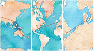
I was looking for something more like the maps in Indiana Jones films—a line drawn from place to place to show the movement over time.

I found a plug-in for Leaflet.js that animates polylines—thanks, Iván! With a bit of wrangling, I was able to get it to animate between the lat/lon points of whichever archive section the map was in. Rather than have it play out automatically, I also added a control so that you can start and stop the animation. While I was at it, I decided to make that “play/pause” button do something else too. Ahem.

If you’d like to see the maps in action, click the “play” button on any of these maps:

You get the idea. It’s all very silly really. It’s right up there with the time I made my sparklines playable. But that’s kind of the point. It’s my website so I can do whatever I want with it, no matter how silly.

First of all, the research department for adactio.com (that’s me) came up with the idea. Then that had to be sold in to upper management (that’s me too). A team was spun up to handle design and development (consisting of me and me). Finally, the finished result went live thanks to the tireless efforts of the adactio.com ops group (that would be me). Any feedback should be directed at the marketing department (no idea who that is).

Indy web

It was Indie Web Camp Brighton on the weekend. After a day of thought-provoking discussions, I thoroughly enjoyed spending the second day tinkering on my website.

For a while now, I’ve wanted to add maps to my monthly archive pages (to accompany the calendar heatmaps I added at a previous Indie Web Camp). Whenever I post anything to my site—a blog post, a note, a link—it’s timestamped and geotagged. I thought it would be fun to expose that in a glanceable way. A map seems like the right medium for that, but I wanted to avoid the obvious route of dropping a load of pins on a map. Instead I was looking for something more like the maps in Indiana Jones films—a line drawn from place to place to show the movement over time.

I talked to Aaron about this and his advice was that a client-side JavaScript embedded map would be the easiest option. But that seemed like overkill to me. This map didn’t need to be pannable or zoomable; just glanceable. So I decided to see if how far I could get with a static map. I timeboxed two hours for it.

After two hours, I admitted defeat.

I was able to find the kind of static maps I wanted from Mapbox—I’m already using them for my check-ins. I could even add a polyline, which is exactly what I wanted. But instead of passing latitude and longitude co-ordinates for the points on the polyline, the docs explain that I needed to provide …cur ominous thunder and lightning… The Encoded Polyline Algorithm Format.

Go to that link. I’ll wait.

Did you read through the eleven steps of instructions? Did you also think it was a piss take?

  1. Take the initial signed value.
  2. Multiply it by 1e5.
  3. Convert that decimal value to binary.
  4. Left-shift the binary value one bit.
  5. If the original decimal value is negative, invert this encoding.
  6. Break the binary value out into 5-bit chunks.
  7. Place the 5-bit chunks into reverse order.
  8. OR each value with 0x20 if another bit chunk follows.
  9. Convert each value to decimal.
  10. Add 63 to each value.
  11. Convert each value to its ASCII equivalent.

This was way beyond my brain’s pay grade. But surely someone else had written the code I needed? I did some Duck Duck Going and found a piece of PHP code to do the encoding. It didn’t work. I Ducked Ducked and Went some more. I found a different piece of PHP code. That didn’t work either.

At this point, my allotted time was up. If I wanted to have something to demo by the end of the day, I needed to switch gears. So I did.

I used Leaflet.js to create the maps I wanted using client-side JavaScript. Here’s the JavaScript code I wrote.

It waits until the page has finished loading, then it searches for any instances of the h-geo microformat (a way of encoding latitude and longitude coordinates in HTML). If there are three or more, it generates a script element to pull in the Leaflet library, and a corresponding style element. Then it draws the map with the polyline on it. I ended up using Stamen’s beautiful watercolour map tiles.

Had some fun at Indie Web Camp Brighton on the weekend messing around with @Stamen’s lovely watercolour map tiles. (I was trying to create Indiana Jones style travel maps for my site …a different kind of Indy web.)

That’s what I demoed at the end of the day.

But I wasn’t happy with it.

Sure, it looked good, but displaying the map required requests for a script, a style sheet, and multiple map tiles. I made sure that it didn’t hold up the loading of the rest of the page, but it still felt wasteful.

So after Indie Web Camp, I went back to investigate static maps again. This time I did finally manage to find some PHP code for encoding lat/lon coordinates into a polyline that worked. Finally I was able to construct URLs for a static map image that displays a line connecting multiple points with a line.

I’ve put this maps on any of the archive pages that also have calendar heat maps. Some examples:

If you go back much further than that, the maps start to trail off. That’s because I wasn’t geotagging everything from the start.

I’m pretty happy with the final results. It’s certainly far more responsible from a performance point of view. Oh, and I’ve also got the maps inside a picture element so that I can swap out the tiles if you switch to dark mode.

It’s a shame that I can’t use the lovely Stamen watercolour tiles for these static maps though.

Checking in at Indie Web Camp Nuremberg

Once I finished my workshop on evaluating technology I stayed in Nuremberg for that weekend’s Indie Web Camp.

IndieWebCamp Nuremberg

Just as with Indie Web Camp Düsseldorf the weekend before, it was a fun two days—one day of discussions, followed by one day of making.

IndieWebCamp Nuremberg IndieWebCamp Nuremberg IndieWebCamp Nuremberg IndieWebCamp Nuremberg

I spent most of the second day playing around with a new service that Aaron created called OwnYourSwarm. It’s very similar to his other service, OwnYourGram. Whereas OwnYourGram is all about posting pictures from Instagram to your own site, OwnYourSwarm is all about posting Swarm check-ins to your own site.

Usually I prefer to publish on my own site and then push copies out to other services like Twitter, Flickr, etc. (POSSE—Publish on Own Site, Syndicate Elsewhere). In the case of Instagram, that’s impossible because of their ludicrously restrictive API, so I have go the other way around (PESOS—Publish Elsewhere, Syndicate to Own Site). When it comes to check-ins, I could do it from my own site, but I’d have to create my own databases of places to check into. I don’t fancy that much (yet) so I’m using OwnYourSwarm to PESOS check-ins.

The great thing about OwnYourSwarm is that I didn’t have to do anything. I already had the building blocks in place.

First of all, I needed some way to authenticate as my website. IndieAuth takes care of all that. All I needed was rel="me" attributes pointing from my website to my profiles on Twitter, Flickr, Github, or any other services that provide OAuth. Then I can piggyback on their authentication flow (this is also how you sign in to the Indie Web wiki).

The other step is more involved. My site needs to provide an API endpoint so that services like OwnYourGram and OwnYourSwarm can post to it. That’s where micropub comes in. You can see the code for my minimal micropub endpoint if you like. If you want to test your own micropub endpoint, check out micropub.rocks—the companion to webmention.rocks.

Anyway, I already had IndieAuth and micropub set up on my site, so all I had to do was log in to OwnYourSwarm and I immediately started to get check-ins posted to my own site. They show up the same as any other note, so I decided to spend my time at Indie Web Camp Nuremberg making them look a bit different. I used Mapbox’s static map API to show an image of the location of the check-in. What’s really nice is that if I post a photo on Swarm, that gets posted to my own site too. I had fun playing around with the display of photo+map on my home page stream. I’ve made a page for keeping track of check-ins too.

All in all, a fun way to spend Indie Web Camp Nuremberg. But when it came time to demo, the one that really impressed me was Amber’s. She worked flat out on her site, getting to the second level on IndieWebify.me …including sending a webmention to my site!

IndieWebCamp Nuremberg

One week of Map Tales

It’s been just a week since Clearleft unveiled the Map Tales project that we built at Hackfarm and there have already been some great stories told with the site.

Paul documented his 2009 road trip to South by Southwest.

Alessio put together a photographic guide to his adopted home, showing the secrets of Barcelona.

Andy told two tales of two different trips: wine-tasting in California’s Dry Creek Valley and hanging with the hipsters in East London.

Fellow Brightonian Tom Prior has recreated the story of the famous Stirling Moss victory at the 1955 Mille Miglia, the legendary open-road endurance race in Northern Italy.

I love the simplicity of Oliver and Peter Walk to School that Peter Ruk has embedded on his site—beautifully simple .

I’ve made a map tale of the voyage of The Beagle with material fromAboutDarwin.com.

Meanwhile Anna is putting together the tale of the Terra Nova expedition to the South Pole because—get this—a relative of hers was part of Scott’s team!

There’s plenty of room for improvement with Map Tales. It would be nice to have customisation options at some point—colours, fonts, maybe even map tiles. Some narratives would probably work better with aerial imagery, for example. In fact, that’s something that Andy has been tirelessly tinkering with. To get a taste of how that looks, check out Britain From Above, the epic map tale of the 2008 BBC documentary series.

Wait. They don’t love you like I love you.

There’s been a lot of map-related activity on the BBC recently. The series of documentaries called The Beauty of Maps was all too short.

Meanwhile, Radio 4 ran a ten-part series entitled On The Map. They would have disappeared down the Beeb’s memory hole but Brian did a little bit of digital preservation and passed them on to me. I’ve put them on Huffduffer. You can subscribe to a podcast of all ten episodes or listen to them individually:

  1. The Map Makers
  2. Mapping the Metropolis
  3. Motoring Maps
  4. Social Mapping
  5. The Lie of the Land
  6. World View
  7. Off The Map
  8. Whose Map is it Anyway?
  9. Digital Maps
  10. Maps of the Mind

If you’re in London any time before September 19th, be sure to check out the Magnificent Maps exhibition at The British Library. It’s free and it’s excellent.

Sparkmaps

Last week, on Richard’s recommendation, Jessica and I went out to eat at relatively new Kemp Town establishment, The Ginger Dog—all in the name of research for Prinicipia Gastronomica of course.

Being relatively new to this neighbourhood, I wanted to make sure we didn’t go astray. I don’t have an iPhone but I do have an iPod Touch so, before leaving the house, I loaded up the map app with walking directions.

The way to The Ginger Dog

Even though I didn’t have 3G, or even WiFi, to help me on my perambulation, the iPod Touch does have triangulation. So every time I checked the map, a blue dot marked my spot. I just had to make sure that the blue dot didn’t stray off the purple line.

On the way back, I opened up the map app again to retrace my steps. This time, the map tiles didn’t load. But my route home was still marked in purple, and the blue dot still showed my position.

That’s when I realised that all the other information on the map—the streets and landmarks—were irrelevant to the task of navigating my way from A to B. All I needed to do was keep the blue dot on the purple line. It’s the minimum information density for wayfinding: the mapping equivalent of a sparkline.

Map sparkline

Wayfinders keepers

Cennydd has written a great article for Johnny Holland magazine called Wayfinding Through Technology—a preview of his EuroIA talk, The Future of Wayfinding. It dovetails nicely with some of the stuff that Adam Greenfield spoke about at dConstruct.

Meanwhile, over on OpenType, there’s an article on Wayfinding observations: Landmarks and cardinal directions. It uses the specific example of navigating Vienna:

The city center was also easy to find and I can easily place it on my cognive map. It’s across the river and Southwest of my hotel.

It’s interesting that the river is mentioned as being particular useful as an orientation point. The new iteration of the London tube map has ditched the Thames, to much dismay.

tube map

Closed open data

I arrived in San Francisco yesterday after a smooth flight (I bumped into Malarkey on the plane—how did I not spot him at the airport?). Now I’m on the ground, staying with Tantek for a couple of days—I’ll be moving into a hotel room once the conference starts.

I have a few days on either side of the conference to explore San Francisco. I’ll probably end up walking around a lot. It might be fun to make use of one of the newer features of Google Maps: put yourself on the map. If this feature had existed when I was in Chicago for An Event Apart, I would have plotted my explorations of that city.

If I do map my movements while I’m in San Francisco, you’ll be able to find them on my profile page. That page also has an hCard… sorta.

Alas, the hCard is contained within an embedded iframe. This means that most microformat parsers—bookmarklets, plugins, converters—won’t find the hCard because they parse at the URL level, reasonably enough. There doesn’t seem to be any good reason for using an iframe. This is exactly the kind of embedding that’s normally done on the server before a page is served up to the browser.

The guys over at Google are smart so I’m sure they’ll get this sorted out but I can’t help but feel that it’s a perfect example of why it’s important to use markup before adding microformats. If you aren’t using the right elements to structure your content to begin with, it’s probably going to be more of a struggle to implement that extra sprinkling of microformats.

Map games

At last year’s FooCamp, Tom, Simon, Paul, Suw and others had fun creating giant pictures for the benefit of a Google fly-over. The results are now visible and they look pretty good.

I mention this because if you’re in Sydney tomorrow, you might want to arrange something similar for the Australia Day Google fly-over. No rude words or Firefox logos, please.

Virtual trainspotting

The second day of BarCamp London is going great — I’m amazed a the energy and enthusiasm after a night of very little sleep for everyone. The lack of sleep can be attributed to Simon and his damn Werewolf game.

I’ve just seen the most wonderful presentation from the excellent Matthew Somerville. He works on They Work For You… and I just found out that he’s the guy who did the renegade accessible Odeon site!

He’s built a fantastic mashup of maps and train times. Maybe I shouldn’t be drawing attention to it because he’s getting the data by screen-scraping — because there is no National Rail API — but damn, this is sweet! You can find out when they’re due to arrive at a station. You can see the trains moving along the map. Click the checkbox to speed up the movement by ten.

See how Brighton is in the drop-down list of stations? Matthew added that in the middle of the presentation in response to my request. After all, I need to get back down to Brighton later today.

Iteravely Upcoming

Upcoming.org has rolled out some changes. The visual design has been tweaked, particularly on the events pages.

The colours and typography are looking very good indeed. The change to the way attendees are listed inline doesn’t work quite as well. I’m not the only one who thinks so. But instead of just bitching about it like me, others have provided mockups as part of their constructive criticism.

While this latest update is one of the biggest changes that has been rolled out on the site, it certainly isn’t the first. In fact, Upcoming seems to be in a constant state of gradual change and improvement.

There’s a lot of talk these days about , but Upcoming is one of the few places where I’ve noticed it in action. The design has been improving gradually and almost imperceptibly. Did anyone notice when the top banner changed from being a solid colour to a gradient? I wish now that I had taken screenshots of Upcoming every few weeks. They would make for an interesting time-lapse movie.

The Yahooiness of Upcoming is beginning to make itself felt. You can now migrate your Flickr buddy icon over to Upcoming. Also, if you tag photos on Flickr with “upcoming:event={event id}”, they will show up on the corresponding event page. Then there’s the maps integration.

Both Upcoming and Flickr are now making use of Yahoo maps. The Flickr map exploration page is, like so many things on Flickr, a real time-sink. It’s fun browsing photos with the added context of location.

But — and it’s a big but — Yahoo’s mapping data for Europe is particularly poor. So don’t expect too much detail when you’re browsing holiday snapshots from Brighton. I blame crown copyright myself (though I do wonder how Google has managed to get such detailed data).

As part of this latest iteration, Flickr are moving away from using tags for geocoding:

As a bonus there will be no more need for the unsightly “geotagged/geo:lat/geo:long” tags cluttering up your photos - we’ll offer an automated way to remove them all once the development community has had a chance to make the necessary changes to their code.

I’m not sure that’s such a good idea. There’s nothing wrong with using visible geographical co-ordinates. I’d prefer to keep my meta-data visible, thank you very much.

Mashing up with microformats

Back in March, during South by Southwest, Tantek asked me if I’d like to sit in on his microformats panel alongside Chris Messina and Norm! The audio recording of the panel is now available through the conference podcast.

I’ve taken the liberty of having the recording transcribed (using castingWords.com) and I’ve posted a tidied up version of the transcript to the articles section: Microformats: Evolving the Web. You can listen along through the articles RSS feed which doubles up as a podcast.

I’ve also posted the transcript on the microformats wiki so that others can edit it if they catch any glaring mistakes in the transcription.

During the panel I talked about Adactio Austin, a fairly trivial use of microformats but one that I’ve been building upon. I’d like to provide some cut’n’paste JavaScript that would allow people to get some added value from using microformats. Supposing you have a bunch of locations marked up in hCard with geotags, you could drop in a script and have a map appear showing those locations.

Perhaps the geotagging won’t even be necessary. Google added a geocoder to their mapping API two weeks ago. The UK, alas, is not yet supported (probably because the Post Office won’t let go of its monopoly that easily… Postman Pat, your money-grabbing days are numbered).

Unfortunately, Google Maps isn’t very suited to the cut’n’paste idea: you have to register a different API key for each domain where you want to use the mapping API.

The Yahoo maps API is less draconian about registration but its lack of detailed UK maps makes it a non-starter for me.

Maybe I should step away from maps and concentrate on events instead. It probably wouldn’t be too hard too write a script to create a calendar based on any hCalendar data found in a document. Perhaps I’ll investigate the calendar widget from Yahoo.

Ultimately I’d like to create something like Chris’s Mapendar idea. If only there were enough hours in the day.

When mashups attack

In all the many mashups out there, Google Maps is probably the most used API (version 2 is out now).

One of the latest in the long line of map mixes is Galker Stalker. It takes user-submitted celebrity sightings and displays them on a map of Manhattan.

Has Nick Denton gone too far this time? George Clooney certainly thinks so. Of course, for a site like Gawker, any publicity is good publicity. Jessica and Jesse are just so excited that George Clooney has noticed their existence.

Adactio Austin

In less than a week, I — along with the rest of the Brit Pack — will be flying out to Austin, Texas for South by Southwest 2006.

I will be speaking with Aaron. If you fancy learning how to bluff your way in DOM Scripting, swing on by.

The standard of panels looks really good this year. As usual, it’s going to be difficult to choose which ones to attend and which ones to pass up. I remember at last year’s conference, I had the constant feeling that there was probably something really good happening somewhere at every moment and I was missing it… but I was missing it for something equally good. That’s a nice, if somewhat frustrating feeling.

But the panels and presentations are just one part of Southby. The real value of Geekstock is the pressing of the flesh and the meeting of the minds. I met so many wonderful people last year, it was astounding. I mean, by the sheer law of averages, I should have come across at least a few assholes, right? Nope. Salt of the earth, those webby geeks.

I am so looking forward to once again being surrounded by fellow nerds, imbibing Shiner Bock and consuming Texas barbecue. This year is going to be all the more fun for the presence of Jessica.

Instead of posting a list of panels I’m thinking of attending, I thought I’d put together a page of much more useful information: parties I plan on going to. To use the term du jour, I’ve “mashed up” hCalendar with Google Maps and here’s the result:

Adactio Austin

If you’re going to be in Austin, and just in case you’re wondering where I’m going to be on any given evening, just make use of Austin’s ubiquitous WiFi to pull up that page. I want to make it easy as possible for you to join me for a beer.

Update: After some inspiring banter with Tantek, I’ve added some more microformat goodness to Adactio Austin. The list of parties is now outlined in xoxo and the venues are marked up as hCards.