Building the dConstruct 2015 site
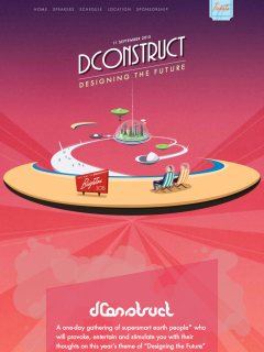
I remember when I first saw Paddy’s illustration for this year’s dConstruct site, I thought “Well, that’s a design direction, but there’s no way that Graham will be able to implement all of it.” There was a tight deadline for getting the site out, and let’s face it, there was so much going on in the design that we’d just have to prioritise.
I underestimated Graham’s sheer bloody-mindedness.
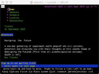
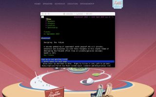
At the next front-end pow-wow at Clearleft, Graham showed the dConstruct site in all its glory …in Lynx.
I love that. Even with the focus on the gorgeous illustration and futuristic atmosphere of the design, Graham took the time to think about the absolute basics: marking up the content in a logical structured way. Everything after that—the imagery, the fonts, the skewed style—all of it was built on a solid foundation.
It would’ve been easy to go crazy with the fonts and images, but Graham made sure to optimise everything to within an inch of its life. The biggest bottleneck comes from a third party provider—the map tiles and associated JavaScript …so that’s loaded in after the initial content is loaded. It turns out that the site build was a matter of prioritisation after all.
There’s plenty of CSS trickery going on: transforms, transitions, and opacity. But for the icing on the cake, Graham reached for canvas and programmed space elevator traffic with randomly seeded velocity and size.
Oh, and of course it’s all responsive.
So, putting that all together…
The dConstruct 2015 site is gorgeous, semantic, responsive, and performant. Conventional wisdom dictates that you have to choose, but this little site—built on a really tight schedule—shows otherwise.


